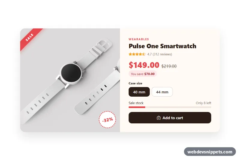
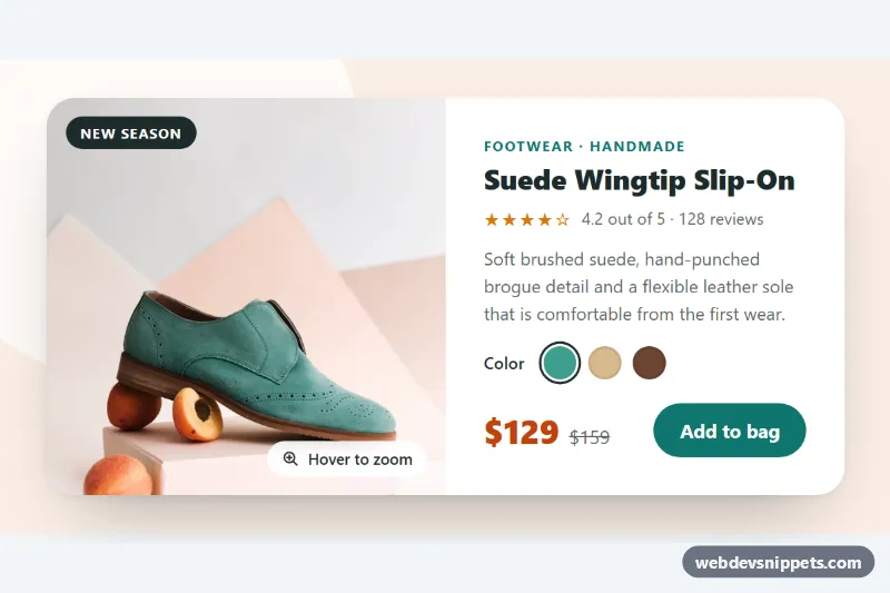
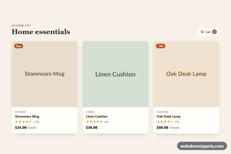
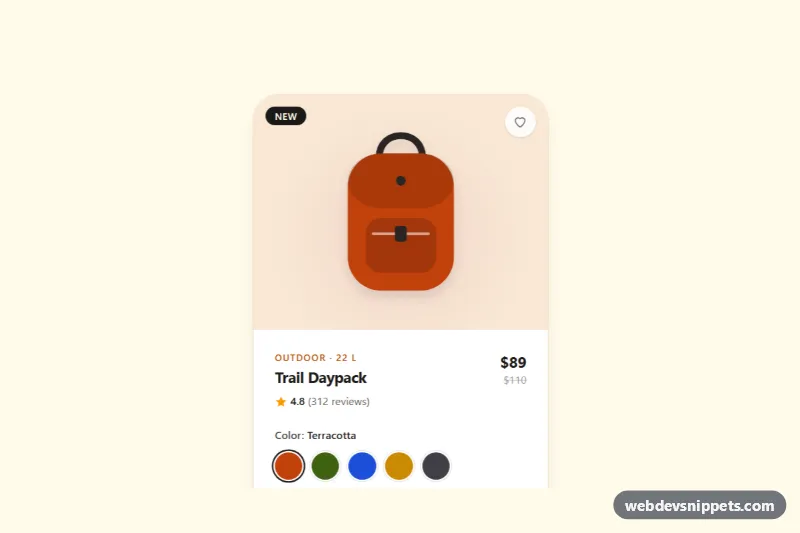
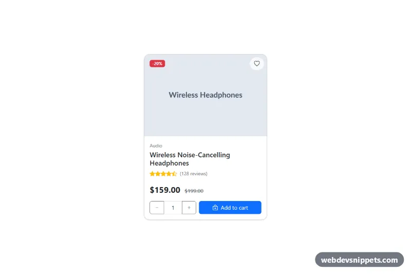
A Bootstrap 5 product card for discounted items: a large product photo with a diagonal "Sale" ribbon and a round discount sticker, next to the old and new prices, a savings pill, size options, a stock bar and an add-to-cart button. Use it for flash sales and deal-of-the-day blocks.
How it works
The root is an article.card.sbp-card with a Bootstrap row g-0. On phones the photo sits on top as a square; from the md breakpoint the card turns horizontal and the .sbp-img fills the left half with object-fit: cover. The .sbp-media wrapper holds two absolutely positioned elements: .sbp-ribbon, a band rotated by -45 degrees across the top-left corner, and .sbp-badge, a dashed circle that shows the discount percentage.
The right column contains the category, title, star rating, the sale price in .sbp-new, the struck-through original price inside an s.sbp-old element and the .sbp-save pill. The case-size buttons are Bootstrap .btn-check radios styled as .sbp-option; each carries a data-price and a data-old-price. A Bootstrap .progress bar shows how much of the sale stock is left.
The script runs on DOMContentLoaded for every .sbp-card. Its update() function reads the checked radio, formats the prices with Intl.NumberFormat, calculates the amount saved and the rounded percentage, and writes them into .sbp-new, .sbp-old-value, .sbp-save-value and .sbp-badge-value. Clicking .sbp-add writes a confirmation into .sbp-status. Without JavaScript the card still shows the correct prices for the default option.
Customization
data-priceanddata-old-priceon each.btn-check: set the prices per variant; the savings and the badge percentage are recalculated automatically.--sbp-saleinstyle.css: changes the color of the ribbon, the sticker, the sale price and the stock bar.--sbp-inkand--sbp-bg: set the text color, the selected option and button color, and the card background.- Remove
.sbp-ribbonor.sbp-badgefrom.sbp-mediaif you want only one sale marker. width: 20%in.sbp-stock-filltogether witharia-valuenowandaria-valuetexton.sbp-stock-bar: show the real remaining stock.max-width: 52remin.sbp-card: make the card wider or narrower.- The message in the
.sbp-addclick handler ofscript.js: replace it with a call to your cart API.
Use cases
- Flash sales: a diagonal Sale ribbon and a round discount sticker highlight reduced items
- Deal-of-the-day blocks: old and new prices with a savings pill show the offer clearly
- Online stores: size options recalculate prices and the saved amount
- Limited-stock offers: a stock bar shows how much of the sale stock is left
- Product pages: a horizontal card with a large photo and an add-to-cart button
Accessibility
The card is an article labelled by its heading. The ribbon is decorative and hidden with aria-hidden="true", while the sticker and both prices carry visually-hidden prefixes ("Discount", "Sale price", "Original price"), so screen readers announce them in context. The original price uses the semantic s element. Size options are native radios inside a fieldset with a legend, operable with arrow keys and with a clear focus outline. The star row is a single role="img" with a text label, the stock bar exposes aria-valuetext, and .sbp-status is a polite live region. The photo zoom on hover is turned off under prefers-reduced-motion: reduce.
Usage notes
Requires Bootstrap 5 (added automatically) and Bootstrap Icons. The product photo comes from Unsplash; replace it with your own image. For several cards on one page give each one unique id and radio name values.