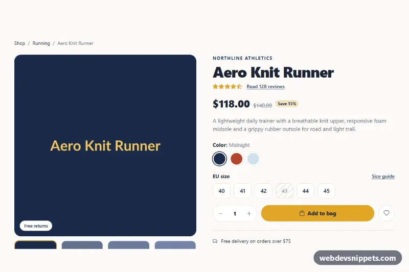
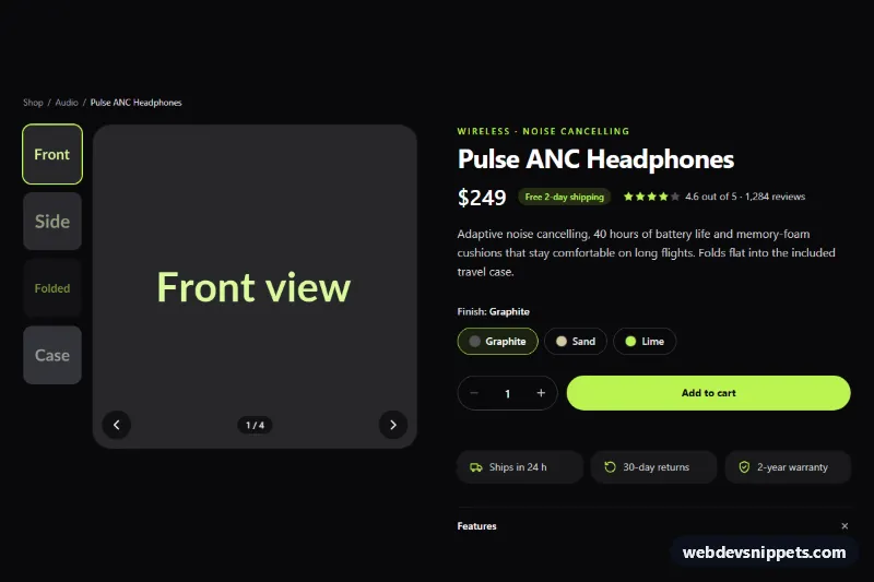
A complete Bootstrap 5 product details page for online stores: an image gallery with thumbnails, price with discount, color and size pickers, a quantity stepper and add-to-bag button, followed by Bootstrap tabs for the description, specifications and customer reviews.
How it works
The root .pp-product starts with a breadcrumb and a two-column row. The left column holds .pp-gallery: a large .pp-stage__img and four .pp-thumb buttons. The right column, .pp-info, contains the brand, title, star rating, .pp-price, a short lead and the .pp-form. Colors and sizes are radio inputs with Bootstrap's btn-check class, styled through the .pp-color and .pp-size labels; a disabled size gets a striped, crossed-out look. Below the columns, .pp-tabs is a Bootstrap nav with role="tablist" and .pp-panels holds three fading tab panes, including a navy .pp-score box with rating bars and .pp-review cards.
The script handles each .pp-product separately. Thumbnails swap the main image using data-pp-src and data-pp-alt, and color radios do the same while updating .pp-color-name. The quantity buttons with data-pp-step change .pp-qty__input within its min and max. On submit, a missing size adds .pp-is-invalid, writes a message into .pp-error and focuses the first available size; otherwise .pp-status confirms the selection. Links that point to a tab pane, such as "Read 128 reviews", open that tab with bootstrap.Tab.
Customization
--pp-navyand--pp-goldon.pp-productinstyle.css: change the main dark color and the accent used for the button, stars and active tab.data-pp-srcon each.pp-thumband color radio: point to your own product photos..pp-color--midnight,.pp-color--emberand.pp-color--glacier: set the swatch colors for your variants.min="1" max="5"on.pp-qty__input: change the allowed quantity range.disabledon a size radio: marks that size as sold out with the striped style..pp-bar--72and the other width classes: update the rating bar lengths together witharia-valuenow.- The status text in the submit handler in
script.js: replace it with afetch()call to your cart endpoint.
Accessibility
Tabs use Bootstrap's ARIA pattern with aria-selected, aria-controls and arrow key support, and each pane is focusable. Color and size choices are native radios grouped in fieldsets with legends, and sold-out sizes include hidden "(sold out)" text. Thumbnails and the wishlist button use aria-pressed. .pp-error and .pp-status are live regions, star ratings are role="img" with labels and the progress bars have aria-label values. Visible gold focus outlines are applied to all controls, and fades are disabled under prefers-reduced-motion.
Usage notes
Requires Bootstrap 5 with its JS bundle (added automatically) and Bootstrap Icons. The component uses one h1, so place it as the main content of a product page.