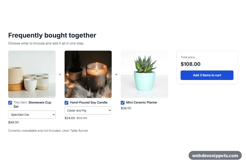
A frequently bought together section for Shopify: the current product shown beside up to three products you pick, with a checkbox for each, a running total and one button that adds everything checked to the cart. No app is needed.
How it works
You choose the paired products by hand in the theme editor, so the section shows exactly what you selected. It does not calculate which products are really bought together.
Each product is rendered as a .wds-fbt__item with its image, a checkbox, a variant select when it has variants, and its price. Changing a checkbox or a variant recalculates the total and updates the button label, and unchecked items are dimmed. Prices follow your store's money format.
The button sends every checked variant in one request to the Cart API. On success the shopper goes to the cart page. If Shopify refuses the request, its message is shown in an alert under the button and the shopper stays on the page.
Sold-out products are left out automatically and named in a short note, and sold-out variants are disabled in the select. If the current product's variant changes in the theme's own picker, the section follows it when it can find that form.
Customization
In the theme editor, the section is called WDS Bought together:
- Products to pair with the current product: up to 3 products.
- Heading, Subheading: the text above the products.
- Current product prefix: the "This item:" text; leave it empty to hide it.
- Button, one item checked, Button, several items checked: labels, where
[count]becomes the number of checked items. - Total, Button while adding, Nothing checked, Sold-out variant, Unavailable products note, Connection error: the remaining messages.
- Background, Text, Accent (button and checkboxes), Button text: colors.
- Side padding, Top padding, Bottom padding: spacing.
Accessibility
Checkboxes use real label elements, and each variant select has a label that names its product. The total is announced with aria-live="polite", errors use role="alert", and the button reports aria-busy while adding. Focus outlines are visible, and transitions are removed for prefers-reduced-motion.
Usage notes
It requires an Online Store 2.0 theme and a product template. On the live store it stays hidden until there is at least one other available product to show. Subscription-only products count as unavailable.
Limits to know about: pairings are set once per template, so every product using that template shows the same picks. No bundle discount is applied, and the total is simply the sum of the checked prices. Line item properties are not sent. The cart page always opens after adding, even if your theme has a cart drawer.
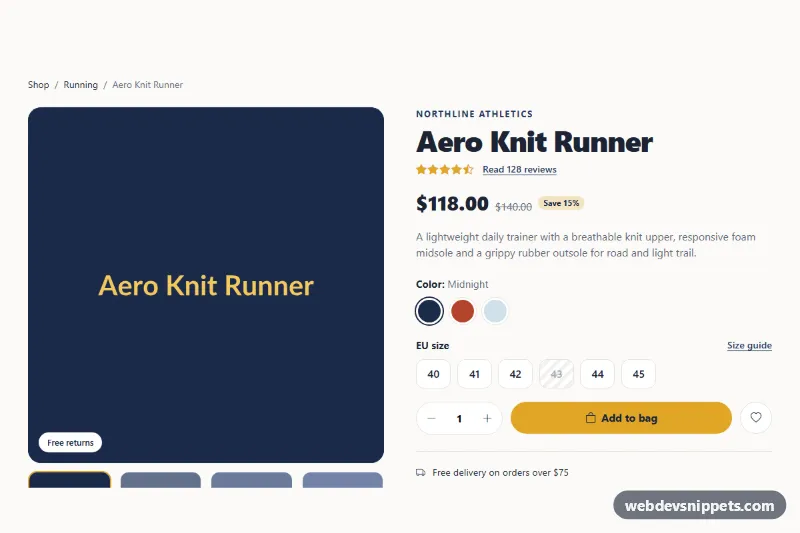
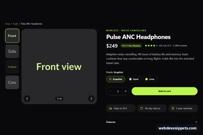
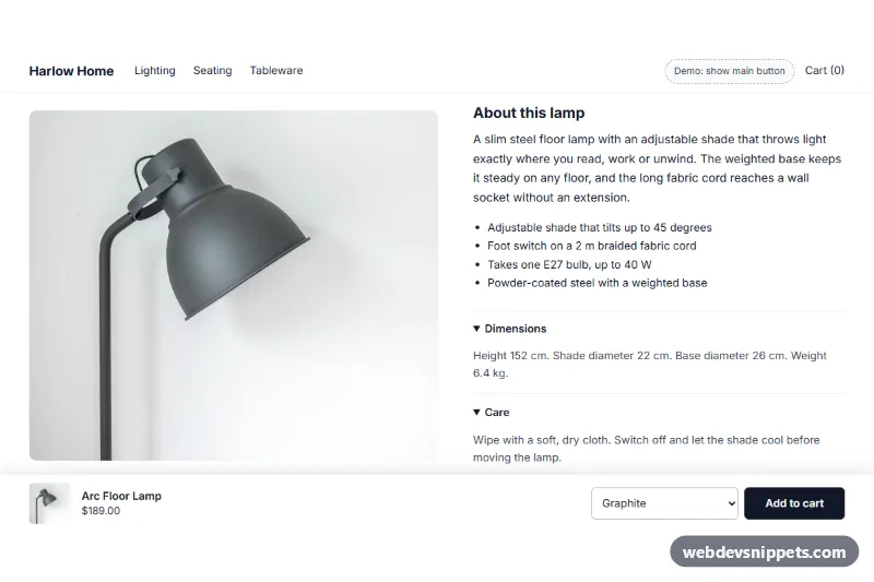
The preview uses sample data for an invented store, and adding is simulated with a demo message because the preview cannot reach a real cart. Photos in the preview are from Unsplash; section.liquid contains none and uses your product images.