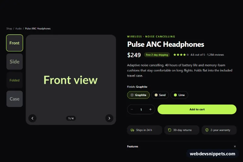
A dark Tailwind CSS product detail section with an image gallery, finish options, a quantity stepper and an "Add to cart" button with a loading state. It is the core of any single-product page in an online store, shown here for a pair of wireless headphones on a zinc and lime palette.
How it works
The root is .tpd-product. From lg up the layout splits into two columns: the gallery on the left and the product information on the right; on phones they stack.
The gallery (.tpd-gallery) has one large image marked data-tpd-main plus four thumbnail buttons marked data-tpd-thumb. Each thumbnail stores the full-size URL and alt text in data-src and data-alt. Clicking a thumbnail, pressing the data-tpd-prev / data-tpd-next arrows or using the arrow keys on a focused thumbnail calls show(), which swaps the image, moves aria-current="true" to the active thumbnail, updates the data-tpd-counter text and replays the tpd-fade animation through the .tpd-main--swap class. Tailwind's aria-[current=true]: variants draw the lime ring on the active thumbnail.
Finishes are visually hidden radio buttons with pill labels styled through peer-checked:; a change listener writes the chosen name into data-tpd-finish. The quantity input (data-tpd-qty) sits between two data-tpd-step buttons; clampQty() keeps the value between the input's min and max and disables a button at either limit. Submitting the form disables data-tpd-add, shows the .tpd-spinner, waits 800 ms to simulate a request and then announces the result in data-tpd-status. The Features and Shipping panels are native details elements, so they work without JavaScript.
Customization
data-src,data-altand the innerimgon eachdata-tpd-thumb: point to your own photos; add or removeliitems freely, the counter adapts.max="5"on#tpd-qty: change the per-order limit for the stepper.- The
setTimeoutin thesubmithandler ofscript.js: replace it with afetch()call to your cart endpoint. lime-300utilities (for examplebg-lime-300ondata-tpd-add): swap forsky-400oramber-300to rebrand the accent.lg:flex-row-reverseon.tpd-gallerypluslg:w-20andlg:grid-cols-1on the thumbnail list: remove them to keep the thumbnails under the main image on desktop.- Add the
openattribute to the seconddetailselement to show shipping information by default.
Accessibility
The gallery is a labelled region; thumbnails are real buttons with visually hidden names, and the active one carries aria-current. The image counter is a polite live region, and the main image's alt text changes with each photo. Finish options are native radios inside a fieldset with a legend, the quantity field has a label and both stepper buttons have names. The cart result is announced via role="status". Lime focus outlines are visible against the dark background, and the fade, spinner and icon rotations stop under prefers-reduced-motion: reduce.
Usage notes
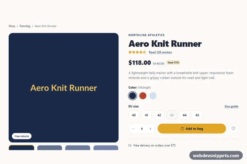
For several products on one page, give each instance unique id values (tpd-title, tpd-qty). The finish radios can keep name="tpd-finish" because each instance has its own form, and the script scopes every query to its .tpd-product root.