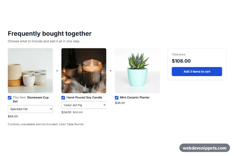
Frequently Bought Together Section for Shopify
Shopify section that shows the current product with up to 3 picked products, checkboxes, variant selects, a live total and one button that adds everything checked to the cart.
Product pages with gallery, options and add to cart.
5 components
Shopify section that shows the current product with up to 3 picked products, checkboxes, variant selects, a live total and one button that adds everything checked to the cart.
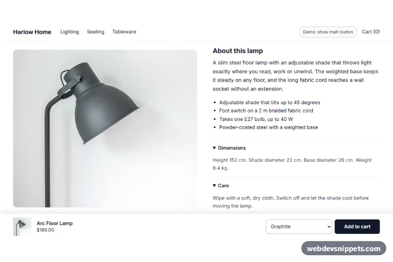
Shopify section: a bar fixed to the bottom of product pages that appears once the main add-to-cart button scrolls away, with image, price, variant select and a real product form.
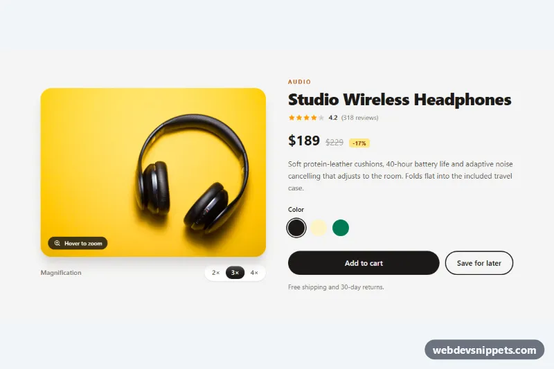
Tailwind CSS product detail section with a round magnifier lens that zooms the photo on hover or arrow keys, plus adjustable 2x to 4x levels.
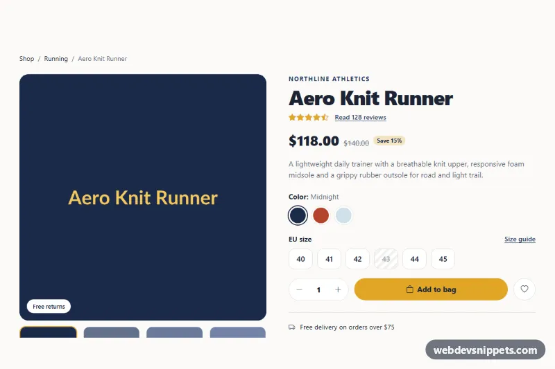
Bootstrap 5 product details page with image gallery, color and size pickers, quantity stepper, and tabs for description, specifications and customer reviews.
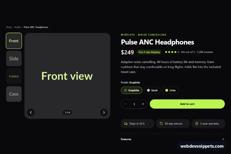
Dark Tailwind CSS product page section with a thumbnail image gallery, finish options, quantity stepper and add to cart button with loading state.
A product details section is the core of a product page. It combines an image gallery with thumbnails or zoom, the product name, price, rating summary, short description, variant options such as size and colour, a quantity selector and the "Add to cart" button. Below that you often find tabs or accordions for the full description, specifications, shipping information and reviews.
Variant selectors work best as groups of radio inputs inside a <fieldset> with a <legend> ("Colour", "Size"); colour swatches need a text label, not just a colour. The quantity stepper should be a labelled number input with buttons that have accessible names. Gallery thumbnails should be buttons with descriptive alt text on the images, and the main image should change without trapping focus. Announce "Added to cart" with a role="status" message. Use proper headings so screen reader users can jump between description, specifications and reviews.
These product page HTML CSS templates and bootstrap product detail examples come in Bootstrap 6, Bootstrap 5, Tailwind CSS and pure CSS. Most include a small script for the gallery and variant switching. Bootstrap 6 versions use the theme-* colour roles for buttons and badges. Check the layout in the live preview, then copy the HTML, CSS and JS from the code tabs or download it and connect it to your store data.