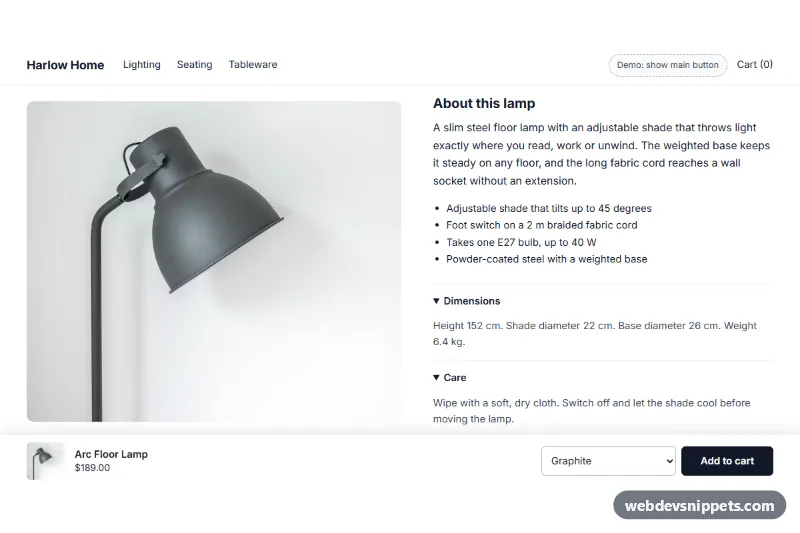
A sticky add to cart bar for Shopify: a Liquid section that keeps the product image, title, price, variant select and buy button on screen after the shopper has scrolled past the main button. Add it to a product template; no app is needed.
How it works
The bar is fixed to the bottom of the page and stays hidden while the theme's main add-to-cart button is in view. An IntersectionObserver watches that button, and the .is-visible class slides .wds-sab in once the button has left the top of the screen.
By default the section finds the theme's product form on its own by looking for a form that posts to /cart/add. The form inside the bar is built with Shopify's form 'product' tag, so it submits to the cart the same way a theme's product form does.
Choosing a variant updates the price, compare-at price and sold-out state. When the bar appears it copies the variant picked in the main form, and on submit it copies filled properties[...] fields from that form, so line item properties are kept. While visible, the bar reserves space at the bottom of the page so it never covers the footer.
Customization
In the theme editor, the section is called WDS Sticky add to cart:
- Custom add-to-cart selector: optional CSS selector of the main button or form, for themes where automatic detection does not find it.
- Add button, Sold out: the labels on the button.
- Variant select (screen readers), Bar name (screen readers): hidden labels.
- Background, Text, Accent (button), Button text: the four colors of the bar.
- Side padding, Top padding, Bottom padding: spacing around the content.
Accessibility
The bar is a named region with a real label on the variant select and aria-live="polite" on the price. While keyboard focus is inside it, the bar stays visible. Controls have visible focus and at least 44 px height, and the slide animation is turned off for prefers-reduced-motion.
Usage notes
It requires an Online Store 2.0 theme, because it is added as a section to a JSON product template. It renders nothing on non-product pages, and it also hides itself for products that can only be bought with a subscription plan. If your theme has its own sticky bar, turn that one off.
Limits to know about: there is no quantity selector, so the bar adds the variant's minimum quantity. Variants are shown in one select rather than one per option. A change made in the bar's select does not update the theme's main picker.
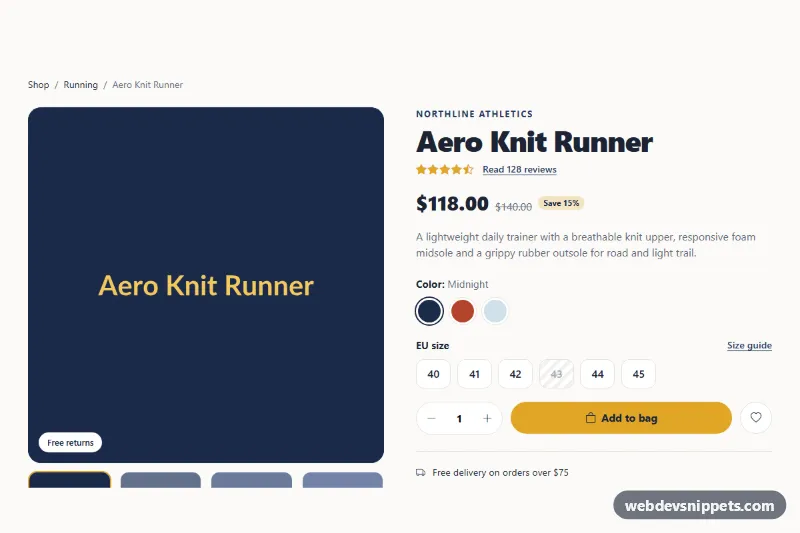
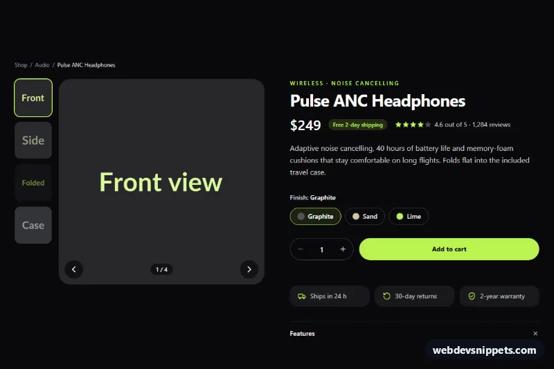
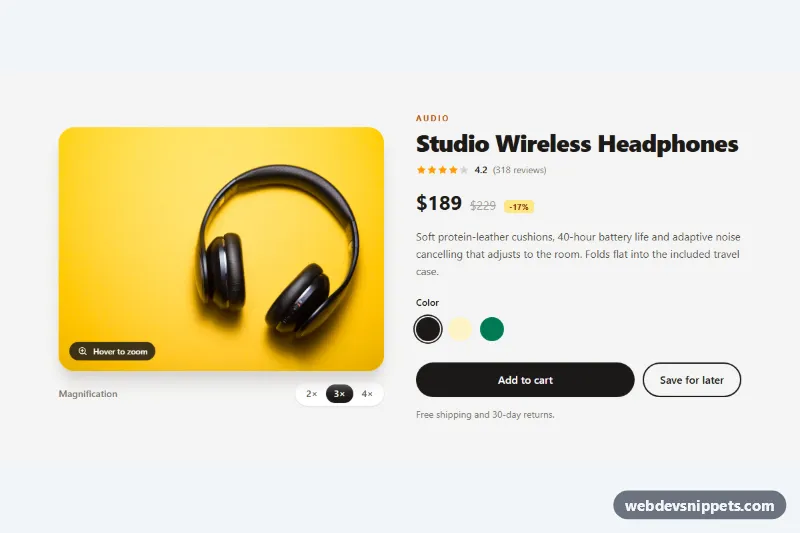
The preview runs on sample data for an invented store, inside a sample product page that is not part of the section. It loads just past the main button; the "Demo" button scrolls up and back so you can see the bar hide and return. Add to cart is simulated there. Photos in the preview are from Unsplash; section.liquid contains none and uses your product's own images.