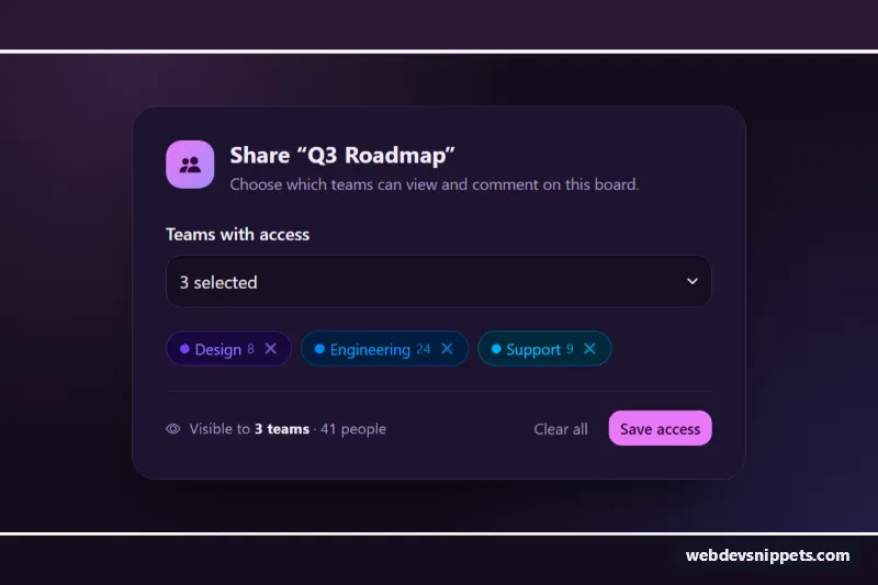
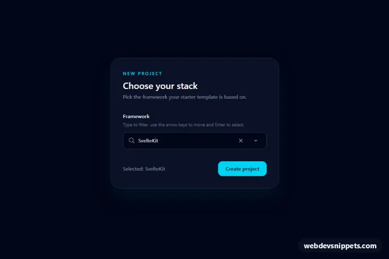
A dark sharing panel built on the Bootstrap 6 multi-select Combobox. Teams picked from the menu appear as color-coded Chips with member counts. Each chip has its own remove button, and a summary line totals how many people get access. Use it for permissions, audience pickers, filters or any "choose several" field where users need to see what they selected.
How it works
The toggle button.combobox-toggle.msc-toggle has data-bs-toggle="combobox", data-bs-multiple="true" and data-bs-name="teams". With multiple selection, clicking an option toggles its selected class and aria-selected and the menu stays open. The toggle reads "3 selected", and Bootstrap fills a hidden teams input with a comma-separated list. The .menu has role="listbox" with aria-multiselectable="true". Each .menu-item is a direct child with data-bs-value, data-msc-theme (a Bootstrap theme color) and data-msc-members, plus a .msc-dot, a .menu-item-description and a .menu-item-check.
script.js imports Combobox and runs render() on every change.bs.combobox. render() rebuilds .msc-chips as a list of .chip.msc-chip.theme-* elements, each with a .chip-dismiss button, and updates the people count in .msc-summary. A dismiss button calls deselect(), which clicks the matching option, so Combobox stays the single source of truth for the selection, the toggle text and the hidden input. Focus then moves to the next chip's remove button. Backspace on the closed toggle removes the last team. "Clear all" deselects everything, and "Save access" simulates a request.
Customization
--msc-accentand--msc-accent-inkon.msc-root: change the pink accent of the badge, check marks, focus rings and Save button.--msc-bg,--msc-paneland--msc-lineon.msc-root: set the page, panel and border colors.data-msc-themeon a.menu-item: use any Bootstrap 6 theme (primary,accent,success,warning,info,danger,secondary) to recolor its dot and chip.data-msc-memberson a.menu-item: the number shown in the chip and added to the total.- Add or remove
selectedandaria-selected="true"on options to change the starting selection. - Replace the
setTimeoutin the.msc-savehandler withfetch(), sending the hiddenteamsvalue.
Use cases
- Permission and sharing panels: pick several teams and see color-coded chips with member counts
- Audience pickers: a summary line totals how many people will get access
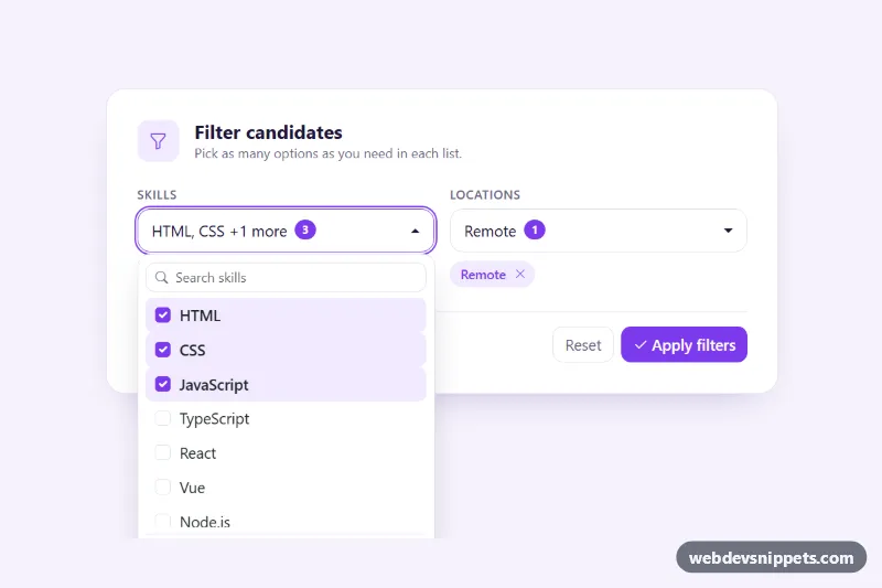
- Filter bars: selected options show as removable chips, so users see what is active
- Admin forms: a hidden comma-separated value submits the chosen teams, with a Clear all button
Accessibility
The menu is a labelled multi-select listbox, and each option reports aria-selected. Arrow keys, Home, End, Enter and Escape work inside the menu. Every chip's remove button has a label such as "Remove Design" and a visible focus ring. After a removal, focus moves to a neighbouring chip or back to the toggle, so it is never lost. A visually hidden role="status" line announces added, removed and saved teams.
Bootstrap 6 notes
Bootstrap 5 offered only a native <select multiple>. Bootstrap 6 adds data-bs-multiple="true" on the Combobox and .chip styles with .chip-dismiss, colored through theme-* classes instead of bg-*/text-bg-*. Menu items must be direct children of .menu for arrow-key navigation in 6.0.0-alpha.1, which also logs a harmless "more than one instance" console warning. This is an alpha release, so APIs may change.