Skip to content

Searchable Select with Combobox

Bootstrap 6 Combobox time zone picker with live search, grouped options, type-ahead, keyboard navigation and a local-time clock card.

Also known as: searchable select, searchable dropdown, time zone picker, select with search, filterable dropdown list

Bootstrap 6 Selects Responsive #combobox #dropdown #form #search #select

Searchable Select with Combobox live demo

Open in new tab

Bootstrap 6 code (HTML, CSS, JS)

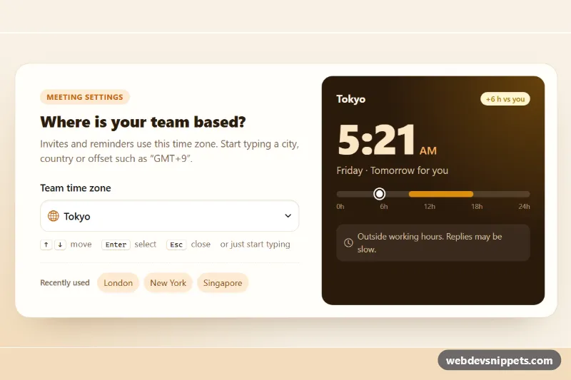
A searchable time zone select built on the Bootstrap 6 Combobox. Visitors filter about 20 cities by name, country or live GMT offset. Pressing a letter on the closed select opens it and starts the search, and the arrow keys walk through the results. A warm clock card next to it shows the current time in the chosen zone. Use the pattern for any long select list: time zones, currencies, languages or projects.

How it works

The toggle is a <button class="form-control combobox-toggle"> with data-bs-toggle="combobox", data-bs-search="true", data-bs-search-normalize="true" (so "sao" finds "São Paulo") and data-bs-name="timezone". Bootstrap creates a hidden input with that name. The .menu sibling holds a .combobox-search input, .menu-header group titles and .menu-item buttons with data-bs-value set to an IANA zone such as Asia/Tokyo. Items stay direct children of .menu, because Bootstrap's Menu only moves arrow-key focus between direct children.

script.js imports Combobox and does five things:

  1. On load, it writes each zone's current offset into its .ssc-off span with Intl.DateTimeFormat, so offsets follow daylight saving time and typing "GMT+9" filters too.
  2. After each search input, syncGroups() hides a .ssc-group-head when none of its items match. The query also appears in .combobox-no-results.
  3. A keydown listener on the toggle adds type-ahead: a printable key calls show(), puts the character in the search field and focuses it.
  4. change.bs.combobox updates the clock card: local time, weekday, "Today"/"Tomorrow for you", the hour difference badge and a marker on the working-hours bar. The card refreshes every 30 seconds.
  5. The .ssc-pick buttons click the matching option, so the Combobox value and hidden input stay in sync.

Customization

  • --ssc-accent and --ssc-accent-soft on .ssc-root: change the orange accent, the selected option and the focus rings.
  • --ssc-clock-bg and --ssc-work-color on .ssc-root: recolor the clock card and its working-hours bar.
  • Add a .menu-item with data-bs-value="Europe/Madrid" and an empty .ssc-off span; the offset fills in by itself.
  • Move selected and aria-selected="true" to another item to change the default zone.
  • Change hour >= 9 && hour < 17 in renderClock(), and the .ssc-work position in CSS, to match other working hours.
  • Edit the data-ssc-pick values on the .ssc-pick buttons to offer different shortcuts.

Use cases

  • Scheduling and meeting tools: users search about 20 cities by name, country or GMT offset
  • Account and profile settings: long lists such as time zones, languages or currencies stay easy to scan
  • Remote team dashboards: a clock card shows the local time and hour difference for the chosen zone
  • Forms with long option lists: grouped options and type-ahead let keyboard users find items fast

Accessibility

The label is tied to the toggle, which gets aria-expanded and aria-haspopup from Bootstrap, and selected options get aria-selected. Arrow keys, Home, End, Enter and Escape work, and focus returns to the toggle after a choice. The search field has its own aria-label. The clock card is a polite live region, and the shortcut buttons use aria-pressed. The caret and menu animations respect prefers-reduced-motion.

Bootstrap 6 notes

Bootstrap 5 developers would reach for a form-select plus a third-party library. Bootstrap 6 has the Combobox: a toggle button with a .menu, built on the new Menu component (formerly Dropdown), with .menu-item-check marks and .menu-item-description text. In 6.0.0-alpha.1 the console logs a harmless "more than one instance" warning for comboboxes. This is an alpha release, so APIs may change.
Searchable Select with Combobox at a glance

Framework
Bootstrap 6
Code
HTML, CSS, JavaScript
JavaScript
Vanilla JavaScript, no jQuery
Dependencies
Bootstrap 6, Bootstrap Icons
Layout
Responsive, works on mobile
Category
Selects
License
Free for personal and commercial use

Questions about this template

Can I use the Searchable Select with Combobox code for free?

Yes. You can copy or download the code and use it in personal and commercial projects, including client work. No sign-up is needed. Reselling it as part of a component library or template collection is not allowed; see the license.

How do I add it to my website?

Load Bootstrap 6 and Bootstrap Icons from a CDN (the links are under Requirements). Paste the HTML where the component should appear, add the CSS to your stylesheet and load the JavaScript before the closing </body> tag. Download HTML gives you a complete page with everything already linked.

Does it need jQuery or a JavaScript framework?

No. The script is plain vanilla JavaScript, so it works without jQuery, React or Vue. You can still use the markup inside those frameworks.

Does it work on mobile?

Yes. The layout adapts to small screens. Use the Mobile and Tablet buttons above the live demo to check it at phone and tablet width.

Requirements

Add these to your page (already included in the download):

  • <link rel="stylesheet" href="https://cdn.jsdelivr.net/npm/bootstrap@6.0.0-alpha.1/dist/css/bootstrap.min.css">
  • <script type="module" src="https://cdn.jsdelivr.net/npm/bootstrap@6.0.0-alpha.1/dist/js/bootstrap.bundle.min.js"></script>
  • <link rel="stylesheet" href="https://cdn.jsdelivr.net/npm/bootstrap-icons@1.11.3/font/bootstrap-icons.min.css">

Built for Bootstrap 6.0.0-alpha.1. Bootstrap 6 ships as an ES module, so its script and this component's JavaScript load with type="module". Alpha releases can still change before the stable version.

Searchable Select with Combobox – Bootstrap 6 selects component screenshot
Searchable Select with Combobox · Bootstrap 6 Selects

More Selects

Multi-Select Dropdown with Checkboxes – Bootstrap 5 selects preview

Multi-Select Dropdown with Checkboxes

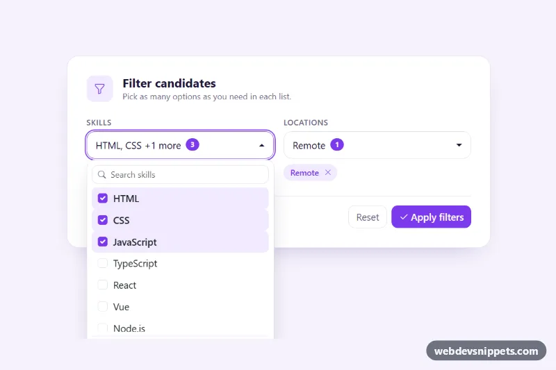
Bootstrap 5 multi-select dropdown with checkboxes, live search, select all and clear, a selected count badge and removable chips.

Multi-Select with Chips – Bootstrap 6 selects preview

Multi-Select with Chips

Dark Bootstrap 6 multi-select Combobox where chosen teams appear as removable Chips, with check marks, member totals, keyboard removal and a hidden form value.

Country Select with Flags – Bootstrap 6 selects preview

Country Select with Flags

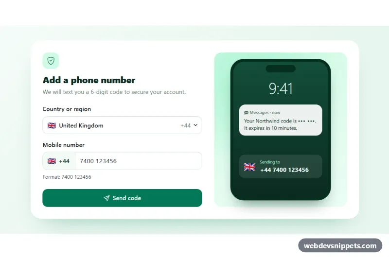
Bootstrap 6 Combobox of countries with emoji flags and dial codes, searchable by name or code, feeding a phone number field and an SMS preview.

Styled Native Select – Pure CSS selects preview

Styled Native Select

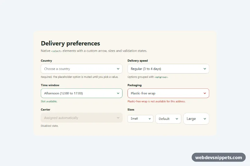
Pure CSS restyle of the native select element with a custom arrow, focus ring, error, success and disabled states, and three sizes.

Searchable Select – Tailwind CSS selects preview

Searchable Select

Accessible Tailwind CSS combobox that filters options as you type, highlights matches and supports full keyboard navigation.