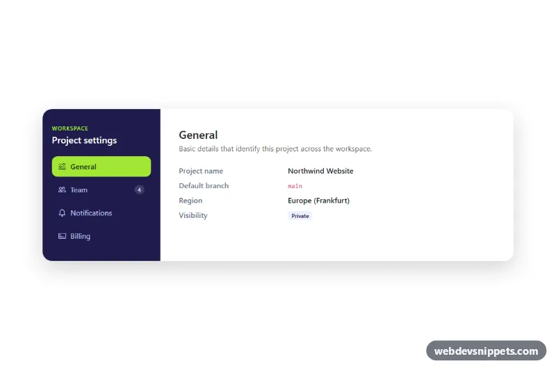
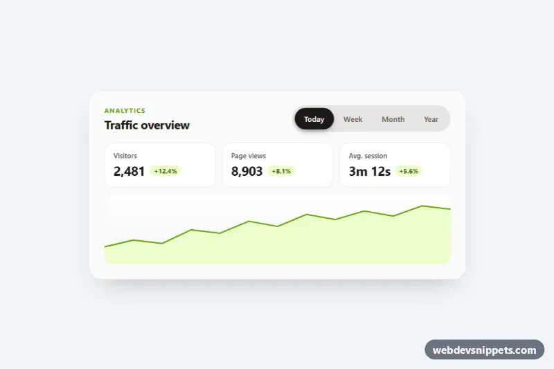
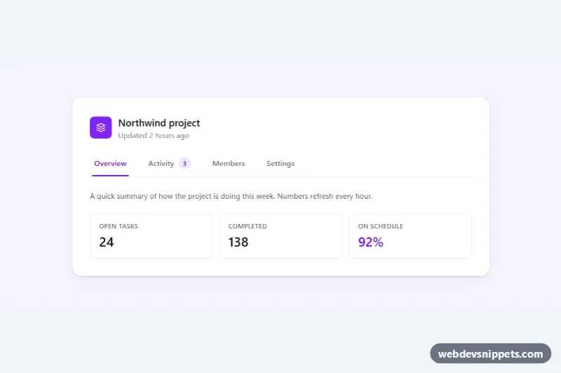
A Bootstrap 5 vertical tabs component built from nav-pills, styled as a project settings panel with a dark indigo sidebar and a lime active pill. Use it for account settings, dashboards, documentation sections or any place where several related panels share one card.
How it works
The root section.vt-tabs holds a rounded .vt-shell card split into two Bootstrap columns. The left .vt-side column contains the .vt-nav pill list: four button.nav-link elements with data-bs-toggle="pill" and a data-bs-target that points to a matching .tab-pane. The right column holds the .tab-content.vt-content container with the General, Team, Notifications and Billing panes.
There is no custom JavaScript. Bootstrap's Tab plugin, loaded with the bundle, switches the active class, updates aria-selected, moves tabindex and fades the panes in with the fade and show classes.
The layout is mobile first. Below 768px the nav uses flex-row and .vt-nav scrolls horizontally with overflow-x: auto, so the pills sit above the content as a scrollable strip. From the md breakpoint flex-md-column stacks them vertically and the sidebar fills the full card height. The panes show typical settings content: a definition list (.vt-list), a member list with initials avatars (.vt-members, .vt-avatar), switch toggles and a plan box (.vt-plan).
Customization
--vt-side-bgin.vt-tabs: changes the sidebar color, avatars, checked switches and the.vt-btnbutton in one place.--vt-accentand--vt-accent-textin.vt-tabs: set the background and text color of the active pill and the small "Workspace" eyebrow.--vt-radiusin.vt-tabs: makes the outer card corners sharper or rounder.col-md-4 col-lg-3on.vt-side: widen or narrow the sidebar; adjust the content column (col-md-8 col-lg-9) to match.- Add a tab by copying a
button.nav-linkand a.tab-pane, then give both new ids and pointdata-bs-targetandaria-controlsat the pane. - Remove
fadefrom each.tab-paneto switch panels instantly instead of fading. .vt-countbadge in the Team tab: remove it or use it to show counts on other tabs.
Accessibility
The nav has role="tablist" and aria-orientation="vertical", each button has role="tab", aria-controls and aria-selected, and each pane has role="tabpanel" with aria-labelledby pointing to its tab. Bootstrap handles roving tabindex and arrow keys (Up/Down and Left/Right) plus Home and End between tabs. Tabs and panes show a clear :focus-visible outline, icons are hidden with aria-hidden="true", and initials avatars are hidden because the name is already readable. Fades and color transitions are turned off under prefers-reduced-motion: reduce.
Usage notes
Requires the Bootstrap 5 bundle (added automatically) and Bootstrap Icons. When you place two instances on one page, give the tabs and panes unique ids, because data-bs-target and aria-controls refer to ids.