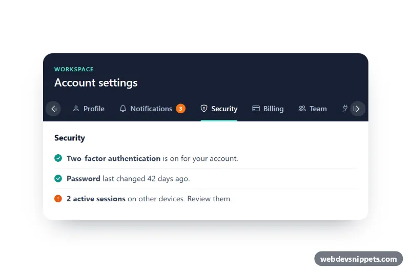
Scrollable Tabs for Mobile
Bootstrap 5 tabs that scroll horizontally on small screens, with fade edges, arrow buttons, scroll snapping and the active tab centered automatically.
Switch between related views without leaving the page.
5 component(s)
Bootstrap 5 tabs that scroll horizontally on small screens, with fade edges, arrow buttons, scroll snapping and the active tab centered automatically.
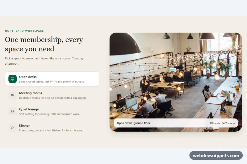
Tailwind CSS feature tabs that swap a large photo preview with a caption for each selected tab, with full keyboard support.
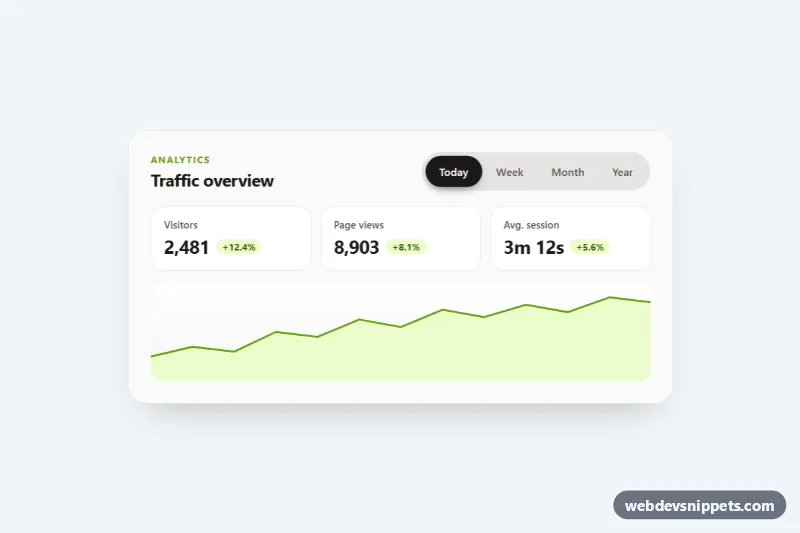
Segmented pill tabs with a sliding, springy background, ARIA tabs keyboard support and fading panels, shown on an analytics card. Pure CSS and vanilla JS.
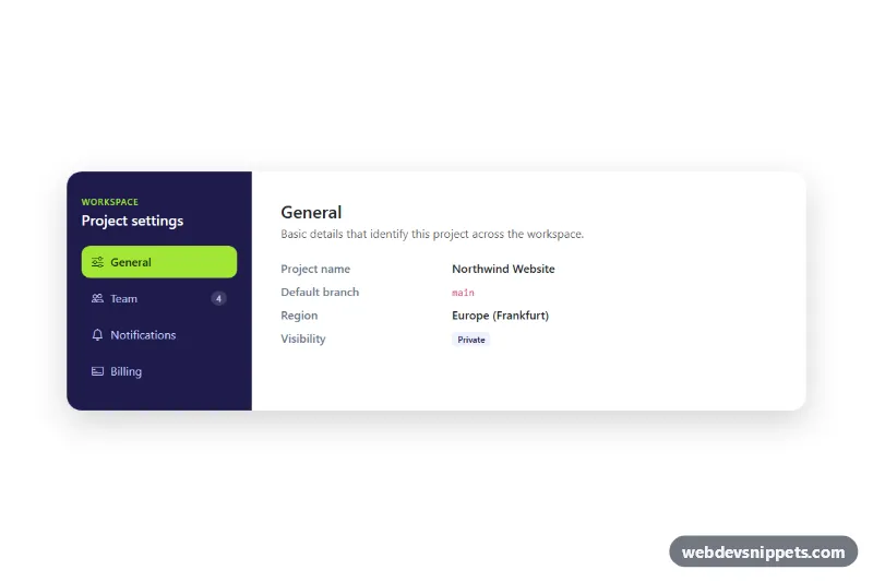
Bootstrap 5 vertical nav-pills tabs styled as a settings panel with a dark sidebar, icons, fading content panes and a scrollable mobile tab strip.
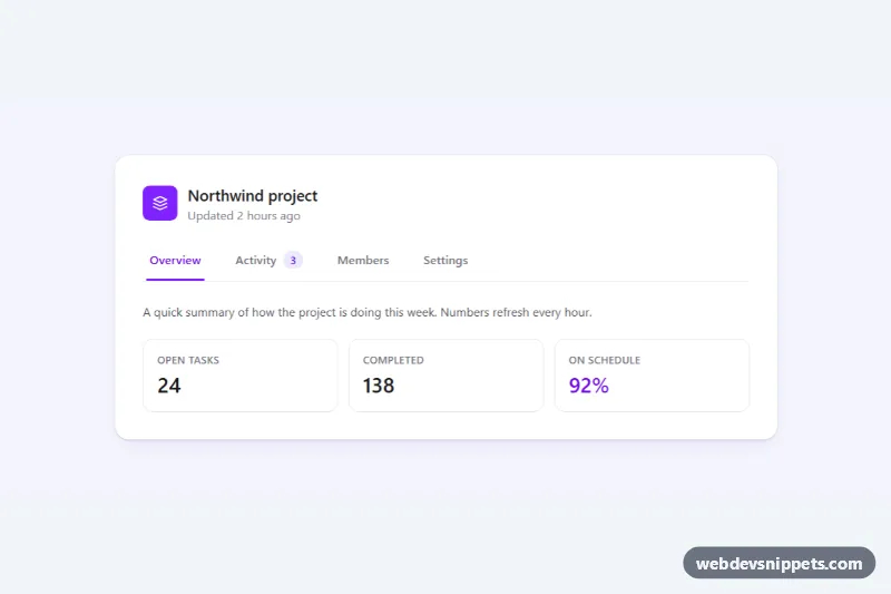
Accessible Tailwind CSS tabs with a sliding underline indicator, arrow-key and Home/End navigation, count badge and scrollable tab bar on mobile.
Tabs let users switch between related views within the same page without navigating away. A row of tab buttons sits above a set of panels, and only the panel for the selected tab is visible. Tabs are used for product details (description, specs, reviews), settings pages, pricing plans, code examples and dashboard views.
Use tabs when content falls into a few parallel groups and users only need one at a time. Do not use them for sequential steps (use a stepper), for content users must compare side by side, or when there are so many tabs that they wrap onto several rows. If each view deserves its own URL, consider navigation links styled as tabs instead.
role="tablist", buttons with role="tab" and panels with role="tabpanel".aria-controls on each tab and aria-labelledby on each panel, and set aria-selected on the active tab.Tab snippets come in Bootstrap 6, Bootstrap 5, Tailwind CSS and pure CSS versions. Bootstrap 5 tabs use the nav-tabs and nav-pills classes with the tab plugin; the Bootstrap 6 alpha versions use ES module JavaScript and theme-* colour roles for the active state. Tailwind and pure CSS examples include underline, pill, segmented and vertical tabs with a small script for keyboard support. Filter by framework, try the keyboard behaviour in the live preview, then copy the HTML, CSS and JS or download the snippet.