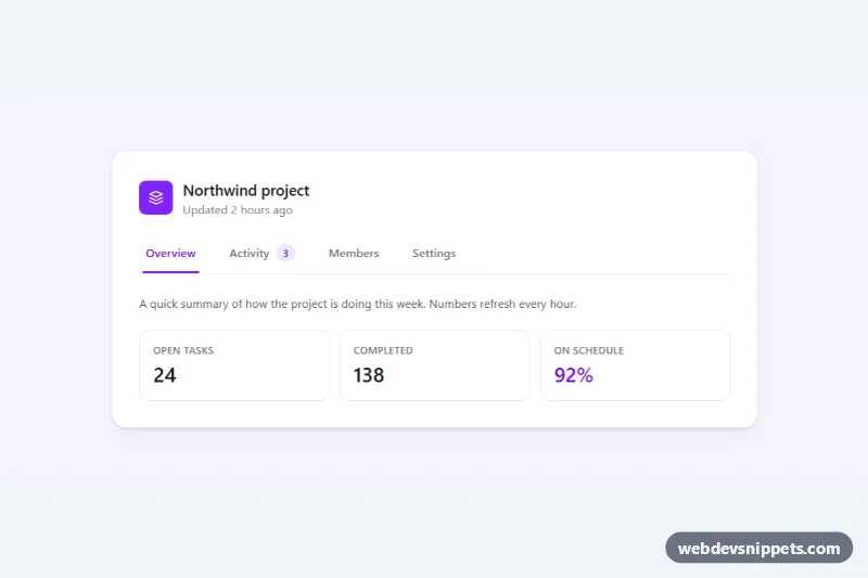
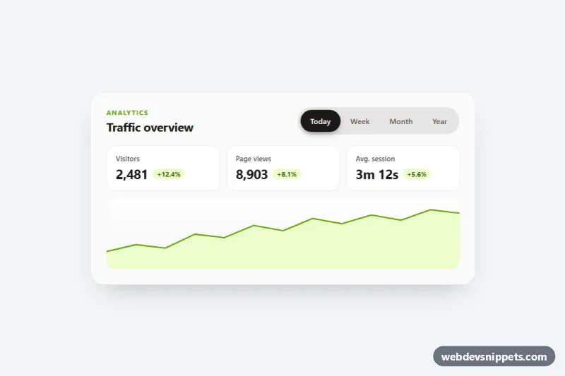
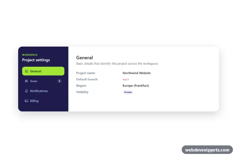
Underline tabs built with Tailwind CSS and a small vanilla JavaScript controller. A violet line slides under the active tab, panels switch instantly, and the full WAI-ARIA tabs pattern with arrow-key navigation is included. Use it for project dashboards, account pages, product details or any card that groups related content into sections.
How it works
The root element is .tut-tabs. Inside the card, .tut-scroller wraps the role="tablist" container and the .tut-indicator line. Each button with role="tab" points to its panel through aria-controls, and each role="tabpanel" (also marked .tut-panel) points back with aria-labelledby. Inactive panels carry the hidden attribute.
On DOMContentLoaded the script initializes every .tut-tabs on the page. select() updates aria-selected, sets a roving tabIndex (only the active tab is in the Tab order), toggles hidden on the panels and calls moveIndicator(). That function measures the active tab's offsetLeft and offsetWidth and writes them to the --tut-left and --tut-width custom properties; style.css turns them into a transform and width transition so the underline glides between tabs. A ResizeObserver re-measures whenever the tab bar changes size.
When the script is ready it adds data-tut-ready to the root. Before that, the active tab shows its own aria-selected:border-violet-600 border, so the component still looks correct if JavaScript fails. On narrow screens the tab bar scrolls horizontally with a hidden scrollbar, and keyboard selection scrolls the active tab into view.
Customization
bg-violet-600on.tut-indicatorandaria-selected:text-violet-700on each tab: change both to another color such asemeraldorskyto restyle the active state.h-0.5on.tut-indicator: useh-1for a bolder underline, or addbottom-1to lift it off the divider.cubic-bezier(0.22, 1, 0.36, 1)and0.3sin the.tut-indicatorrule: make the slide snappier or slower.gap-6andsm:gap-8on therole="tablist"container: tighten or widen the spacing between tabs.- The count badge inside
#tut-tab-activity: copy thespaninto any tab to show notification counts, or delete it. - Set
aria-selected="true"on another tab (andfalseon the first) to open a different section by default; the script picks it up on load. - The
tut-fadekeyframes instyle.css: remove the.tut-panel:not([hidden])rule to switch panels without animation.
Accessibility
The markup follows the WAI-ARIA tabs pattern: role="tablist" with an aria-label, role="tab" buttons with aria-selected and aria-controls, and role="tabpanel" regions labelled by their tab. Left and Right arrows move between tabs and wrap around, Home and End jump to the first and last tab, and activation follows focus. Panels have tabindex="0" so keyboard users can reach content without focusable elements. Every tab and panel shows a violet focus outline, decorative icons and the indicator are aria-hidden, and the slide and fade animations are disabled under prefers-reduced-motion: reduce.
Usage notes
For several tab groups on one page, wrap each in its own .tut-tabs and give all tabs and panels unique id values.