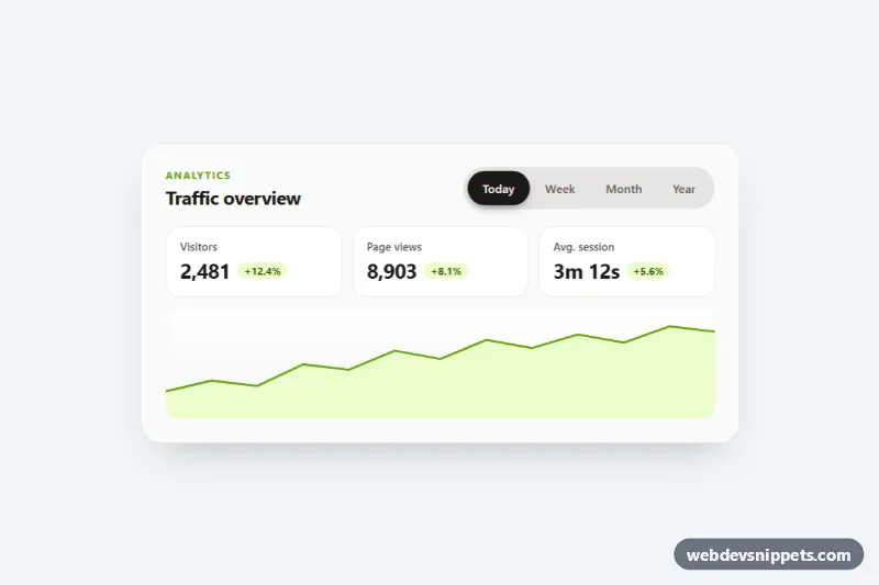
Animated pill tabs in pure CSS and vanilla JavaScript: a segmented control in a stone-colored tray where a black pill slides and stretches to the selected tab, with a small spring at the end. The demo switches an analytics card between Today, Week, Month and Year; the same tabs suit pricing periods, settings or product details.
How it works
The root section.pl-tabs contains a .pl-head with the title and the .pl-tablist, followed by one .pl-panel per tab. The tab list holds a decorative span.pl-pill and four button.pl-tab elements. Each panel shows a dl.pl-stats grid of .pl-stat cards with .pl-delta badges and an inline SVG .pl-chart area chart.
The pill is absolutely positioned inside the tray and sits behind the buttons thanks to isolation: isolate and z-index: -1. On DOMContentLoaded the script initializes every .pl-tabs root. placePill() copies the offsetLeft, offsetTop, offsetWidth and offsetHeight of the selected tab into --pl-x, --pl-y, --pl-w and --pl-h, and CSS transitions transform and width with --pl-ease, so tabs of different widths are handled correctly. A ResizeObserver on the tray keeps the pill aligned when the layout changes. Transitions are only switched on after the first position is set (the .pl-ready class); without JavaScript the selected tab simply gets a solid background.
select() updates aria-selected and the roving tabIndex, toggles the hidden attribute on the panels and fires a pl:change event with detail.index and detail.tab. Each panel that becomes visible plays the pl-in fade-up keyframes. On phones the tray spans the full width and the stat cards stack; from 640px the tabs sit next to the title and the stats form three columns.
Customization
--pl-pilland--pl-pill-texton.pl-tabs: color of the sliding pill and of the selected tab label.--pl-trayand--pl-muted: tray background and the color of unselected tabs.--pl-easeand--pl-speed: the spring of the slide;cubic-bezier(0.65, 0, 0.35, 1)removes the overshoot.--pl-radius:999pxgives pills;0.75remturns the control into rounded rectangles.--pl-accentand--pl-accent-soft: the chart line, chart fill and positive badges.- Set
aria-selected="true"andtabindex="0"on another.pl-tab(and movehiddento the other panels) to change the tab that is open on load. - Listen to
pl:changeon.pl-tabsto fetch data for the chosen range.
Accessibility
The control follows the WAI-ARIA tabs pattern: role="tablist" with aria-label="Time range", buttons with role="tab", aria-selected and aria-controls, and panels with role="tabpanel" and aria-labelledby. Only the selected tab is in the tab order. Left and Right arrows move between tabs and wrap around, Home and End jump to the first and last tab, and Tab moves into the focusable panel. Change badges include visually hidden "up" or "down" text, and the charts are aria-hidden. Tabs and panels have visible :focus-visible outlines, and prefers-reduced-motion: reduce disables the slide and the panel animation.
Usage notes
For several instances on one page give every tab and panel a unique id; each .pl-tabs keeps its own state.