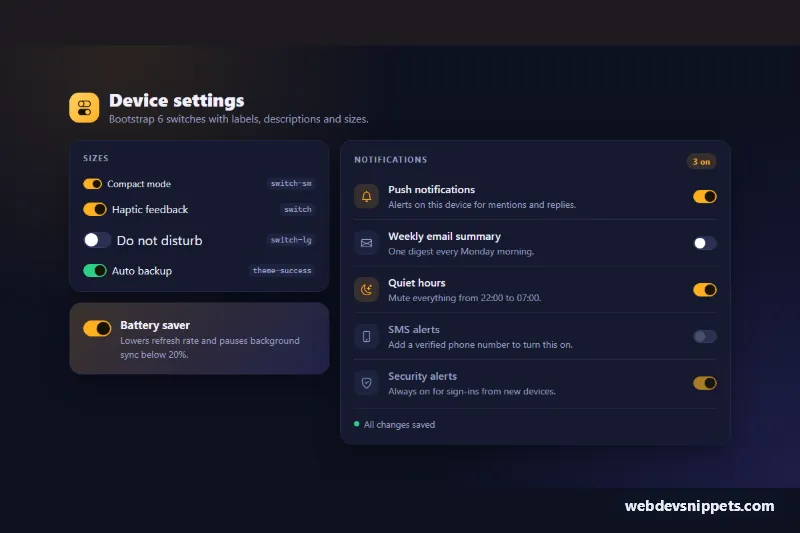
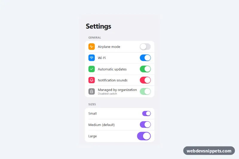
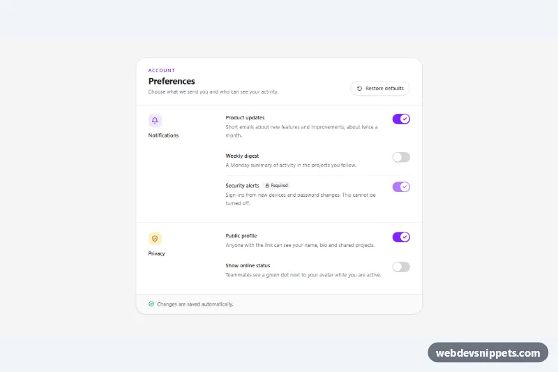
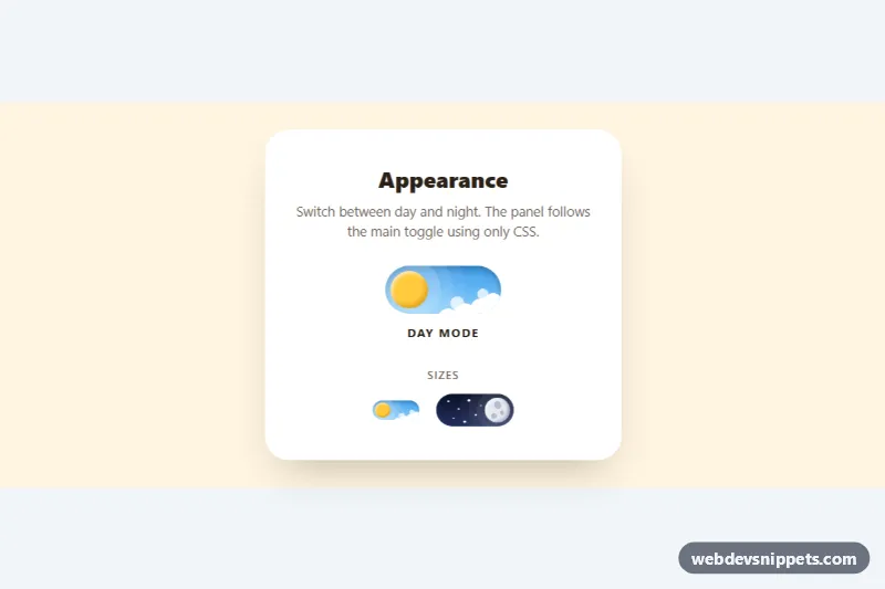
A dark device-settings panel with Bootstrap 6 toggle switches. It shows the small, default and large sizes, a themed switch, a feature card with a description, and a notification list with icons and disabled states. A small status line simulates auto-save. Use it for account settings, privacy options or app preference screens.
How it works
Every toggle uses the Bootstrap 6 switch markup: <div class="switch"><input type="checkbox" role="switch" switch></div>. The native switch attribute and role="switch" make screen readers announce it as on or off.
- Sizes card (
.tsl-sizes):switch-sm,switchandswitch-lginside.form-fieldwrappers, plus aswitch theme-successfor a second color. - Feature card (
.tsl-feature): a large switch with a.form-field-contentcolumn for the label and description. - Notifications (
.tsl-list): each.tsl-rowis a flex row with an icon, the label and description, and the switch at the end. Two rows usedisabled: one is off and one is locked on.
The amber accent comes from --bs-control-checked-bg on .tsl-root. .tsl-root .switch sets a darker track (--bs-switch-bg) and border. A :has(input:checked) rule turns the knob dark on the amber track. Another :has() rule tints a row's .tsl-icon when its switch is on.
script.js listens for change on the root. It updates the .tsl-count-num badge for the notification list. It then shows "Saving…" in .tsl-status and confirms the change after a short simulated delay.
Customization
--tsl-accentand--tsl-accent-softon.tsl-root: change the checked track, the icons, the count badge and the focus ring.--bs-switch-bgand--bs-switch-border-colorin.tsl-root .switch: restyle the unchecked track.--bs-switch-heighton a.switch: set any custom size. The width follows at 1.75× the height.- Change
theme-successtotheme-dangerortheme-info, and edit the.switch.theme-success:has(input:checked)rule to match. - Add or remove
disabledon any input to lock a setting. The label and icon dim automatically. - Replace the
setTimeoutinscript.jswith afetch()PATCH to save each setting.
Use cases
- Account and app settings: switches with labels and short descriptions explain each option
- Preference screens: a simulated auto-save status confirms that changes were stored
- Admin dashboards: three switch sizes fit different layouts and densities
- Plan-limited features: disabled switches show options that are not available yet
Accessibility
Each switch has a <label for>. Rows with descriptions link them through aria-describedby. Switches work with Tab and Space and show the accent focus ring through --bs-focus-ring. The count badge is aria-live="polite", and the save message uses role="status". Icons are aria-hidden. Transitions are disabled under prefers-reduced-motion. The root sets data-bs-theme="dark", so the panel always renders dark.
Bootstrap 6 notes
Bootstrap 5's form-check form-switch wrapper becomes a .switch div around the input, with switch-sm / switch-lg sizes and theme-* colors on the wrapper. Labels go in .form-field or .form-field-content. Built on Bootstrap 6.0.0-alpha.1, so alpha APIs can still change. Icons come from Bootstrap Icons.