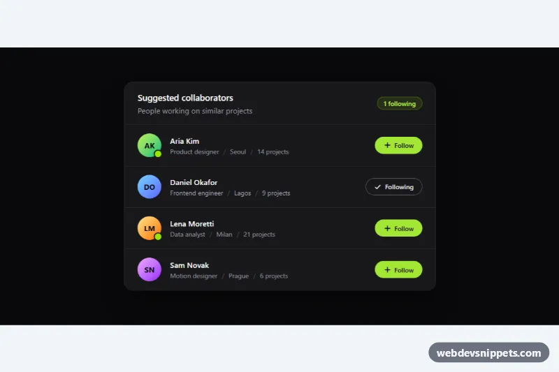
List with Avatars and Actions
Dark Tailwind CSS user list with initials avatars, online status, meta details and accessible Follow toggle buttons with a live counter.
Components tagged with "dark".
29 component(s)
Dark Tailwind CSS user list with initials avatars, online status, meta details and accessible Follow toggle buttons with a live counter.
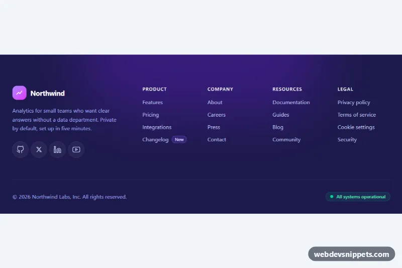
Dark Tailwind CSS website footer with brand block, social icons, four labelled link columns and a bottom bar with copyright and status.
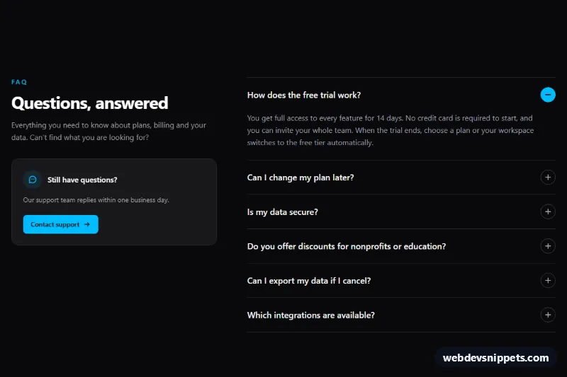
Dark Tailwind CSS FAQ section with an accessible accordion, smooth expand animation, keyboard navigation and a support contact card.
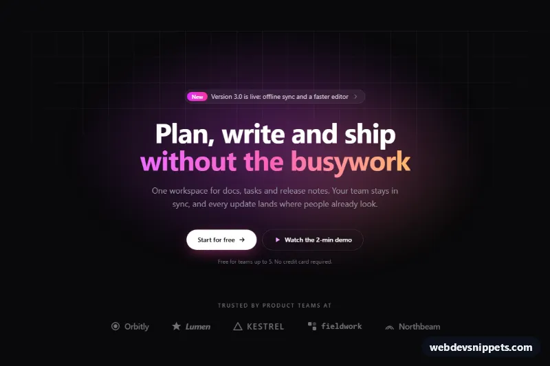
Dark Tailwind CSS hero section with an announcement pill, gradient headline, two CTA buttons, glowing grid background and a row of trust logos.

Dark Tailwind CSS split hero with gradient headline, two CTA buttons and an animated mock app dashboard built entirely from divs.