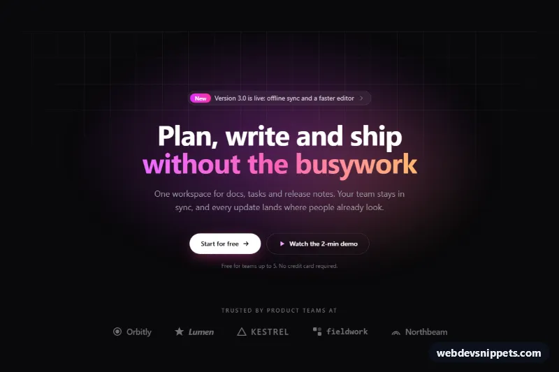
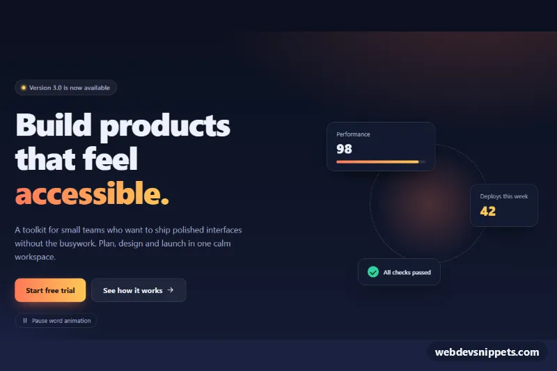
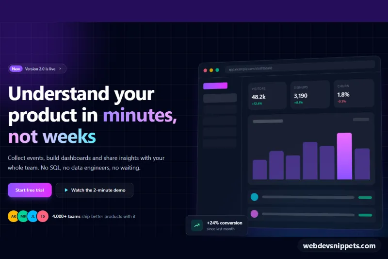
A dark, centered hero section built with Tailwind CSS: an announcement pill on top, a large headline with a gradient phrase, a short supporting paragraph, two call-to-action buttons and a row of customer logos. It is a common first screen for SaaS landing pages, product launches and app websites. No JavaScript is needed.
How it works
The root is a section with the class .thc-hero, using relative isolate overflow-hidden so the decorative layers stay inside it. Two absolutely positioned layers sit behind the content with -z-10. .thc-grid draws a faint square grid from two linear-gradient backgrounds and fades it out with a radial mask-image. .thc-glow is a blurred pair of radial gradients in fuchsia and orange that slowly "breathes" through the thc-breathe keyframes.
The content column is limited to max-w-3xl and centered. The announcement pill is a single link containing a "New" label, the message and an arrow that nudges right on hover through the group-hover:translate-x-0.5 utility. The h1 uses text-balance for even line breaks, and its second line is painted with bg-linear-to-r plus bg-clip-text text-transparent. The CTAs stack full width on phones and sit side by side from the sm breakpoint. The logo row is a wrapping flex list of inline SVG marks and wordmarks; .thc-logo keeps them muted at 70% opacity and brightens each one on hover.
Customization
--thc-glow-aand--thc-glow-bon.thc-heroinstyle.css: change the two glow colors, for example to blue and teal for a cooler look.--thc-grid-sizeand--thc-grid-color: make the background grid denser, larger or more visible; delete the.thc-gridelement to remove it.from-fuchsia-400 via-pink-400 to-orange-300on the highlighted headline span: set a different gradient, or removebg-clip-text text-transparentfor solid text.bg-zinc-950on.thc-hero: switch tobg-slate-950orbg-indigo-950for a different dark base.sm:text-6xlon theh1: uselg:text-7xlfor a bolder statement on large screens.- Edit the
li.thc-logoitems: replace the inline SVGs and names with your customers' logos, ideally as monochrome SVGs usingcurrentColor. animation: thc-breathe 8son.thc-glow: remove it for a static glow.
Accessibility
The section is labelled by its heading through aria-labelledby="thc-title", and the page has a single h1. The decorative grid, glow and all icons are aria-hidden; the logo list has aria-label="Customer logos" and every logo includes a readable name. Text colors on the near-black background (zinc-100, zinc-400) meet WCAG AA contrast. Links show a fuchsia focus-visible outline with an offset so it stays visible on the dark surface. The glow animation and all hover transitions are disabled under prefers-reduced-motion: reduce.
Usage notes
Point the href of the pill and both CTAs to real pages. If the hero is not the first heading on your page, change h1 to h2.