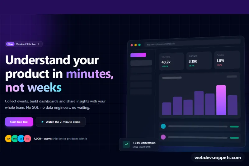
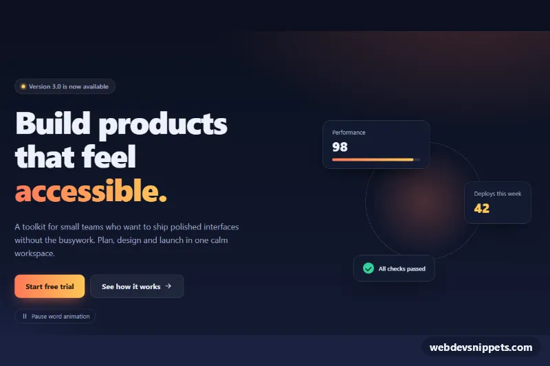
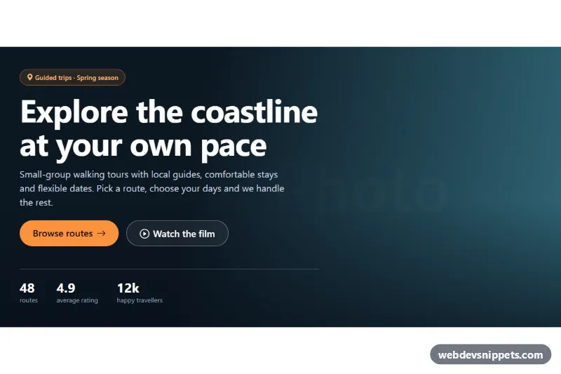
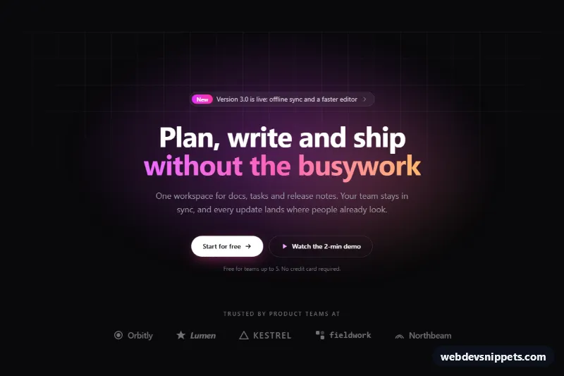
A dark split hero section built with Tailwind CSS: headline, supporting copy and two call-to-action buttons on the left, and a mock app screenshot drawn entirely with div elements on the right. It is made for SaaS landing pages, product launches and analytics or dashboard tools that want a product preview without exporting real screenshots.
How it works
The root is section.ths-hero, a bg-slate-950 block with two blurred color glows and a faint CSS grid pattern drawn by an arbitrary bg-[linear-gradient(...)] utility. The content grid stacks on mobile and becomes two columns at lg with lg:grid-cols-[1fr_1.1fr], giving the screenshot slightly more room than the copy.
The left column has an announcement pill, an h1 with a gradient phrase (bg-linear-to-r plus bg-clip-text text-transparent), a paragraph, a primary "Start free trial" button, a secondary demo button and a row of initial avatars for social proof. Text is centered on small screens and left-aligned from lg up.
The right column is .ths-shot: a fake browser window with traffic-light dots, an address bar, a sidebar (hidden below sm), three stat tiles, a bar chart and two list rows. Each bar is a .ths-bar whose height is set with utilities like h-[72%]. style.css animates the bars with the ths-grow keyframes, staggered by the --ths-delay custom property, and tilts the window in 3D on large screens using --ths-tilt-x and --ths-tilt-y; hovering flattens it. A .ths-float stat card overlaps the bottom corner and drifts gently. No JavaScript is needed.
Customization
--ths-tilt-xand--ths-tilt-yon.ths-heroinstyle.css: set both to0degfor a flat screenshot or increase them for a stronger perspective.h-[38%]…h-[88%]on each.ths-bar: change the chart shape; the highlighted bar usesfrom-violet-500 to-fuchsia-400.[--ths-delay:80ms]on each bar: adjust the stagger of the grow-in animation.from-violet-400 via-fuchsia-300 to-cyan-300on the headlinespan: pick new gradient stops to rebrand the hero.bg-violet-600/30andbg-cyan-500/20on the two glowdivs: change or remove the background lighting.- Replace the whole
.ths-shotblock with animgfromhttps://placehold.co/1200x800or your real screenshot once you have one. lg:grid-cols-[1fr_1.1fr]: uselg:grid-cols-2for equal columns.
Accessibility
The section is labelled by #ths-title, the only h1. The mock screenshot has role="img" with a descriptive aria-label, so screen readers hear one summary instead of dozens of empty boxes, and the decorative glows, avatars and floating card are aria-hidden. Both buttons and the announcement pill are links with a visible cyan focus-visible:outline-2 ring. Body text uses text-slate-300 on near-black for strong contrast. With prefers-reduced-motion: reduce, the bar animation, the floating card and the tilt transition are switched off.
Usage notes
Requires only the Tailwind browser build plus style.css. Point the two CTA links at your sign-up page and demo video. The bg-linear-to-r gradient utilities are Tailwind v4 syntax; in v3 use bg-gradient-to-r.