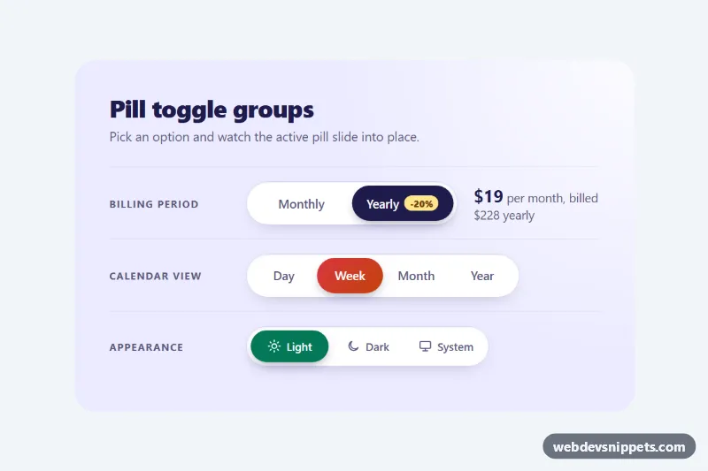
A set of rounded pill button groups built with pure CSS, where a colored pill slides behind the selected option. Use it for billing period switches, calendar or chart range pickers, theme selectors and any segmented control with two to five choices. No JavaScript is required.
How it works
Each .ptg-group is a role="radiogroup" that contains one .ptg-slider and several label.ptg-option elements. Every option wraps a native radio button (.ptg-input) and its visible text (.ptg-label). Because the controls are real radio buttons sharing a name, the browser handles selection, keyboard input and form submission for you.
The group is an inline grid with grid-auto-columns: 1fr, so all options get the width of the widest one. Two custom properties drive the slider. --ptg-count is set by :has() rules that check how many .ptg-option elements exist, and the slider width becomes calc((100% - 2 * var(--ptg-pad)) / var(--ptg-count)). --ptg-index is set by :has() rules that look for the checked input inside the second, third, fourth or fifth option. The slider then moves with transform: translateX(calc(var(--ptg-index) * 100%)) and a slightly springy cubic-bezier transition. The checked label switches to --ptg-active-text.
The billing row also shows a pure CSS result: .ptg-row:has(.ptg-input[value="yearly"]:checked) hides .ptg-price--monthly and reveals .ptg-price--yearly.
Customization
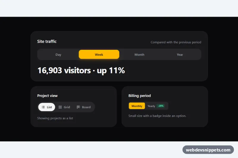
.ptg-group--ink,.ptg-group--coraland.ptg-group--mint: each sets--ptg-active-bg, the color or gradient of the sliding pill. Add your own modifier for a new theme.--ptg-active-texton.ptg-group: text color of the selected option, for example a dark color on a light pill.--ptg-speedin.ptg-demo: duration of the slide and the text color fade.--ptg-pad: the gap between the track edge and the pill; larger values give a chunkier, inset look.--ptg-trackand--ptg-track-border: background and border of the white track..ptg-group--sm: a compact size with smaller padding and text, used for the icon group.- Add a fifth
label.ptg-optionto any group; the count and index rules already cover up to five options.
Use cases
- Pricing pages: switch between monthly and yearly billing and show the matching price
- Dashboards: choose a chart or calendar range such as week, month or year
- Settings screens: a theme selector with two to five choices in one control
- Compact toolbars: a small icon-only group saves space in tight toolbars
- Forms without scripts: native radio inputs handle keyboard and form submission with no JavaScript
Accessibility
Each group has role="radiogroup" and an aria-labelledby pointing to its .ptg-caption. The radio inputs are hidden visually with opacity: 0 but stay in the accessibility tree, so screen readers announce "radio button, 2 of 4, checked". Users can Tab into a group and change the selection with the arrow keys. :focus-visible on the input draws a ring around the matching .ptg-label. Icons are aria-hidden, and the slider is decorative. With prefers-reduced-motion: reduce the pill jumps without animation. Active text colors meet WCAG AA contrast on every pill color.
Usage notes
The sliding pill needs :has(), available in all current browsers. Older browsers fall back through @supports not selector(:has(*)): the slider is hidden and the checked label gets the active background directly, so the control still works.