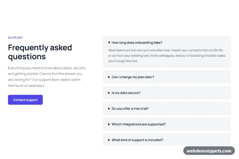
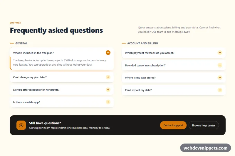
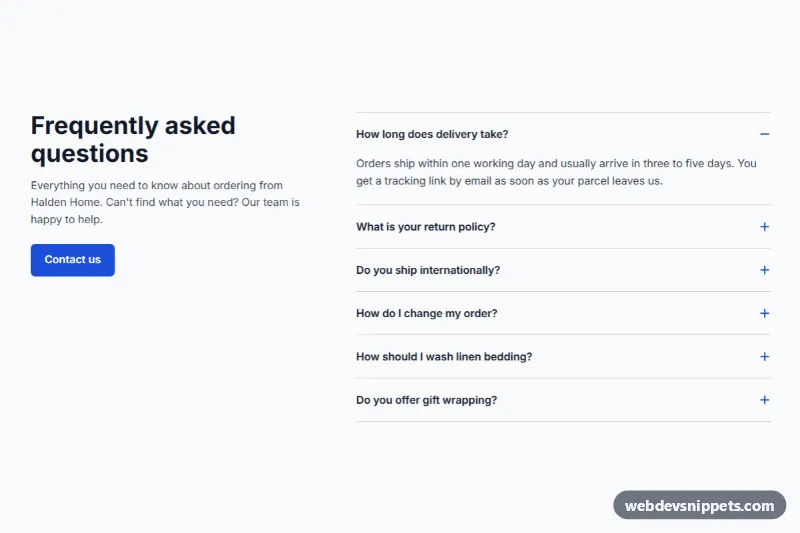
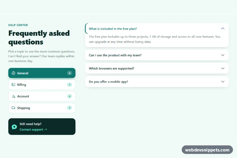
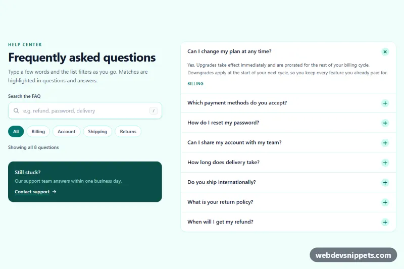
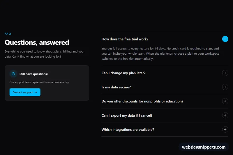
An FAQ accordion with six expandable questions next to a heading and contact button, a frequently asked questions section built from Gutenberg Details blocks.
Also known as: faq section, gutenberg faq block, frequently asked questions accordion, collapsible faq without plugin, questions and answers section
This FAQ accordion with Details blocks is a Gutenberg pattern that puts a heading, short intro and contact button next to six expandable questions. It gives you a frequently asked questions section, a collapsible FAQ without a plugin and a clean questions and answers layout, using only the core Details block.
How it works
A full-width Group with a white background and 112px vertical padding holds a Columns block split 38% / 62%. The left column has an indigo eyebrow, an h2 heading, a paragraph that points readers to support, and a single Button. The right column contains six Details blocks spaced 12px apart. Each Details block has a light gray background, 12px rounded corners and 22px by 28px padding; its summary is the question and a Paragraph inside holds the answer. The first item is open by default so visitors see what an answer looks like. Details uses the native HTML details and summary elements, so it opens and closes without JavaScript. On phones the columns stack and the questions follow the intro.
How to use it
Copy the block markup.
Paste it into an empty paragraph in the block editor.
Replace the questions, answers and the button link with your own content.
Customization
Item background: select a Details block, Color > Background, #f3f4f6. Select all six with Shift-click to change them at once.
Question style: on the Details block, Typography > Size 17px and Appearance 600 set the question text; the answer Paragraph resets to 16px, weight 400 and Color > Text #4b5563.
Open by default: select a Details block and toggle "Open by default" in the block settings. It is enabled on the first question.
Accent color: the eyebrow uses Color > Text #4f46e5 and the button Color > Background #4f46e5. Change both for your brand.
Spacing between items: select the right Column, Dimensions > Block spacing, 12px.
Column widths: select a Column and change Width (38% and 62%).
More questions: duplicate a Details block (Ctrl+Shift+D) and edit the summary and answer.
Use cases
SaaS pricing and product pages: answer questions about plans, trials and security.
Online shops: cover shipping, returns and payment questions above the footer.
Service businesses: explain booking, cancellations and what is included.
Help centre landing pages: list the most common questions with a link to contact support.
Accessibility
Native details and summary elements are keyboard accessible: Tab moves between questions, Enter or Space toggles them, and screen readers announce the expanded state. The section has a single h2 heading. Dark text on #f3f4f6 and white on #4f46e5 meet WCAG AA contrast.
Can I use the FAQ Accordion with Details Blocks code for free?
Yes. You can copy or download the block markup and use it in personal and commercial projects, including client work. No sign-up is needed. Reselling it as part of a component library or template collection is not allowed; see the license.
How do I add it to my WordPress site?
Copy the block markup, open a page in the block editor, click into an empty paragraph and paste. WordPress turns it into regular blocks that you can edit like any other content. You can also paste it in the Code editor view (Options menu > Code editor).
Does it need a page builder or plugin?
No. The pattern is built only from core blocks such as Group, Columns, Heading, Image and Buttons, so it works without Elementor, Spectra, Kadence or any other plugin. Colors and spacing are set on the blocks themselves; headings and text use your theme's fonts.
Will it look the same in my theme?
The layout, colors and spacing come with the blocks, so they carry over. Fonts, link styles and the content width follow your theme, so small differences are normal. The live demo shows the pattern in the default Twenty Twenty-Five theme. It works best with block themes; in classic themes the block editor still renders it, with your theme's styles.
Does it work on mobile?
Yes. The layout adapts to small screens. Use the Mobile and Tablet buttons above the live demo to check it at phone and tablet width.
How to install
Copy the block markup above.
Open a page or post in the WordPress block editor, click into an empty paragraph and paste. The editor turns the markup into blocks.
Replace the sample text and images. To reuse it, select the blocks and choose Create pattern from the block toolbar menu.
Uses only core WordPress blocks, so no plugin is needed. Tested with WordPress 6.8 and later. Fonts come from your theme; the live demo uses the default Twenty Twenty-Five theme. WebDevSnippets is not affiliated with or endorsed by the WordPress Foundation.
FAQ Accordion with Details Blocks · WordPress FAQ Sections