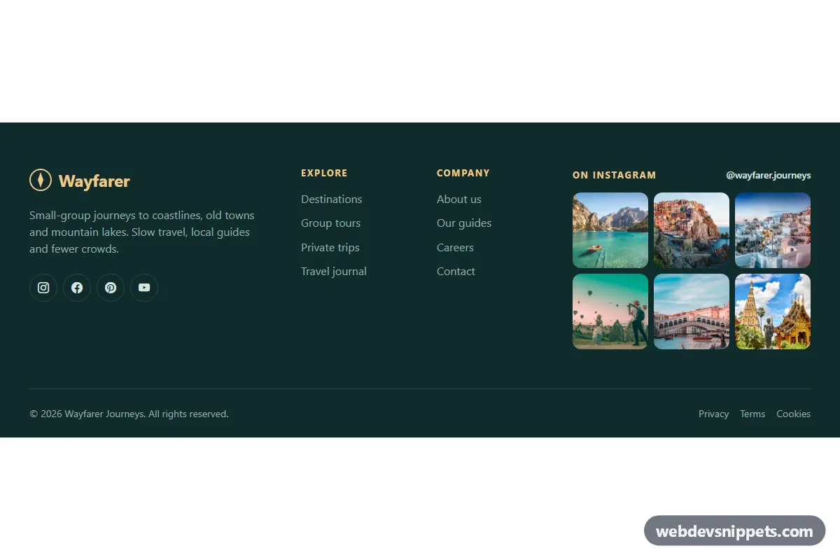
A dark teal Bootstrap 5 footer for travel, lifestyle and hospitality sites, with a brand blurb, round social icons, two navigation columns and a six-photo Instagram-style grid. It brings your social feed into the bottom of every page without any third-party widget.
How it works
The root is footer.fi-footer. A Bootstrap row splits the top area into four parts: the brand column with an inline SVG logo, a short .fi-about text and the .fi-social icon list; two nav elements with .fi-links lists; and the Instagram block. On phones everything stacks, the two link columns sit side by side (col-6), and on large screens the layout becomes 4 + 2 + 2 + 4 columns.
The Instagram block is a heading, a .fi-follow handle link and ul.fi-grid, a CSS grid with three equal columns. Each tile is an a.fi-shot with aspect-ratio: 1 / 1, so the photos stay square whatever their original size, and object-fit: cover crops them cleanly. A .fi-likes layer with a heart icon and like count sits on top of each photo at zero opacity; on hover or keyboard focus it fades in while the image zooms slightly.
The .fi-bottom bar holds the copyright line and legal links, separated from the content by a thin divider. The component is CSS only and needs no JavaScript.
Customization
--fi-bgand--fi-textin.fi-footer: change the footer background and main text color.--fi-accent: recolors the logo, column headings, link hover color, focus outline and the filled social icon on hover.--fi-tile-radius: rounds the photo tiles; set0for a sharp grid.grid-template-columns: repeat(3, 1fr)in.fi-grid: userepeat(4, 1fr)and add two more tiles for a 4 × 2 grid.backgroundin.fi-likes: changes the tint of the hover overlay.hrefon eacha.fi-shotand on.fi-follow: point them to your real Instagram posts and profile.- The
col-lg-*classes on the four columns: rebalance the widths, for examplecol-lg-3for a smaller brand column.
The photos come from Unsplash; replace them with images from your own Instagram account. For a live feed, render the tiles server-side from the Instagram API.
Use cases
- Travel and hospitality sites: a six-photo grid brings the Instagram feed into the bottom of every page
- Lifestyle blogs: brand blurb, round social icons and two link columns sit in one dark teal footer
- Photographer portfolios: square photo tiles show like counts on hover and keyboard focus
- Small business websites: a follow link points visitors to the real Instagram profile without a widget
Accessibility
Both link columns are nav landmarks labelled by their headings through aria-labelledby, and the photo list is labelled by the "On Instagram" heading. Each photo link takes its accessible name from the image alt text, while the like counts are aria-hidden because they are decorative. Icon-only social links have an aria-label. Links show a 2 px accent outline with :focus-visible, and the hover overlay also appears on keyboard focus. Text colors keep good contrast on the dark teal background. With prefers-reduced-motion: reduce the zoom and fades are disabled.
Usage notes
Requires Bootstrap 5 (added automatically) and Bootstrap Icons. Place the footer at the end of the page body.