Skip to content

Dark Footer with Contact Info

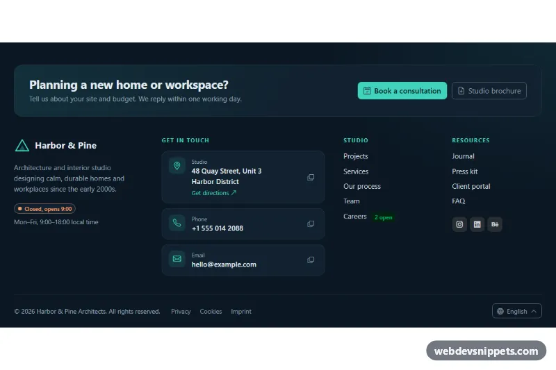
Dark Bootstrap 6 footer with address, phone and email cards, copy-to-clipboard Toast, live open/closed hours badge, link columns and a language Menu.

Also known as: footer with contact info, dark footer contact details, footer with opening hours, business footer with address

Bootstrap 6 Footers Responsive Dark #address #contact #dark #footer #responsive

Dark Footer with Contact Info live demo

Open in new tab

Bootstrap 6 code (HTML, CSS, JS)

A dark Bootstrap 6 footer for agencies, clinics and local businesses. It puts the contact details up front: a call-to-action band, an address, phone and email card list with copy buttons, an opening-hours badge that shows whether the office is open right now, two link columns and a bottom bar with a language Menu. A Bootstrap 6 Toast confirms each copy.

How it works

The root <footer class="dfc-root"> uses data-bs-theme="dark", so Bootstrap's buttons, menu and toast render in dark mode whatever the visitor's OS setting is. .dfc-grid is one column on phones, two from md and four from lg (1024px).

Each li in .dfc-contact-list has an icon, the value and a .dfc-copy button. The value element carries data-dfc-copy-text. On click, script.js tries navigator.clipboard.writeText(). If that fails, for example in a sandboxed iframe, it falls back to a hidden textarea. It then swaps the icon to a check mark and shows .dfc-toast with Toast.getOrCreateInstance(...).show(), imported from the Bootstrap 6 bundle.

.dfc-open-badge reads data-dfc-hours="1-5 9-18" (weekdays 1 to 5, 9:00 to 18:00) and compares it with the visitor's local time. It then adds .dfc-is-open or .dfc-is-closed, so no hours text ever goes stale. The language switcher is a Bootstrap 6 Menu: the .dfc-lang-toggle button has data-bs-toggle="menu" and data-bs-placement="top-end", and the script moves .active and aria-current to the chosen menu-item and updates .dfc-lang-current.

Customization

  • --dfc-accent on .dfc-root: changes the headings, icons, links and the solid CTA button.
  • --dfc-bg, --dfc-panel and --dfc-line on .dfc-root: adjust the background, card surfaces and borders.
  • --dfc-open and --dfc-closed on .dfc-root: change the badge colors for open and closed.
  • data-dfc-hours on .dfc-open-badge: set your own days and hours, for example 1-6 8-20.
  • data-dfc-copy-text on each value: the exact text that gets copied (use it to drop line breaks from the address).
  • In the [data-dfc-lang] click handler, uncomment the redirect hook to load the localized site.

Use cases

  • Agencies: address, phone and email cards with copy buttons make contact easy
  • Clinics: a badge shows whether the office is open or closed right now
  • Local businesses: a call-to-action band invites visitors to get in touch
  • Multilingual sites: a language menu sits in the bottom bar, and a toast confirms each copy

Accessibility

Contact items use <address>, tel: and mailto: links. Each copy button has a specific aria-label, such as "Copy phone number". The toast has role="status" with aria-live="polite", so screen readers announce the result. Menu keyboard support (arrow keys, Escape) comes from Bootstrap. Focus outlines use the accent color, and the light text has strong contrast on the navy background.

Bootstrap 6 notes

Built on Bootstrap 6.0.0-alpha.1, so alpha APIs can still change. The Bootstrap 5 dropdown with dropdown-menu becomes a .menu sibling with data-bs-toggle="menu", and dropup becomes data-bs-placement="top-end". Toasts are imported as an ES module (there is no window.bootstrap), and btn-primary is now btn-solid theme-primary. Icons come from Bootstrap Icons.
Dark Footer with Contact Info at a glance

Framework
Bootstrap 6
Code
HTML, CSS, JavaScript
JavaScript
Vanilla JavaScript, no jQuery
Dependencies
Bootstrap 6, Bootstrap Icons
Layout
Responsive, works on mobile, dark design
Category
Footers
License
Free for personal and commercial use

Questions about this template

Can I use the Dark Footer with Contact Info code for free?

Yes. You can copy or download the code and use it in personal and commercial projects, including client work. No sign-up is needed. Reselling it as part of a component library or template collection is not allowed; see the license.

How do I add it to my website?

Load Bootstrap 6 and Bootstrap Icons from a CDN (the links are under Requirements). Paste the HTML where the component should appear, add the CSS to your stylesheet and load the JavaScript before the closing </body> tag. Download HTML gives you a complete page with everything already linked.

Does it need jQuery or a JavaScript framework?

No. The script is plain vanilla JavaScript, so it works without jQuery, React or Vue. You can still use the markup inside those frameworks.

Does it work on mobile?

Yes. The layout adapts to small screens. Use the Mobile and Tablet buttons above the live demo to check it at phone and tablet width.

Requirements

Add these to your page (already included in the download):

  • <link rel="stylesheet" href="https://cdn.jsdelivr.net/npm/bootstrap@6.0.0-alpha.1/dist/css/bootstrap.min.css">
  • <script type="module" src="https://cdn.jsdelivr.net/npm/bootstrap@6.0.0-alpha.1/dist/js/bootstrap.bundle.min.js"></script>
  • <link rel="stylesheet" href="https://cdn.jsdelivr.net/npm/bootstrap-icons@1.11.3/font/bootstrap-icons.min.css">

Built for Bootstrap 6.0.0-alpha.1. Bootstrap 6 ships as an ES module, so its script and this component's JavaScript load with type="module". Alpha releases can still change before the stable version.

Dark Footer with Contact Info – Bootstrap 6 footers component screenshot
Dark Footer with Contact Info · Bootstrap 6 Footers

More Footers

Simple Centered Footer – Pure CSS footers preview

Simple Centered Footer

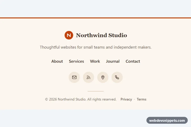
Minimal centered footer in pure CSS with a logo, tagline, links with animated underlines, round icon links and an auto-updating copyright year.

Dark Footer with App Badges – Tailwind CSS footers preview

Dark Footer with App Badges

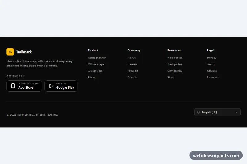
Dark Tailwind CSS footer with four link columns, App Store and Google Play badges, and a language select that remembers the choice.

Footer with Newsletter – Bootstrap 5 footers preview

Footer with Newsletter

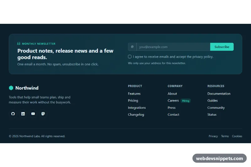
Dark Bootstrap 5 footer with a newsletter signup panel, email validation, social icons, three link columns and a legal bar.

Multi-Column Footer – Tailwind CSS footers preview

Multi-Column Footer

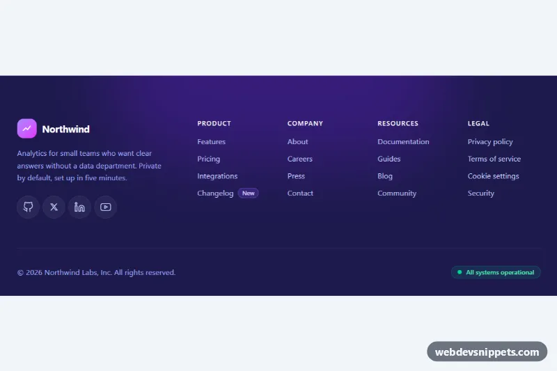
Dark Tailwind CSS website footer with brand block, social icons, four labelled link columns and a bottom bar with copyright and status.

Mega Footer with Accordion on Mobile – Bootstrap 6 footers preview

Mega Footer with Accordion on Mobile

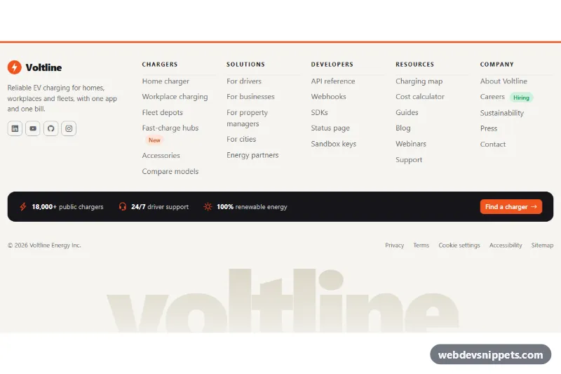
Large Bootstrap 6 footer whose five link columns turn into an exclusive details accordion on phones, with brand block, stats strip, CTA and legal bar.

Footer with App Download Buttons – Bootstrap 6 footers preview

Footer with App Download Buttons

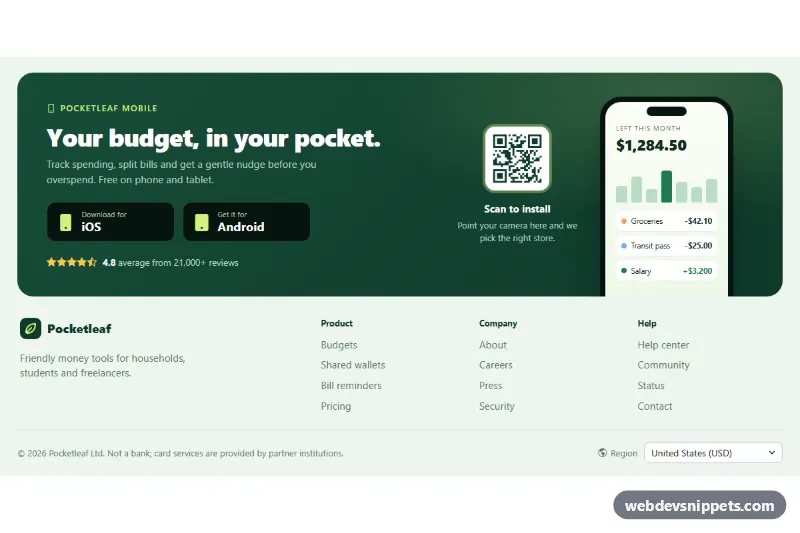
Bootstrap 6 footer with a green app promo panel: generic iOS and Android download buttons, QR code, CSS phone mockup, link columns and a region Combobox.