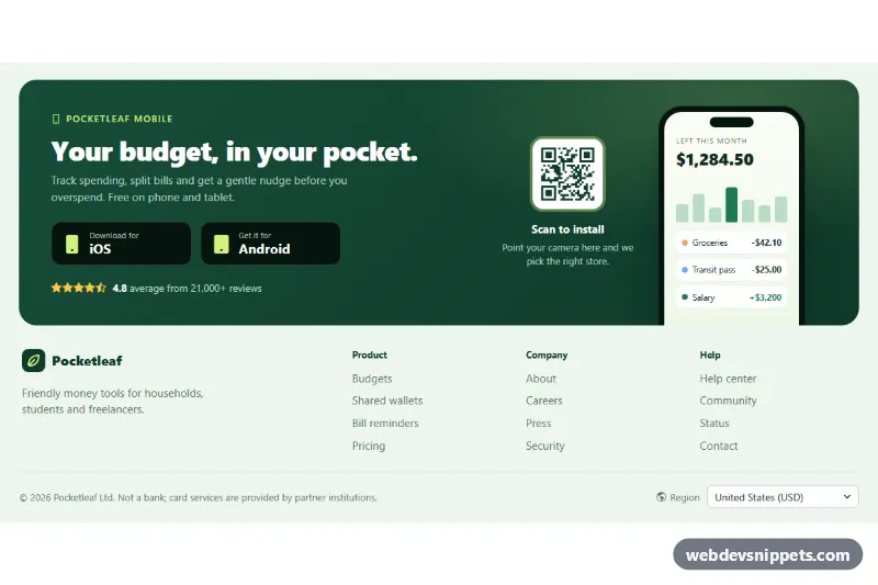
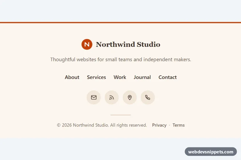
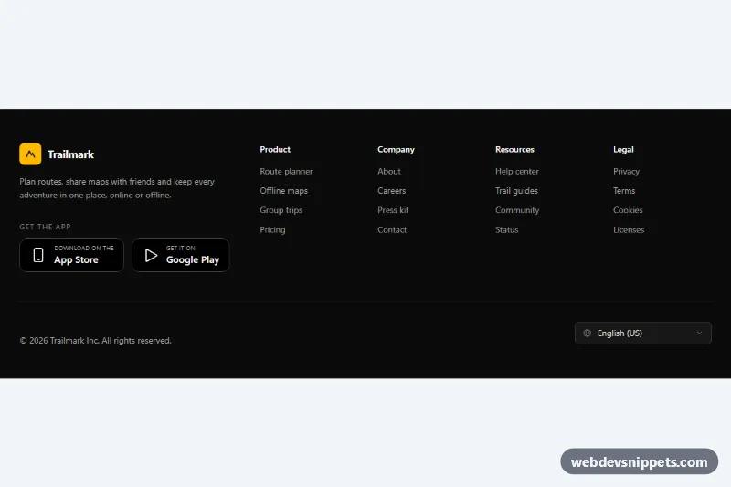
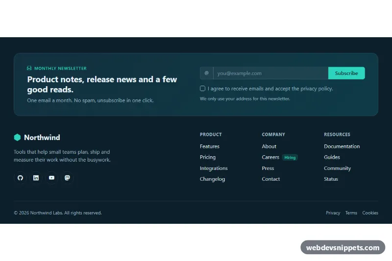
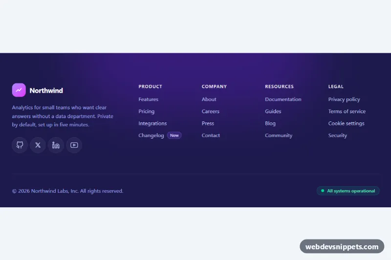
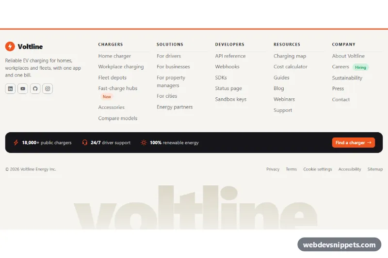
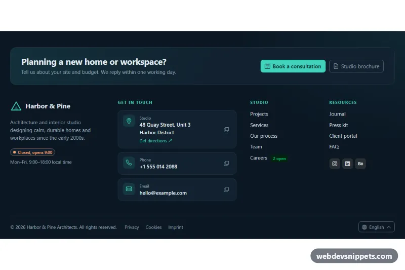
A Bootstrap 6 footer for mobile apps and fintech or SaaS products with a companion app. A deep green promo panel holds generic iOS and Android download buttons, a star rating, a QR code card and a CSS-only phone mockup. Below it are a brand block, three link columns and a bottom bar with a region picker built on the new Bootstrap 6 Combobox.
How it works
The root <footer class="fad-root"> is pinned to data-bs-theme="light", with the dark .fad-promo panel styled in style.css. From 1024px the panel is a three-column grid: copy and buttons, the QR card, and the .fad-phone mockup, which stays hidden on smaller screens. The mockup is plain HTML and CSS (balance, bar chart, transactions) and is aria-hidden.
The download buttons are generic .fad-store links with an icon and two lines of text, so you do not need official store badges. script.js reads navigator.userAgent and adds .fad-is-match to the button whose data-fad-platform matches the device. That reveals the "For your device" .fad-store-hint and links a hidden "Recommended for your device" note with aria-describedby.
The region picker is a combobox-toggle button with data-bs-toggle="combobox" and data-bs-name="region", followed by a .menu of menu-item buttons with data-bs-value. Bootstrap creates a hidden region input for forms. data-bs-placement="top-end" opens the list upward, because it sits at the very bottom of the page. The script listens for change.bs.combobox and stores the value in data-fad-region on the root, where you can reload prices. It also writes the current year into .fad-year.
Customization
--fad-forest,--fad-forest-2and--fad-limeon.fad-root: recolor the promo panel gradient, the button icons and the highlight badge.--fad-mint,--fad-lineand--fad-mutedon.fad-root: change the footer background, dividers and link color.- Set the
hrefof each.fad-storeto your real store URLs and changedata-fad-platformif you add a desktop build. - Replace the inline
.fad-qr-codeSVG with a real QR code that points to your download page. The sample pattern is decorative only. - Edit the
menu-itementries anddata-bs-valuecodes in the region menu, and handle the change in thechange.bs.comboboxlistener. - Delete
.fad-phoneif you prefer a two-column panel. The grid then needsgrid-template-columns: 1.3fr auto.
Use cases
- Mobile apps: iOS and Android download buttons sit in a promo panel with a star rating
- Fintech products: a QR code card lets visitors open the app from a phone
- SaaS with a companion app: a phone mockup shows the app next to the buttons
- International sites: a region picker in the bottom bar lets visitors choose their country
Accessibility
The promo is a labelled <section>, link columns are <nav aria-labelledby>, and decorative icons and the mockup are hidden from assistive tech. The combobox gets its name from the visible "Region" label via aria-labelledby, and Bootstrap provides arrow key navigation. Store buttons have a lime focus outline, and their hover lift is switched off under prefers-reduced-motion.
Usage notes
The Combobox logs a "more than one instance" console notice in 6.0.0-alpha.1 even with the documented markup. It still works.
Bootstrap 6 notes
Built on Bootstrap 6.0.0-alpha.1, so alpha APIs can still change. A Bootstrap 5 form-select or dropdown region picker becomes the new Combobox on top of .menu, and badges and buttons use theme-* roles instead of color-specific classes. Icons come from Bootstrap Icons.