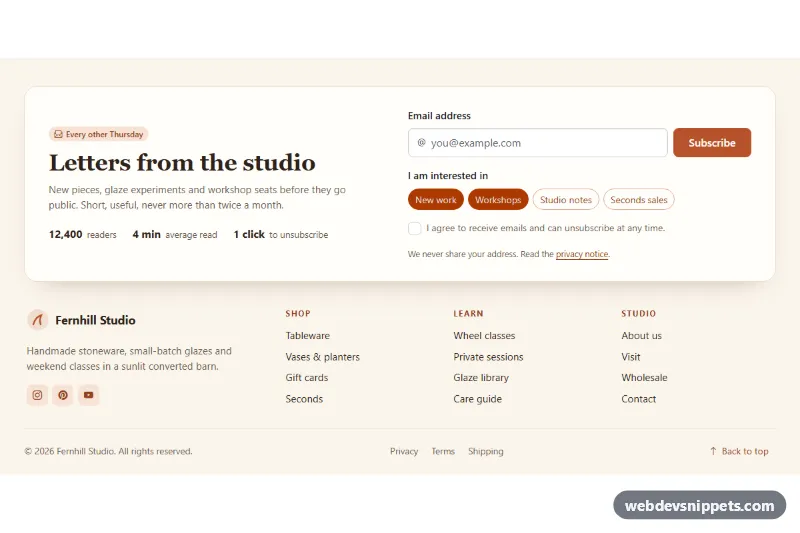
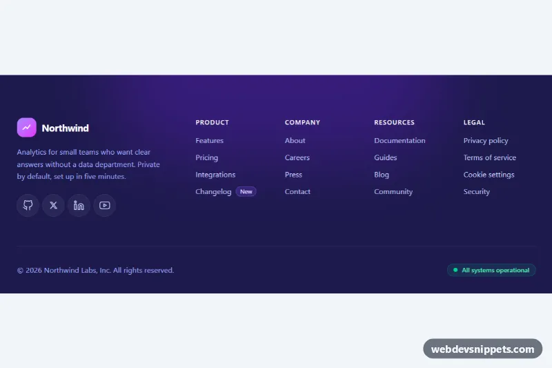
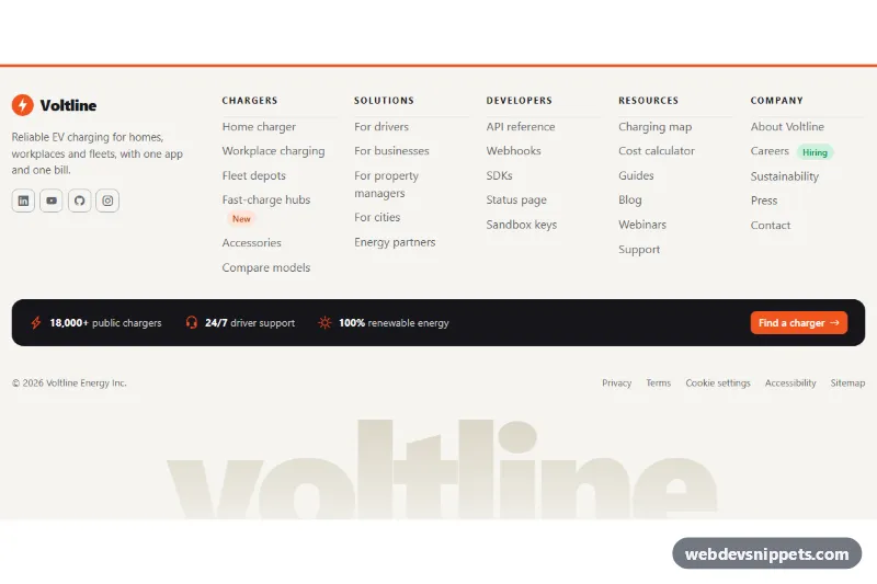
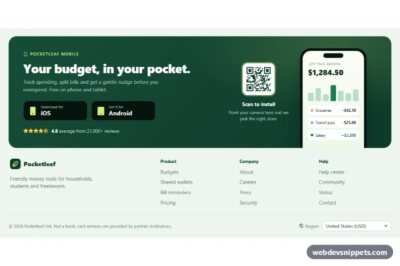
A warm, light Bootstrap 6 footer that puts the newsletter signup first: a cream card with an adorned email field, topic toggle pills and a consent checkbox, followed by a brand block, three link columns and a bottom bar. It suits shops, studios and blogs that want readers to subscribe before they leave the page.
How it works
The root <footer class="fns-root"> is pinned to data-bs-theme="light". The .fns-news section is a CSS grid that becomes two columns from the lg breakpoint (1024px). The email field uses the Bootstrap 6 form-control form-adorn label with a form-adorn-icon and a borderless form-ghost input. The topics are Bootstrap 6 toggle buttons: each label.btn-check.btn-outline.theme-primary wraps its own checkbox, so no id/for pairs are needed. The consent box is a plain .check inside a .form-field.
script.js listens for submit on .fns-form, always calls preventDefault() and validates the email with a simple pattern and the consent box. Invalid fields get aria-invalid="true" and their .form-field gets .fns-invalid, which shows the .invalid-feedback text. Focus moves to the first invalid control. A valid submit disables .fns-submit, shows a .spinner-border.spinner-sm, and after a short timeout reveals the .fns-success alert with the entered address, then resets the form. The script also fills .fns-year with the current year and makes .fns-top scroll back to the top.
Customization
--fns-accentand--fns-accent-strongon.fns-root: change the terracotta buttons, pills, headings and focus rings. The root maps them onto--bs-primary-*and--bs-control-checked-bg, so Bootstrap's own buttons and the checkbox follow.--fns-bg,--fns-cardand--fns-lineon.fns-root: adjust the page tint, the newsletter card and the divider lines.- Add or remove
label.btn-checkitems in.fns-topic-listto offer other topics. Theirvalueends up indata-topicson.fns-success. - Replace the
window.setTimeoutin the submit handler with afetch()POST to your mailing list provider. Keep the success branch as it is. - Change
grid-template-columnson.fns-linksto fit more or fewer link columns. - Edit
.fns-proofto show your own reader count and reading time, or delete the list.
Use cases
- Online shops: a newsletter card with email field and topic pills sits at the top of the footer
- Studios and blogs: visitors choose topics and tick a consent checkbox before subscribing
- Content sites: a brand block and three link columns follow the signup card
- Small businesses: a bottom bar holds the legal links and copyright
Accessibility
The footer uses <nav aria-labelledby> for each link column and a labelled <section> for the signup. Every input has a visible label, errors are linked with aria-describedby and flagged with aria-invalid, and the success alert has role="status" and receives focus. Icon-only social links carry aria-label. Links and the back-to-top button have visible focus outlines, and transitions are switched off under prefers-reduced-motion.
Bootstrap 6 notes
Built on Bootstrap 6.0.0-alpha.1, so alpha APIs can still change. btn btn-primary becomes btn-solid theme-primary. Toggle buttons put the input inside label.btn-check. form-check is replaced by a bare .check, and input-group icons can use form-adorn. Subtle badges are badge badge-subtle theme-primary. Icons come from Bootstrap Icons.