Skip to content

Simple Centered Footer

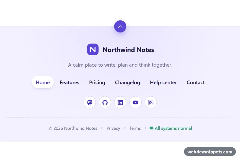
Minimal centered Bootstrap 6 footer with logo, tagline, pill nav links, outline social icon buttons with tooltips, a floating back-to-top button and status line.

Also known as: minimal footer, centered footer, simple website footer, footer with social icons

Simple Centered Footer live demo

Open in new tab

Bootstrap 6 code (HTML, CSS, JS)

A minimal, centered Bootstrap 6 footer with a soft lavender background: logo and tagline, a single row of pill-style navigation links, round outline social buttons with tooltips, and a short meta line with copyright, legal links and a status indicator. A round back-to-top button sits on the top border. It fits landing pages, SaaS sites and portfolios that need a clean ending without big link columns.

How it works

The root <footer class="scf-root"> is pinned to data-bs-theme="light" and centers everything inside .scf-inner (max 760px wide). The links use the standard Bootstrap 6 nav / nav-item / nav-link markup. .scf-nav wraps them and centers them, and the current page has .active plus aria-current="page". The social icons are btn-icon btn-outline theme-primary rounded-circle links inside the .scf-social list.

Every social link and the .scf-top button has data-bs-toggle="tooltip" and data-bs-title. In Bootstrap 6 tooltips set themselves up on the first hover or focus, so the snippet needs no tooltip init code. script.js only writes the current year into .scf-year and scrolls the page to the top when .scf-top is clicked. It uses smooth scrolling unless the visitor prefers reduced motion.

The .scf-meta line separates items with small .scf-dot spans. On phones .scf-status moves to its own line and the dot before it is hidden with :has().

Customization

  • --scf-accent and --scf-accent-strong on .scf-root: change the logo, active link, social buttons and back-to-top color. They feed the --bs-primary-* variables, so Bootstrap's buttons follow.
  • --scf-bg and --scf-line on .scf-root: change the background tint and the divider lines. The radial glow is set in the background of .scf-root.
  • --scf-ok on .scf-root: changes the status dot color. Link .scf-status to your real status page or remove it.
  • Edit the nav-link items in .scf-nav, and move .active / aria-current to the current page.
  • Change data-bs-placement on any tooltip trigger to bottom, left or right.
  • Remove .scf-top and the margin-top on .scf-root if you do not want the floating button.

Use cases

  • Landing pages: logo, tagline and one row of pill links give a clean ending
  • Portfolios: round outline social buttons with tooltips link to profiles
  • SaaS sites: a short meta line shows copyright, legal links and a status indicator
  • Long pages: a floating back-to-top button helps visitors return to the top

Accessibility

The navigation is a <nav aria-label="Footer">, and the social list has its own aria-label. Icon-only links and the back-to-top button have aria-label text, and icons are aria-hidden. Tooltips appear on keyboard focus as well as hover. All links and buttons show a clear focus outline. Hover color changes only animate when prefers-reduced-motion is not set.

Bootstrap 6 notes

Built on Bootstrap 6.0.0-alpha.1, so alpha APIs can still change. btn btn-outline-primary becomes btn-outline theme-primary, and square icon buttons use btn-icon. Tooltips no longer need a new bootstrap.Tooltip() loop, because they initialise lazily from data-bs-toggle="tooltip". Icons come from Bootstrap Icons.
Simple Centered Footer at a glance

Framework
Bootstrap 6
Code
HTML, CSS, JavaScript
JavaScript
Vanilla JavaScript, no jQuery
Dependencies
Bootstrap 6, Bootstrap Icons
Layout
Responsive, works on mobile
Category
Footers
License
Free for personal and commercial use

Questions about this template

Can I use the Simple Centered Footer code for free?

Yes. You can copy or download the code and use it in personal and commercial projects, including client work. No sign-up is needed. Reselling it as part of a component library or template collection is not allowed; see the license.

How do I add it to my website?

Load Bootstrap 6 and Bootstrap Icons from a CDN (the links are under Requirements). Paste the HTML where the component should appear, add the CSS to your stylesheet and load the JavaScript before the closing </body> tag. Download HTML gives you a complete page with everything already linked.

Does it need jQuery or a JavaScript framework?

No. The script is plain vanilla JavaScript, so it works without jQuery, React or Vue. You can still use the markup inside those frameworks.

Does it work on mobile?

Yes. The layout adapts to small screens. Use the Mobile and Tablet buttons above the live demo to check it at phone and tablet width.

Requirements

Add these to your page (already included in the download):

  • <link rel="stylesheet" href="https://cdn.jsdelivr.net/npm/bootstrap@6.0.0-alpha.1/dist/css/bootstrap.min.css">
  • <script type="module" src="https://cdn.jsdelivr.net/npm/bootstrap@6.0.0-alpha.1/dist/js/bootstrap.bundle.min.js"></script>
  • <link rel="stylesheet" href="https://cdn.jsdelivr.net/npm/bootstrap-icons@1.11.3/font/bootstrap-icons.min.css">

Built for Bootstrap 6.0.0-alpha.1. Bootstrap 6 ships as an ES module, so its script and this component's JavaScript load with type="module". Alpha releases can still change before the stable version.

Simple Centered Footer – Bootstrap 6 footers component screenshot
Simple Centered Footer · Bootstrap 6 Footers

More Footers

Simple Centered Footer – Pure CSS footers preview

Simple Centered Footer

Minimal centered footer in pure CSS with a logo, tagline, links with animated underlines, round icon links and an auto-updating copyright year.

Dark Footer with App Badges – Tailwind CSS footers preview

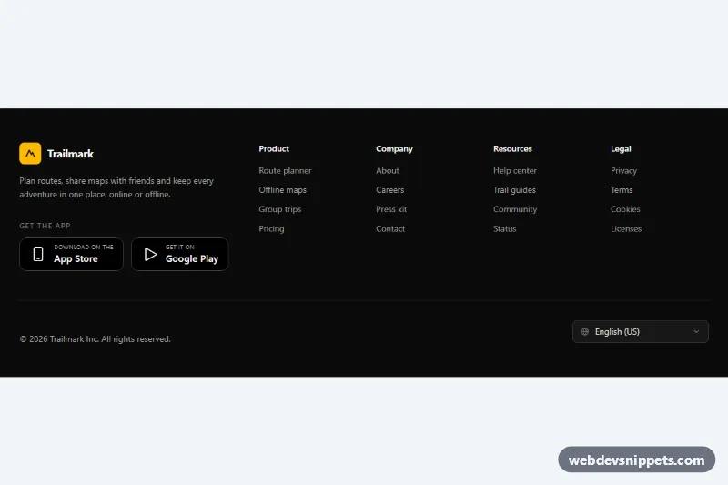
Dark Footer with App Badges

Dark Tailwind CSS footer with four link columns, App Store and Google Play badges, and a language select that remembers the choice.

Footer with Newsletter – Bootstrap 5 footers preview

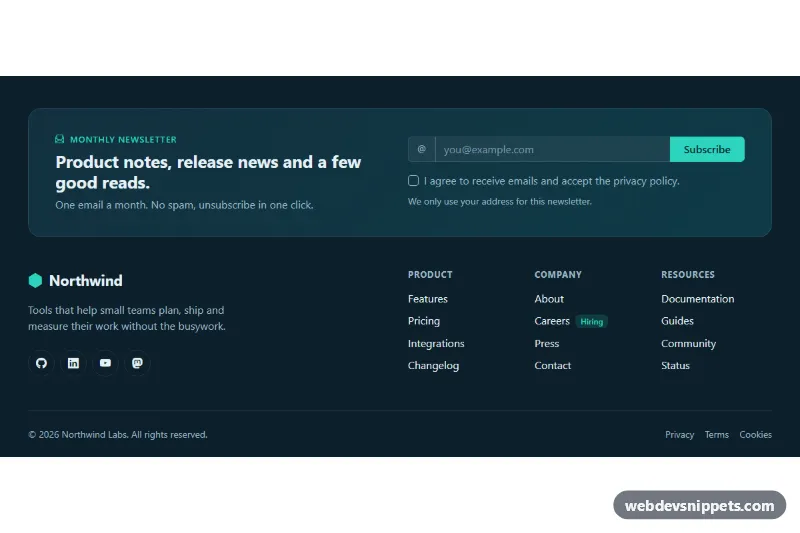
Footer with Newsletter

Dark Bootstrap 5 footer with a newsletter signup panel, email validation, social icons, three link columns and a legal bar.

Multi-Column Footer – Tailwind CSS footers preview

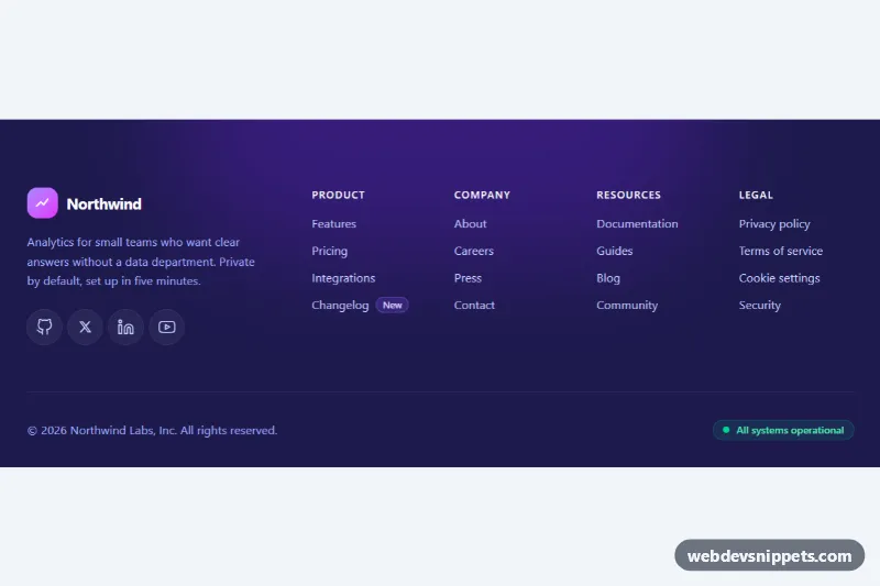
Multi-Column Footer

Dark Tailwind CSS website footer with brand block, social icons, four labelled link columns and a bottom bar with copyright and status.

Mega Footer with Accordion on Mobile – Bootstrap 6 footers preview

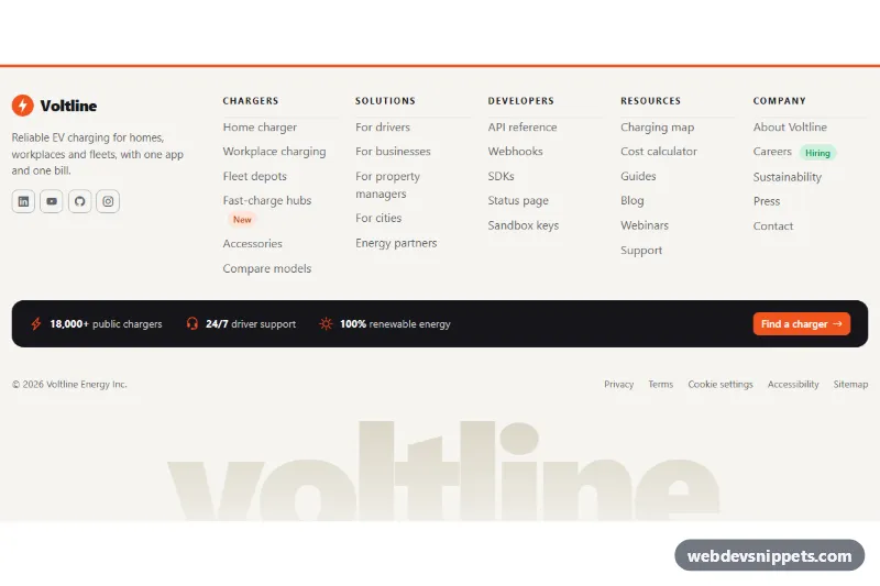
Mega Footer with Accordion on Mobile

Large Bootstrap 6 footer whose five link columns turn into an exclusive details accordion on phones, with brand block, stats strip, CTA and legal bar.

Footer with App Download Buttons – Bootstrap 6 footers preview

Footer with App Download Buttons

Bootstrap 6 footer with a green app promo panel: generic iOS and Android download buttons, QR code, CSS phone mockup, link columns and a region Combobox.