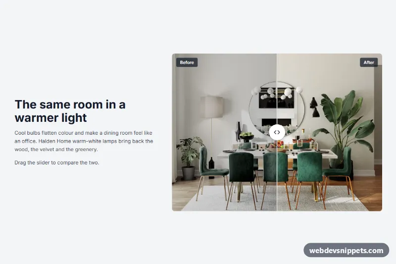
A before and after image slider for Shopify that lets shoppers drag a divider across two photos of the same subject. It suits room makeovers, restorations and care products. Copy section.liquid into your theme's sections folder and add it from the theme editor as "WDS Before and after".
How it works
Both images fill the same frame. The "before" layer sits on top and is clipped at the divider, so moving the divider reveals more of the "after" image underneath. Shoppers can drag the handle, click anywhere on the image, or swipe on a touch screen. On touch screens, a mostly vertical swipe still scrolls the page.
An optional heading and text sit above the images or beside them. Side layouts stack on narrow screens. If both Heading and Text are empty, the images take the full width. Each image can show a small label in its corner.
Customization
All in the theme editor:
- Heading, Text and Text position: choose Above the images, Left of the images or Right of the images.
- Before image and After image: the focal point you set on an image in Shopify is respected when it is cropped.
- Before label and After label: rename them to suit the comparison, or clear them to hide the labels.
- Start position: where the divider rests on load, from 5% to 95%.
- Divider: Vertical (drag left and right) or Horizontal (drag up and down).
- Aspect ratio: Square, Standard, Photo, Wide, Portrait or Match the image.
- Background, Text and Accent colors: the accent colors the keyboard focus ring.
- Side padding, Top padding and Bottom padding.
Use cases
- Home makeover and renovation shops: show a room before and after by dragging a divider across two photos
- Restoration businesses: compare worn and restored items in a vertical or horizontal slider
- Skincare and care products: show visible results with optional side text beside the images
- Touch and keyboard users: drag with a finger or move the divider with the keyboard
Accessibility
The slider is a native range input, so arrow keys, Page Up, Page Down, Home and End all work. Slider label names it for screen readers, and the current position is announced with both labels, such as "Before 30%, After 70%". The handle shows a visible focus ring. Each image uses its alt text from Shopify, falling back to its label or the heading.
Usage notes
This section requires an Online Store 2.0 theme and does not depend on the theme's own CSS or JavaScript.
The preview uses sample data for an invented store. Its photos are from Unsplash, and the "before" image is the same photo with its colors reduced through URL parameters. section.liquid contains no photos, so upload your own. Until then, placeholder illustrations appear.
Each section holds one pair of images, so add the section again for more comparisons. There is no auto-play. With a horizontal divider on touch screens, only the handle drags the slider. Use two photos with the same framing and proportions, otherwise the comparison will not line up. With Match the image, the frame takes its ratio from the before image, or from the after image if there is no before image. Only use comparison photos that honestly show what your product does.