Skip to content

Photo Grid with Captions and Categories

Responsive Bootstrap 5 photo grid with category badges, overlay captions, a featured tile and accessible category filter buttons.

Also known as: filterable photo gallery, image gallery with categories, portfolio photo grid, masonry style photo grid, gallery category filter

Bootstrap 5 Galleries Responsive Dark #filter #gallery #grid #photo #responsive

Photo Grid with Captions and Categories live demo

Open in new tab

Bootstrap 5 code (HTML, CSS, JS)

A dark, responsive Bootstrap 5 photo grid where every image carries a colored category label and an overlay caption, with filter buttons to show one category at a time. It suits portfolios, photo journals, travel blogs and image-heavy landing pages.

How it works

The root section.pg-root holds a heading row and a ul.pg-grid. Bootstrap utilities lay out the heading and the .pg-filters button group, which sit side by side from the md breakpoint and stack on phones. The grid itself is CSS Grid: two columns on small screens and four from 768px, with a fixed row height from --pg-row and grid-auto-flow: dense so the larger tiles leave no gaps. .pg-item--feature spans two columns and two rows, and .pg-item--tall spans two rows.

Every li.pg-item contains a figure.pg-figure with an img set to object-fit: cover, a Bootstrap badge with a category modifier such as .pg-badge--nature, and a figcaption.pg-caption with a title and a meta line on a dark gradient for readable text. Captions are always visible, and on hover the photo zooms slightly.

The script runs on DOMContentLoaded for each .pg-root. It counts the items per data-pg-category value and writes the numbers into the .pg-filter__count spans. Clicking a button with data-pg-filter sets the hidden attribute on items from other categories, updates aria-pressed on all buttons and writes a short result into the visually hidden .pg-status region. Shown items fade back in with the pg-fade keyframes. Without JavaScript, all photos stay visible.

Customization

  • --pg-accent on .pg-root in style.css: changes the kicker text, the active filter and the focus ring.
  • --pg-row and --pg-gap on .pg-root: set the row height and the spacing; the 768px media query overrides both for larger screens.
  • grid-template-columns: repeat(4, 1fr) in the .pg-grid media query: use 3 or 5 columns on desktop.
  • Add .pg-item--feature or .pg-item--tall to any li.pg-item to make that photo larger.
  • data-pg-category on an item and a matching data-pg-filter button: add a new category; the counts update automatically.
  • .pg-badge--nature, .pg-badge--city, .pg-badge--food, .pg-badge--animals: change each label color or add a modifier for a new category.
  • --pg-bg and --pg-text on .pg-root: switch the section to a light palette.

Use cases

  • Photography portfolios: visitors filter photos by category with live counts on each button
  • Travel blogs: nature, city and food photos carry colored category labels and overlay captions
  • Photo journals: a larger featured tile and tall tiles make the grid feel varied
  • Image-heavy landing pages: a dark responsive grid with a hover zoom shows work at its best
  • Agency sites: show the number of results through a screen reader status message

Accessibility

The grid is a list, each photo is a figure with a figcaption, and every image has a descriptive alt. The filter buttons are real buttons in a role="group" with an aria-label, and aria-pressed tells screen readers which filter is active. The .pg-status live region announces how many photos are shown. Filter buttons have a visible :focus-visible outline. Under prefers-reduced-motion the fade animation and the hover zoom are disabled.

Usage notes

Requires Bootstrap 5, which is loaded automatically; no icon font is needed. The photos come from Unsplash; replace them with your own images and keep the width and height attributes to avoid layout shift. Each .pg-root filters independently, so several galleries can share a page.


Photo Grid with Captions and Categories at a glance

Framework
Bootstrap 5
Code
HTML, CSS, JavaScript
JavaScript
Vanilla JavaScript, no jQuery
Dependencies
Bootstrap 5
Layout
Responsive, works on mobile, dark design
Category
Galleries
License
Free for personal and commercial use

Questions about this template

Can I use the Photo Grid with Captions and Categories code for free?

Yes. You can copy or download the code and use it in personal and commercial projects, including client work. No sign-up is needed. Reselling it as part of a component library or template collection is not allowed; see the license.

How do I add it to my website?

Load Bootstrap 5 from a CDN (the links are under Requirements). Paste the HTML where the component should appear, add the CSS to your stylesheet and load the JavaScript before the closing </body> tag. Download HTML gives you a complete page with everything already linked.

Does it need jQuery or a JavaScript framework?

No. The script is plain vanilla JavaScript, so it works without jQuery, React or Vue. You can still use the markup inside those frameworks.

Does it work on mobile?

Yes. The layout adapts to small screens. Use the Mobile and Tablet buttons above the live demo to check it at phone and tablet width.

Requirements

Add these to your page (already included in the download):

  • <link rel="stylesheet" href="https://cdn.jsdelivr.net/npm/bootstrap@5.3.3/dist/css/bootstrap.min.css">
  • <script src="https://cdn.jsdelivr.net/npm/bootstrap@5.3.3/dist/js/bootstrap.bundle.min.js"></script>
Photo Grid with Captions and Categories – Bootstrap 5 galleries component screenshot
Photo Grid with Captions and Categories · Bootstrap 5 Galleries

More Galleries

CSS Grid Bento Photo Gallery – Pure CSS galleries preview

CSS Grid Bento Photo Gallery

Bento-style photo gallery with mixed tile sizes from CSS Grid spans, hover captions and a keyboard-friendly dialog lightbox.

Polaroid Photo Gallery – Pure CSS galleries preview

Polaroid Photo Gallery

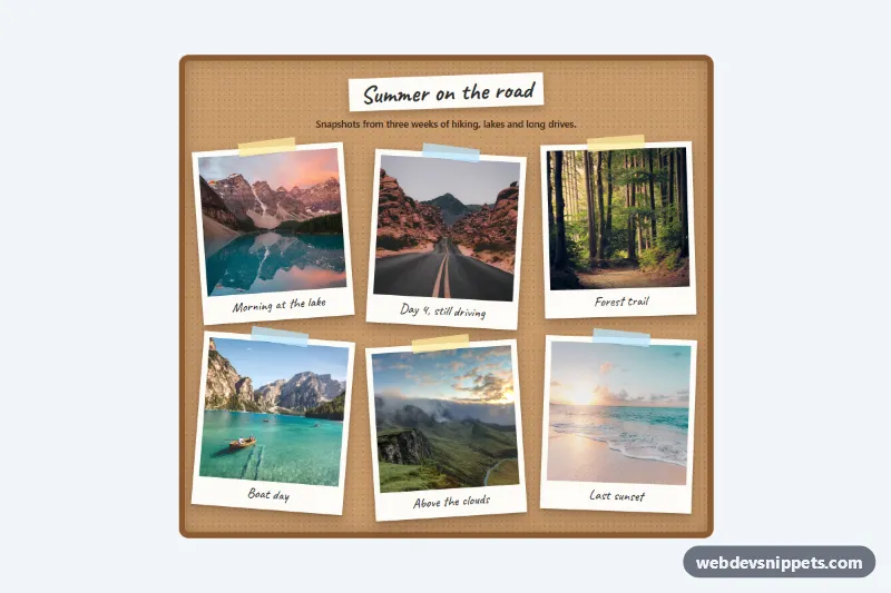
Pure CSS polaroid gallery on a cork board: tilted photo frames with tape and handwritten captions that straighten and lift on hover or focus.

Masonry Image Gallery – Pure CSS galleries preview

Masonry Image Gallery

Pure CSS masonry image gallery using multi-column layout, with hover and focus captions that slide up over each photo. No JavaScript needed.

Before and After Image Slider for Shopify – Shopify galleries preview

Before and After Image Slider for Shopify

Drag-to-compare before and after image slider for Shopify with vertical or horizontal divider, touch and keyboard control, and optional side text.

Filterable Portfolio Gallery – Bootstrap 5 galleries preview

Filterable Portfolio Gallery

Dark Bootstrap 5 portfolio gallery with pill filter buttons, automatic category counts, fade-in tiles and a screen reader status message.

Gallery with Lightbox – Tailwind CSS galleries preview

Gallery with Lightbox

Tailwind CSS mosaic image gallery that opens an accessible lightbox with captions, arrow-key and swipe navigation, focus trap and preloading.