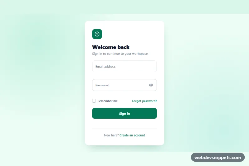
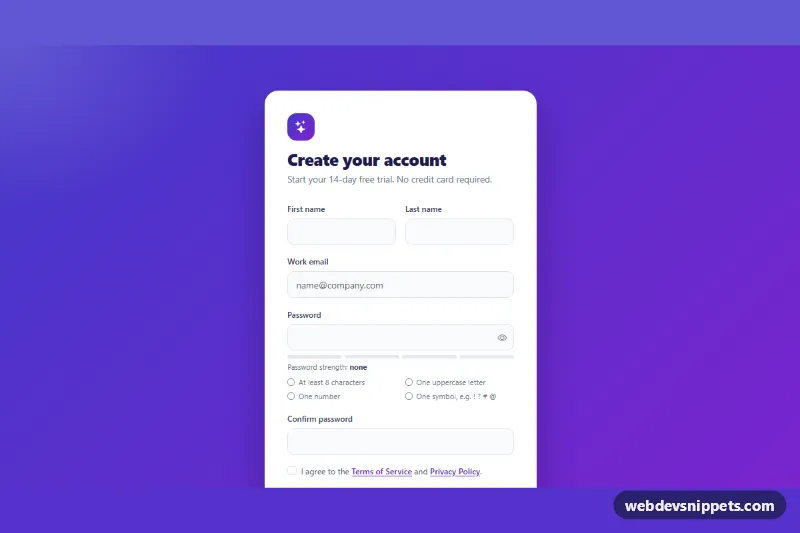
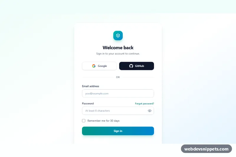
A clean login card with animated floating labels, built with pure CSS and a small vanilla JavaScript file for validation, a show/hide password button and a simulated submit. Drop it into an app sign-in page, an admin panel, a member area or a checkout step.
How it works
The outer .lfl-wrap centers the white section.lfl-card on a soft mint background. Inside, the form.lfl-form holds two .lfl-field blocks. Each field contains an input.lfl-input, then its label.lfl-label, then a p.lfl-error message. The floating effect is CSS only: every input has placeholder=" ", so it matches :placeholder-shown while it is empty. The label sits centered inside the input, and when the input has :focus or is no longer :placeholder-shown, the adjacent + .lfl-label is translated up and scaled down. Because the label follows the input in the markup, the sibling selector works without any JavaScript.
Below the fields are a custom .lfl-check checkbox (a hidden native input styled through .lfl-check-box), a forgot-password link and the .lfl-submit button with a CSS .lfl-spinner.
The script finds every .lfl-card and wires up its form. It reveals the .lfl-reveal button and toggles the password input between password and text. Fields are validated on blur and re-checked on input once they show an error. On submit both fields are checked; the first invalid one receives focus. A valid form gets the .is-loading class, which shows the spinner and disables the button, and after a short setTimeout a success text appears in .lfl-message. Replace that timeout with a fetch() call to your login endpoint.
Customization
--lfl-accentand--lfl-accent-darkon.lfl-wrap: the brand color of the floating label, focus ring, checkbox, links and the button and its hover state.--lfl-field-height: height of the inputs; the label start position and the password button follow it.--lfl-radius: corner radius of the inputs and the submit button.--lfl-error: color of error messages, invalid borders and invalid labels.--lfl-speed: duration of the label float and other transitions.MIN_PASSWORDandEMAIL_PATTERNat the top ofscript.js: the minimum password length and the email check.--lfl-bg: the page background behind the card.
Accessibility
Every input has a real label connected through for, so the floating text is also the accessible name. Error paragraphs are linked with aria-describedby, and invalid fields get aria-invalid="true". The password button is a button with aria-pressed, aria-controls and a label that switches between Show password and Hide password. The .lfl-message paragraph uses role="status" so the result is announced. Inputs, the checkbox, links and buttons all show a visible green focus ring. With prefers-reduced-motion: reduce labels move without animation.
Usage notes
The form uses novalidate so the custom messages replace browser tooltips. Each copy on a page needs unique id values for inputs and error paragraphs.