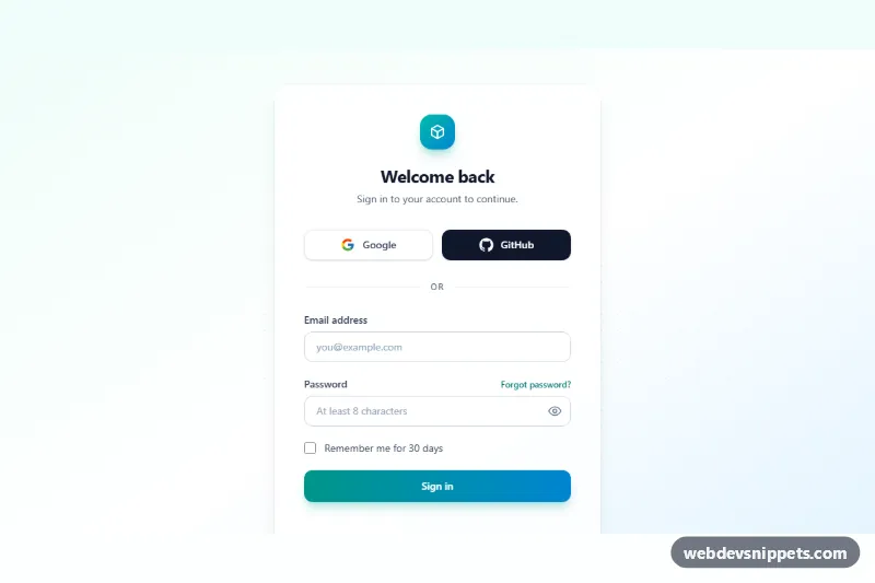
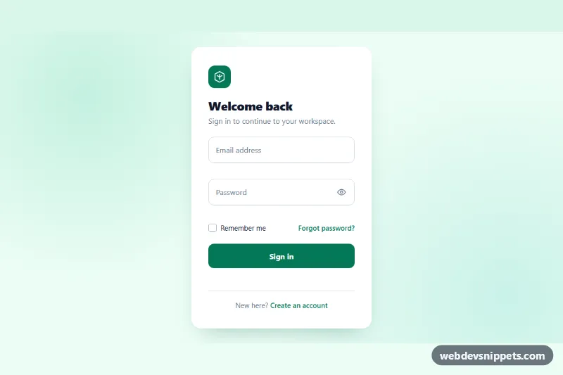
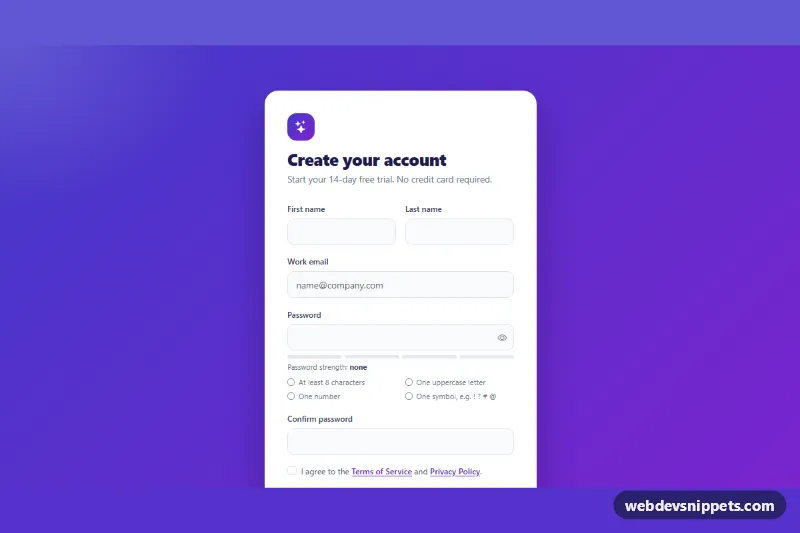
A clean login screen built with Tailwind CSS that combines Google and GitHub sign-in buttons with a classic email and password form, a "Remember me" checkbox, a show/hide password toggle and inline validation. It drops straight into SaaS apps, dashboards and member areas as the sign-in page.
How it works
The root is section.tls-login, a full-height bg-linear-to-br from-teal-50 via-white to-sky-100 background with a masked dot pattern. A translucent card (bg-white/80 backdrop-blur) holds the logo, the heading, two social buttons, an "or" divider and the form marked data-tls-form. The social buttons sit side by side from sm up and stack on narrow phones. Each one carries data-tls-provider with the provider name, and the logos are inline SVG.
The script initializes every .tls-login on DOMContentLoaded. The form has novalidate, so the script handles validation itself: on submit it checks the email against a simple pattern and the password against the input's minlength, writes messages into the data-tls-error paragraphs, sets aria-invalid="true" (which turns the border red through the aria-[invalid=true]: variant) and moves focus to the first invalid field. After the first attempt, errors update live on every input event.
The .tls-reveal button switches the password input between type="password" and type="text", flips aria-pressed and swaps the two icons marked data-tls-eye. On a valid submit, .tls-submit is disabled, the data-tls-spinner icon appears, the data-tls-label text changes to "Signing in…" and a setTimeout stands in for your real request before the data-tls-status region reports success.
Customization
from-teal-600 to-sky-600on.tls-submitand the logo badge: change the gradient to restyle the primary action, e.g.from-indigo-600 to-violet-600.focus:ring-teal-500/20andfocus-visible:outline-teal-600: update together with the gradient so focus states match the new accent.minlength="8"on#tls-password: the script reads this value, so changing it updates both the rule and the error message.data-tls-providerbuttons: turn them intoaelements pointing at your OAuth routes (for example/auth/google), or add a third provider by copying a button.sm:grid-cols-2on the social button grid: remove it to always stack the buttons full width.- The
window.setTimeoutblock inscript.js: replace it with afetch()call to your login endpoint. max-w-mdon the card wrapper: widen the card for longer copy.
Accessibility
Every input has a visible label, correct type and autocomplete values (email, current-password) so password managers work. Error messages are linked through aria-describedby and the invalid state is exposed with aria-invalid. The password toggle is a real button with aria-controls, aria-pressed and a hidden text label that switches between "Show password" and "Hide password". Status messages are announced through a role="status" live region. All controls show a visible focus ring, decorative SVGs are aria-hidden, and the spinner stops spinning with motion-reduce:animate-none.
Usage notes
Client-side validation is for convenience only; always validate on the server too.