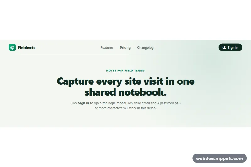
A Bootstrap 5 login modal with social sign-in buttons, floating-label email and password fields, a show/hide password toggle, client-side validation and a success view after signing in. It opens from a "Sign in" button in a small site header, the way most SaaS and content sites let visitors log in without leaving the page.
How it works
The root .lgm-root holds a demo header (.lgm-bar) with the .lgm-open trigger, a short hero and the .lgm-modal. The trigger uses Bootstrap's data-bs-toggle="modal" and data-bs-target="#lgm-modal", so the dialog opens, traps focus and closes with Escape through the Bootstrap bundle alone.
Inside .lgm-dialog there are two views. .lgm-view--form contains the logo, the .lgm-social buttons, an "or" .lgm-divider drawn with pseudo-elements, a hidden .lgm-error alert and the .lgm-form. The password field sits in .lgm-password with the absolutely positioned .lgm-reveal button, which switches the input between password and text and swaps the eye icon.
The script listens for shown.bs.modal to focus the email field and for submit on the form. Invalid forms get was-validated, aria-invalid on each field and focus on the first invalid one. A valid form shows a spinner and "Signing in…" in .lgm-submit, then hides the form view, shows .lgm-view--success with the email in .lgm-user, and changes .lgm-open__label to "My account". hide.bs.modal is cancelled while the request runs, and hidden.bs.modal resets everything for the next opening.
Customization
--lgm-accent,--lgm-accent-hoverand--lgm-accent-rgbin.lgm-root: recolor the submit button, links, checkbox and focus rings.--lgm-radiusin.lgm-root: make the modal corners rounder or square.--bs-modal-widthin.lgm-modal: widen or narrow the dialog (default27rem).--lgm-page-bgin.lgm-root: change the background of the demo header and hero, or remove.lgm-barand.lgm-heroand place the.lgm-openbutton in your own navbar.minlength="8"on#lgm-password: change the password rule; also update the text of#lgm-password-error.- The
window.setTimeoutcall in thesubmithandler ofscript.js: replace it with afetch()POST to your login endpoint. On failure, put the server message in.lgm-errorand remove itshiddenattribute. - Delete the
.lgm-socialblock and the.lgm-dividerparagraph for an email-only login.
Accessibility
The modal is labelled by #lgm-title. Every field has a real label, and the error messages are linked with aria-describedby. The reveal button has aria-controls, aria-pressed and a label that changes between "Show password" and "Hide password". While signing in the submit button uses aria-disabled instead of disabled, so keyboard focus is not lost; after success, focus moves to the success heading. The .lgm-error alert has role="alert". The check mark pop animation is turned off with prefers-reduced-motion: reduce.
Usage notes
Requires the Bootstrap 5 bundle and Bootstrap Icons. Client-side validation is only a convenience; always authenticate on the server and never log or store passwords in the browser.