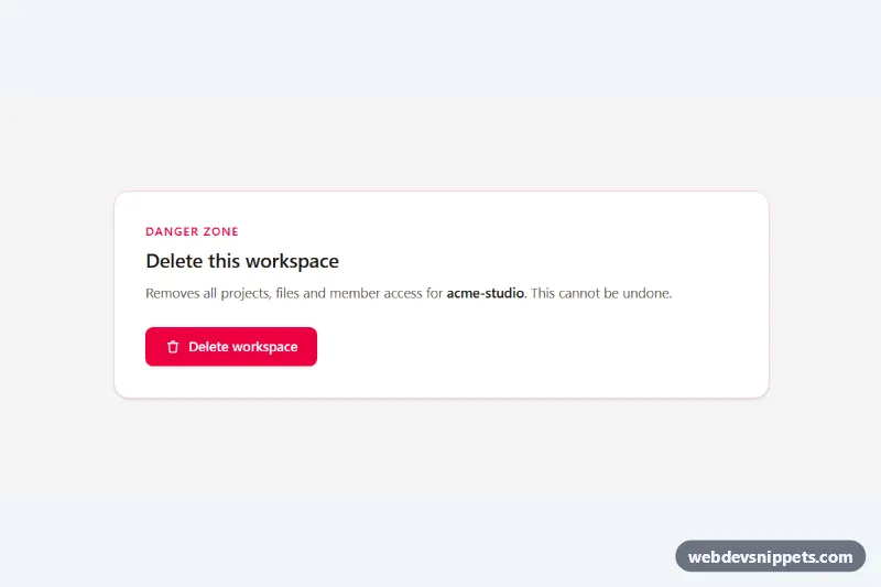
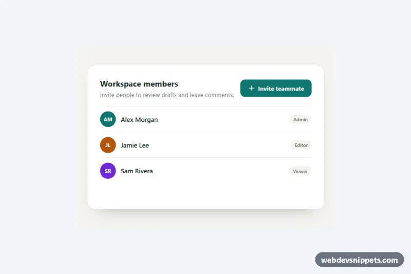
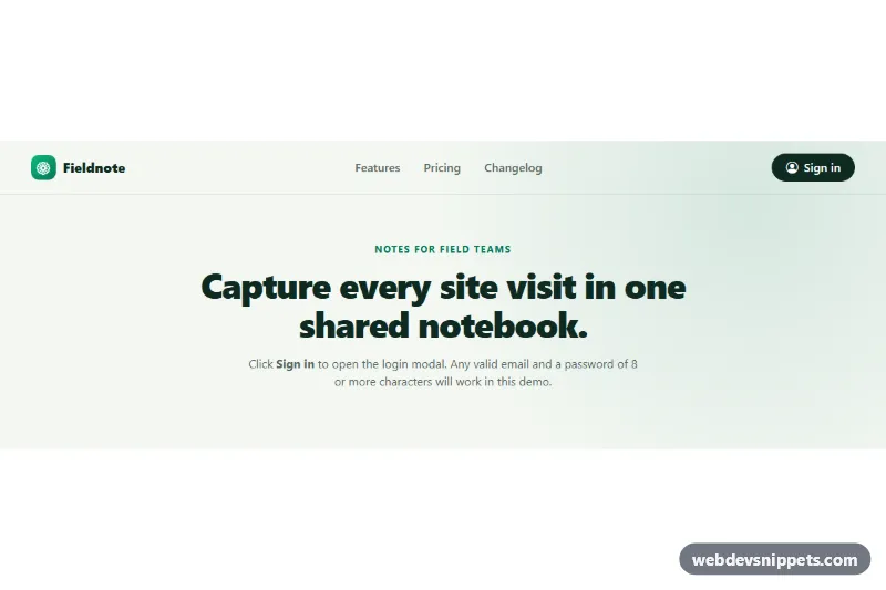
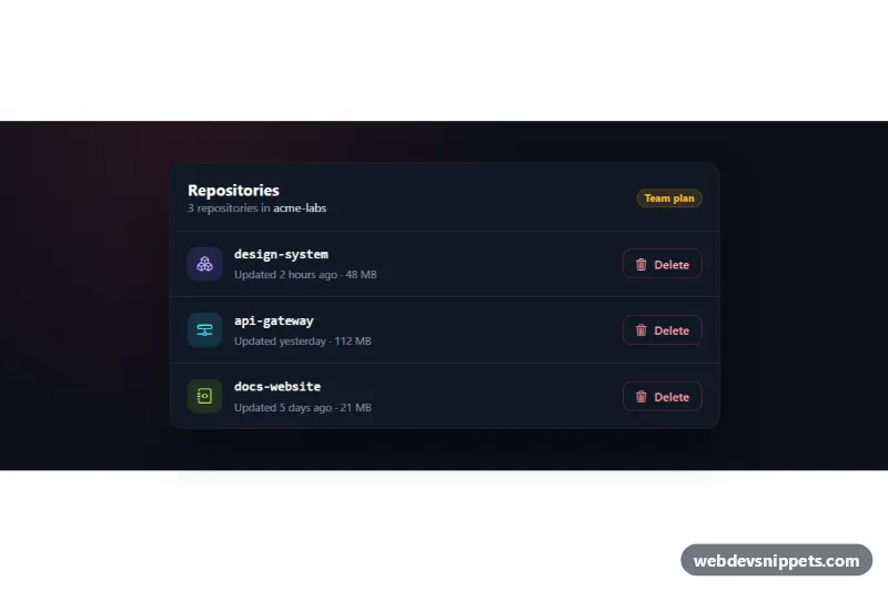
An accessible modal dialog built with Tailwind CSS and a small vanilla JavaScript controller, shown here as a "Delete workspace?" confirmation that only enables the destructive button after the user types the workspace name. It covers the patterns every production modal needs: a focus trap, Escape to close, a clickable backdrop, scroll locking and focus restoration.
How it works
The root is .tmd-modal. It contains the page content with the trigger button marked data-tmd-open, a role="status" message marked data-tmd-status, and the .tmd-overlay container, which starts with the hidden attribute. Inside the overlay are the blurred .tmd-backdrop and the #tmd-dialog panel (.tmd-panel) with role="dialog" and aria-modal="true". On phones the panel slides up from the bottom (items-end); from sm up it is centered.
The script initializes each .tmd-modal on DOMContentLoaded. Clicking the trigger stores the currently focused element, removes hidden, locks page scrolling on the html element and moves focus to the element marked data-tmd-autofocus. A keydown listener on the overlay closes on Escape and, on Tab or Shift+Tab, wraps focus between the first and last visible focusable elements. A focusin listener pulls focus back if it ever lands outside the dialog. Any element with data-tmd-close (the backdrop, the close icon and Cancel) closes the modal, which resets the form, unlocks scrolling and returns focus to the trigger.
The input carries data-tmd-match="acme-studio"; on every input event the data-tmd-confirm button stays disabled until the value matches. Submitting closes the dialog and writes a confirmation into the status message. style.css adds the tmd-fade and tmd-pop entrance animations.
Customization
data-tmd-matchon#tmd-confirm-input: set the phrase users must type; remove the wholelabelandinput(and thedisabledattribute ondata-tmd-confirm) for a simple yes/no confirmation.bg-rose-600,bg-rose-100andfocus-visible:outline-rose-600: swaproseforindigooremeraldto turn it into a non-destructive dialog.max-w-mdon.tmd-panel: usemax-w-lgormax-w-2xlfor forms or longer content.items-end sm:items-centeron.tmd-overlay: useitems-centerto center the panel on phones too.bg-stone-950/60 backdrop-blur-smon.tmd-backdrop: change the dimming strength or remove the blur.animation: tmd-pop 0.25sinstyle.css: tune or drop the entrance motion.- Move
data-tmd-autofocusto the Cancel button so focus lands on the safest action first.
Accessibility
The dialog uses role="dialog", aria-modal="true", aria-labelledby="tmd-title" and aria-describedby="tmd-desc", so its title and consequence are announced on open. The trigger has aria-haspopup="dialog", aria-controls and an aria-expanded state set by the script. Focus is trapped while open and restored to the trigger on close; Escape always closes. The close icon has a visually hidden label, decorative icons are aria-hidden, and the result is announced through the role="status" region. Every control shows a visible focus ring, and animations are disabled under prefers-reduced-motion: reduce.
Usage notes
For several modals on one page, wrap each in its own .tmd-modal and give every dialog unique id values.