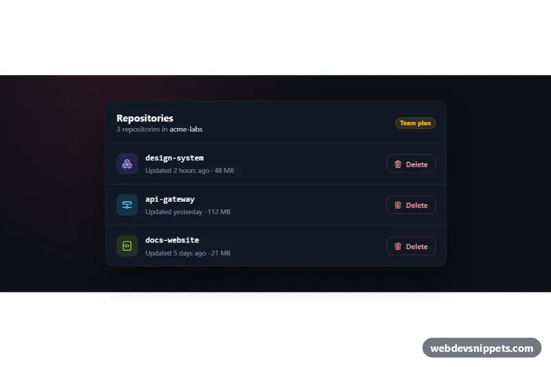
A dark Bootstrap 5 delete confirmation modal that only enables the delete button after the user types the exact name of the item. It ships with a repository list where every row has its own delete button, which makes it a good fit for admin panels, developer dashboards and settings pages with destructive actions.
How it works
The root .mcd-wrap sets data-bs-theme="dark", so both the .mcd-card list and the .mcd-modal use Bootstrap's dark color mode. Each .mcd-item row has a .mcd-trigger button with data-bs-toggle="modal", data-bs-target="#mcd-modal" and a data-mcd-name attribute holding the item name. One modal serves all rows.
The script listens for Bootstrap's show.bs.modal event and reads event.relatedTarget to find the clicked button. It writes the name into .mcd-target and .mcd-target-code, clears the .mcd-input field and stores the name as the expected value. On shown.bs.modal the field receives focus. Every input event compares the value with the expected name; on an exact match the .mcd-confirm button is enabled and the field gets a green border through .mcd-input--match.
Submitting the form shows a spinner and the label "Deleting…", and hide.bs.modal is blocked while the request runs. After a simulated delay the modal closes, the row fades out with .mcd-item--leaving and is removed, .mcd-count is updated and .mcd-status announces the result.
Customization
--mcd-danger,--mcd-danger-darkand--mcd-danger-rgbin.mcd-wrap: change the red used for the triggers, the alert icon, the confirm button and the focus ring.--mcd-warningin.mcd-wrap: recolor the hazard stripes in.mcd-stripeand the plan badge, or delete the.mcd-stripeelement for a plain top edge.--mcd-page-bg,--mcd-surfaceand--mcd-borderin.mcd-wrap: adjust the dark background, the card and modal surface, and the divider lines.--mcd-radiusin.mcd-wrap: round or square the corners of the card and the modal.data-mcd-nameon each.mcd-trigger: the text the user must type; it can be any string, such as a project slug or an email address.- The
.mcd-impactlist: describe what your delete action removes. - The
window.setTimeoutcall in thesubmithandler ofscript.js: replace it with afetch()DELETE request to your API and keep the row removal for the success case.
Accessibility
The modal is labelled by #mcd-modal-title and described by #mcd-modal-desc, and the input is linked to the case-sensitivity note with aria-describedby. Bootstrap traps focus inside the dialog and closes it with Escape. Because the clicked row is removed after a delete, the script moves focus to the next remaining delete button, or to the list heading when the list is empty, instead of losing it. Each row button has an aria-label that includes the item name, and the status line uses role="status". The row fade-out is skipped under prefers-reduced-motion: reduce.
Usage notes
Requires the Bootstrap 5.3 bundle and Bootstrap Icons. When using several instances on one page, give each modal, its input and its hint unique id values and update data-bs-target on the triggers.