A modal built on the native HTML dialog element, styled with pure CSS and opened with a few lines of vanilla JavaScript. It animates in and out with @starting-style, blurs the page behind it, turns into a bottom sheet on phones and contains a small invite form. Use the pattern for confirmations, settings, sign-up prompts or any form that needs the user's full attention.
How it works
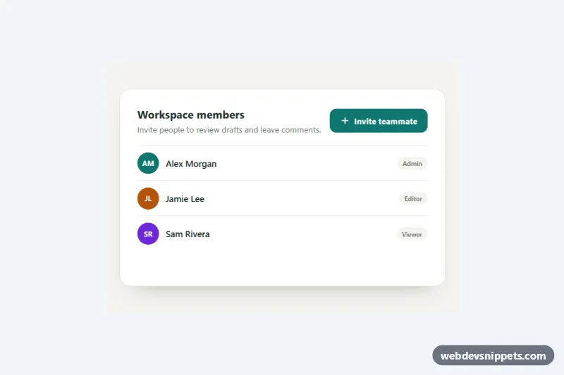
The root section.dm-demo holds a .dm-panel with a member list and the .dm-open trigger, plus the dialog.dm-dialog. Inside the dialog, form.dm-form uses method="dialog": every submit button closes the dialog and sets returnValue to its value. The close icon and "Cancel" use value="cancel" with formnovalidate, so they close even when the email field is empty.
Calling showModal() gives you the hard parts for free: the dialog renders in the top layer, the rest of the page becomes inert, focus moves into it (to the autofocus email field) and Escape closes it. The animation is pure CSS. .dm-dialog transitions opacity and transform, @starting-style defines where [open] starts from, and overlay plus display with allow-discrete keep the dialog visible while it fades out. The ::backdrop fades from transparent to a tinted blur the same way.
The script opens the dialog, closes it on a backdrop click (the closedby="any" attribute does the same natively in newer browsers), and listens for submit on the form. When "Send invite" is used, it shows a busy state for 700 ms; replace that setTimeout with fetch() to your API. On the close event it reads returnValue, adds the invited person to .dm-members, writes a message to .dm-status and returns focus to the trigger.
Customization
--dm-accentand--dm-accent-darkon.dm-demo: primary button, selected role card and the icon badge.--dm-width: the maximum dialog width from 560px up.--dm-speed: duration of the open and close animation for the dialog and its backdrop.--dm-radius: corner radius of the panel and the dialog.rgba(17, 32, 26, 0.55)andblur(4px)in.dm-dialog[open]::backdrop: the tint and blur of the page behind..dm-rolesuses three columns from 560px; changegrid-template-columnsto stack the role cards.- Remove
closedby="any"and the backdropclicklistener if clicking outside should not close the modal.
Accessibility
The dialog is labelled by .dm-title with aria-labelledby and described by .dm-desc with aria-describedby. The trigger has aria-haspopup="dialog". Focus is trapped by the browser while the modal is open and goes back to the trigger on close. The role choices are real radio buttons in a fieldset with a legend. Every control has a visible amber :focus-visible outline, and prefers-reduced-motion: reduce removes the slide and fade.
Usage notes
@starting-style and allow-discrete work in current Chromium, Safari and Firefox; older browsers simply open the dialog without animation.