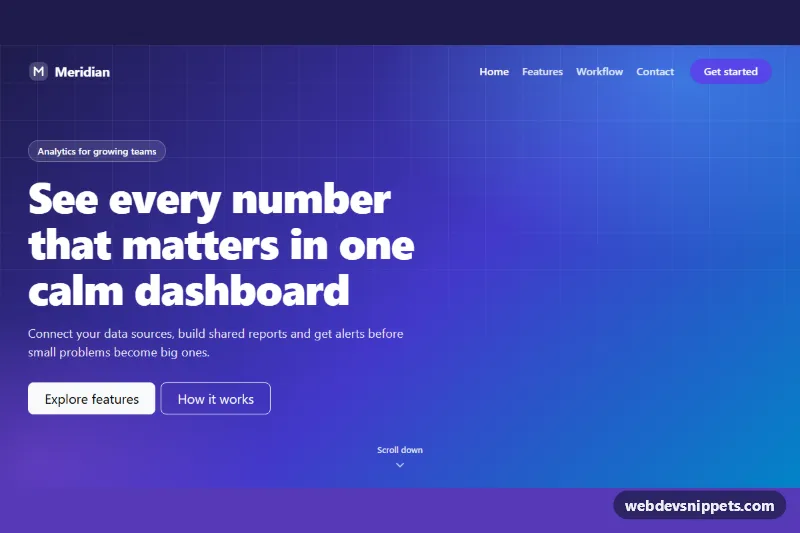
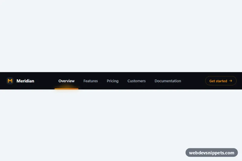
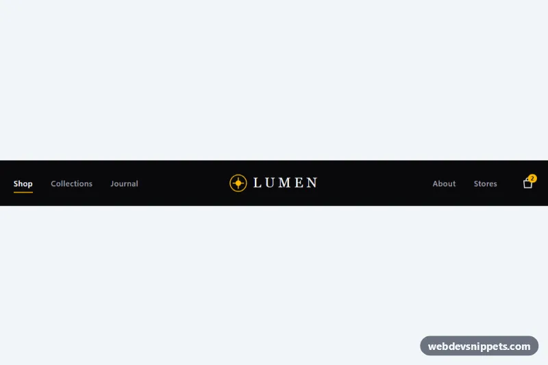
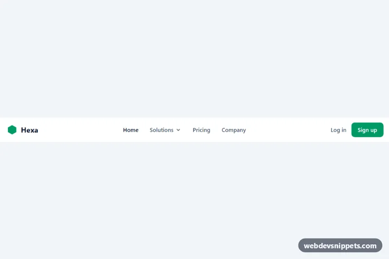
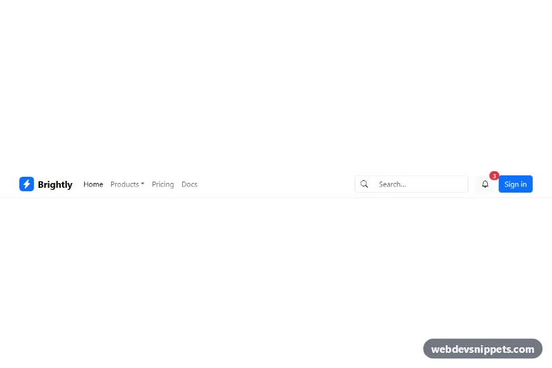
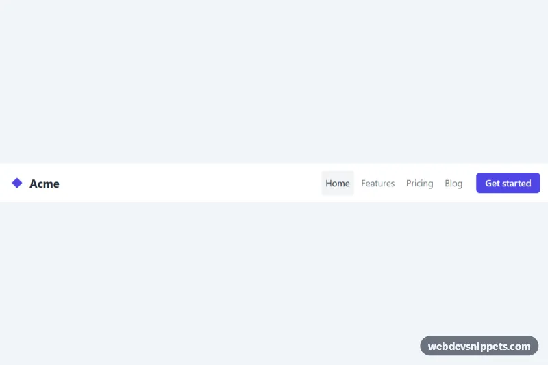
A Bootstrap 5 navbar that sits transparently on top of a full-screen gradient hero and turns into a solid, blurred bar with a soft shadow once the visitor scrolls. It suits landing pages, product sites and portfolios where the first screen should feel open but the navigation must stay readable further down.
How it works
The navbar is a nav.navbar.navbar-expand-lg.fixed-top.tn-nav with a brand, a collapsible link list and a .tn-cta button. Below it, .tn-hero fills the viewport (min-height: 100svh) with layered radial and linear gradients and a faded grid pattern drawn by .tn-hero::after. Three demo sections follow so the page is tall enough to scroll; every element with an id gets scroll-margin-top, so anchor links do not end up under the fixed bar.
The markup ships with .tn-nav--solid and data-bs-theme="light", so the bar is readable even without JavaScript. On DOMContentLoaded the script reads data-tn-offset and listens to scroll (passive, throttled with requestAnimationFrame). Past the offset it adds .tn-nav--solid and sets data-bs-theme="light"; at the top it removes the class and switches to data-bs-theme="dark", which gives white links and a white toggler icon through Bootstrap's own color modes. .tn-nav--ready is added after the first paint so the bar does not fade on page load. The script also listens to show.bs.collapse and hidden.bs.collapse, keeping the bar solid while the mobile menu is open, and closes the menu with bootstrap.Collapse.getOrCreateInstance() after a link is chosen.
Customization
data-tn-offset="48"on.tn-nav: set how many pixels the page scrolls before the bar turns solid; use0to switch immediately.--tn-solid-bgin.tn-nav: change the scrolled background, e.g.rgba(15, 23, 42, 0.9)for a dark bar; then change'light'to'dark'in the script'supdate()function so the links stay white.--tn-shadowin.tn-nav: make the shadow stronger, or set it tononefor a flat bar.--tn-accentand--tn-accent-hoverin.tn-nav: recolor the.tn-ctabutton and the logo in the solid state.--tn-hero-from,--tn-hero-viaand--tn-hero-toin.tn-hero: change the three gradient stops of the hero background.--tn-transitionin.tn-nav: speed up or slow down the background, shadow and padding change.padding-blockin.tn-navand.tn-nav--solid: control how much the bar shrinks when it becomes solid.
Accessibility
The nav has aria-label="Main navigation", the current link uses aria-current="page" and the script moves it to the link that was clicked. The toggler keeps Bootstrap's aria-controls, aria-expanded and label. Nav links, the brand and the call-to-action get a visible outline on :focus-visible in both states. Link colors over the hero are raised to 85% white for better contrast. With prefers-reduced-motion: reduce the bar transition and the bouncing scroll hint are disabled. The decorative SVGs are aria-hidden.
Usage notes
Requires Bootstrap 5.3 or newer for data-bs-theme. Remove the demo sections and keep .tn-nav and .tn-hero in your layout.