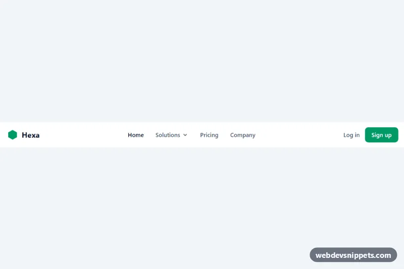
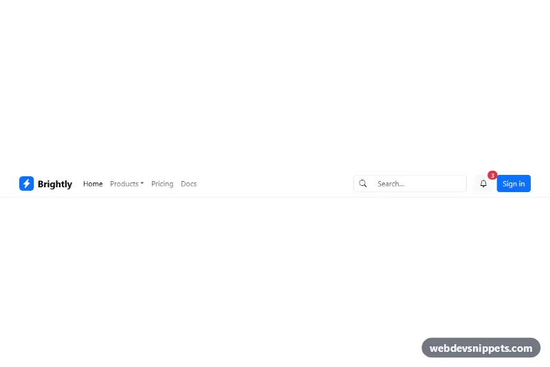
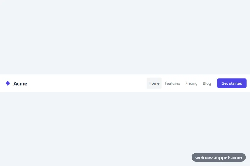
A Tailwind CSS header with a logo, a keyboard-friendly "Solutions" dropdown, login and sign-up actions and a separate mobile menu. It suits SaaS marketing sites, product pages and company websites that need a clean top navigation with a submenu.
How it works
The root is header.tnd-nav. Inside the nav, the desktop links and the auth buttons use hidden md:flex, so they appear only from the md breakpoint. The dropdown is a relative wrapper with data-dropdown, containing a button with data-dropdown-button and an absolutely positioned panel #tnd-solutions with data-dropdown-menu, which starts with the hidden class. Each menu item shows a title and a short description. Below md, a hamburger button with data-mobile-button (visible via md:hidden) controls the #tnd-mobile panel marked data-mobile-menu.
The script runs on DOMContentLoaded for every .tnd-nav. For each data-dropdown it toggles the hidden class on the menu, sets aria-expanded on the button and rotates the chevron with rotate-180. ArrowDown on the button opens the menu and focuses the first link; ArrowDown and ArrowUp inside the menu cycle through links; Escape closes it and returns focus to the button; a click anywhere outside the dropdown closes it. The mobile button toggles hidden on the mobile panel, updates aria-expanded and changes its sr-only text between "Open main menu" and "Close main menu".
Customization
emeraldclasses (text-emerald-600on the logo,bg-emerald-600on Sign up,focus-visible:ring-emerald-500): replace with another Tailwind color such asindigoto rebrand.md:flexandmd:hidden: change tolg:flexandlg:hiddenon all four elements to keep the mobile menu up to a wider screen.w-64on#tnd-solutions: widen the dropdown panel for longer descriptions.left-0on#tnd-solutions: useright-0to align the panel to the right edge of its button.- Add more
aelements inside thedata-dropdown-menupanel; the arrow-key navigation picks them up automatically. - Copy the whole
data-dropdownwrapper to add a second dropdown, with a new menuidand matchingaria-controls. max-w-6xlon thenav: change the width of the content area.
Accessibility
The nav has aria-label="Main", and the current page link uses aria-current="page". The dropdown button exposes aria-expanded, aria-haspopup and aria-controls, and supports arrow keys, Escape with focus return, and outside clicks. The mobile toggle has aria-controls="tnd-mobile", a synced aria-expanded state and a changing sr-only label. Buttons show focus-visible rings, menu links get a background on focus, and all SVG icons are aria-hidden.
Usage notes
Needs the Tailwind browser build (added automatically); there is no style.css. The mobile panel lists Solutions as a plain link, so point it to an overview page or expand it into sub-links.