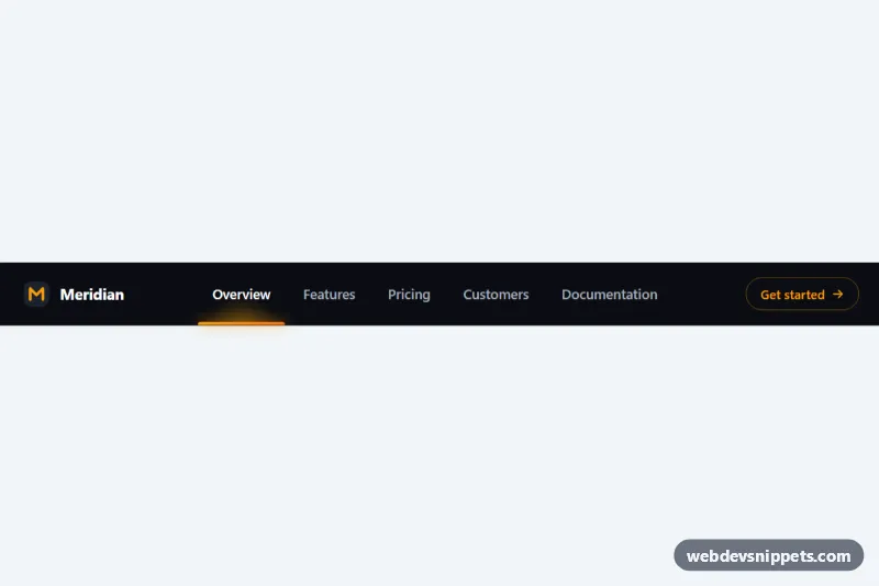
Navbar with Sliding Active Indicator
Dark responsive navbar with a glowing underline that slides between links on hover, focus and click, built with CSS custom properties and vanilla JS.
Top navigation bars with logos, links and responsive toggles.
6 component(s)
Dark responsive navbar with a glowing underline that slides between links on hover, focus and click, built with CSS custom properties and vanilla JS.
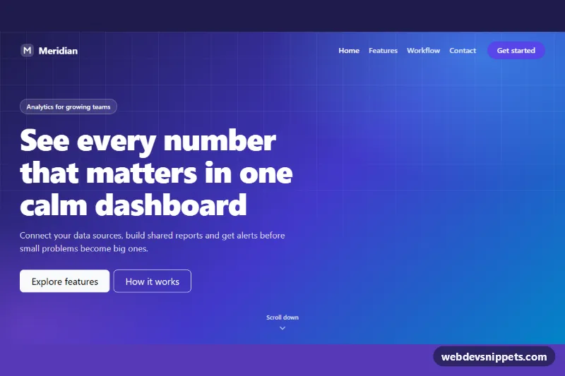
Bootstrap 5 navbar that sits transparently over a gradient hero and becomes a solid, blurred bar with a shadow when the page scrolls.
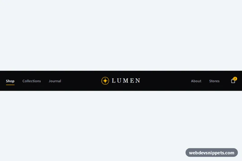
Dark Tailwind CSS navbar with links split around a centered logo, animated underlines and an accessible slide-down mobile menu.
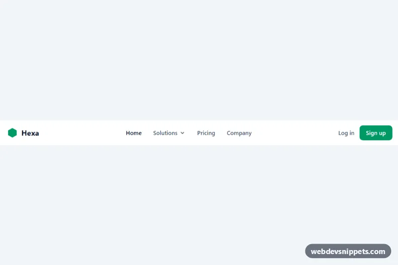
Tailwind CSS navbar with an accessible dropdown, call-to-action buttons and a collapsible mobile menu.
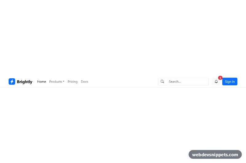
Responsive Bootstrap 5 navbar with brand, dropdown menu, search form and user actions.
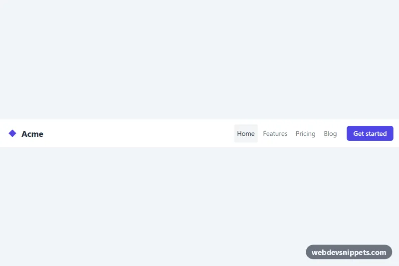
Accessible pure CSS navbar that collapses into a hamburger menu on small screens.
A navbar, or navigation bar, is the horizontal bar at the top of a website that holds the logo, main links and often a search field, language switcher or call-to-action button. It is usually the first thing visitors use to explore a site, so it needs to be clear on desktop and collapse gracefully on phones and tablets.
Use a top navbar for marketing sites, blogs, documentation and most web apps with a small number of main sections, typically five to seven links. For large sites, combine it with a mega menu; for dashboards with many sections, a sidebar is often a better fit. Sticky navbars help on long pages but take up vertical space, so keep them slim on mobile.
<nav> element with an aria-label such as "Main".aria-current="page" and a visible style, not colour alone.<button> with aria-expanded and aria-controls, plus an accessible label.alt text.These responsive navbar examples are available in Bootstrap 6, Bootstrap 5, Tailwind CSS and pure CSS. Bootstrap 5 navbars use the familiar navbar, navbar-expand-* and collapse plugin; the Bootstrap 6 alpha versions use its ES module JavaScript, <dialog>-based off-canvas menus and theme-* colour roles for light, dark and brand variations. Tailwind and pure CSS navbars give you a lightweight HTML and CSS navigation bar with a small toggle script. Filter by framework, check the live preview at narrow widths, then copy the code or download it and swap in your own logo and links.