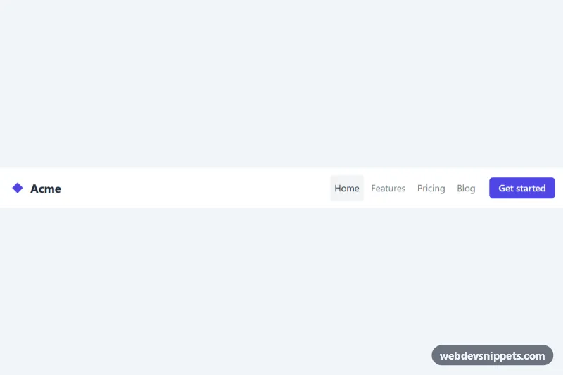
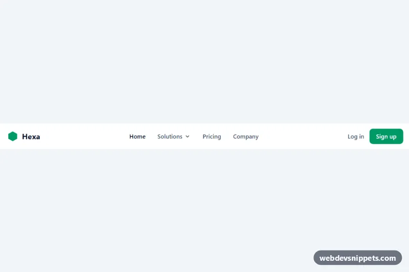
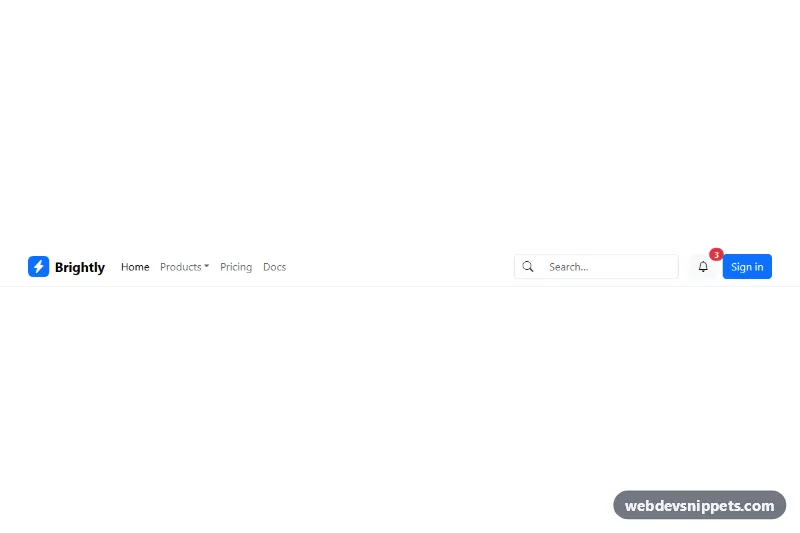
A lightweight responsive navbar built with pure CSS and a few lines of vanilla JavaScript, with a logo, four links and a call-to-action button. It suits landing pages, documentation sites and small apps that need a hamburger menu on phones without loading a framework.
How it works
The root element is .rn-header, which holds a nav.rn-nav flex container. Inside it are the brand link .rn-brand with an inline SVG logo (.rn-logo), the hamburger button .rn-toggle and the list ul.rn-menu with .rn-link items and a highlighted .rn-cta button.
The layout is mobile first. Below 768px .rn-menu is hidden with display: none and takes the full width under the logo row. The hamburger icon is a single .rn-toggle-bar span whose ::before and ::after pseudo-elements draw the top and bottom lines. When the button has aria-expanded="true", the middle bar becomes transparent and the two pseudo-elements rotate into an X.
The script runs on DOMContentLoaded and initializes every .rn-nav on the page. A click on .rn-toggle flips aria-expanded and toggles the is-open class on .rn-menu, which sets it to display: block. A keydown listener on the nav closes the menu when Escape is pressed and moves focus back to the toggle. From 768px up a media query hides the toggle and shows the menu as a horizontal flex row, so the desktop layout does not depend on JavaScript at all.
Customization
--rn-accenton.rn-headerinstyle.css: changes the logo fill and the background of the.rn-ctabutton.--rn-textand--rn-mutedon.rn-header: set the color of the brand, the hamburger bars, active links and the default link color.--rn-bgon.rn-header: changes the bar background, for example a dark color for a dark header (adjust--rn-texttoo).max-width: 1120pxin.rn-nav: widen or narrow the area in which the logo and links are aligned.@media (min-width: 768px): change the breakpoint to switch to the horizontal menu earlier or later.aria-current="page"on a.rn-link: move it to the link of the current page to give it the highlighted gray background..rn-cta:hoverbackground#4338ca: set a darker shade of your accent color for the button hover state.
Accessibility
The nav has aria-label="Main" and the toggle is a real button with aria-controls="rn-menu" and a hidden text label in .rn-sr-only. Its aria-expanded state is kept in sync by the script and also drives the X icon, so the visual state and the announced state always match. Escape closes the open menu and returns focus to the toggle. Links, the brand, the toggle and the CTA get a clear :focus-visible outline, and the toggle is 2.75rem square for comfortable touch targets. Users with prefers-reduced-motion: reduce see the icon change without the rotate transition.
Usage notes
Several navbars can live on one page because the script scopes everything to each .rn-nav, but each instance needs its own unique id on .rn-menu and a matching aria-controls value.