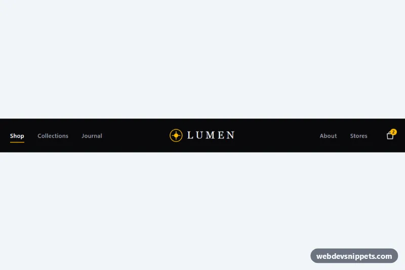
A dark, boutique-style navigation bar built with Tailwind CSS where the links are split into two groups on either side of a centered logo. It collapses into a hamburger menu with a slide-down panel on phones, which makes it a good fit for fashion stores, studios, restaurants and brand sites.
How it works
The root is header.tnc-navbar. The nav uses a three-column grid, grid-cols-[1fr_auto_1fr], so the logo stays exactly centered however wide the link groups are. The left column holds the .tnc-toggle button (below md only) and the first link list, the center holds the SVG mark and "Lumen" wordmark, and the right holds the second link list and a bag link with a count badge.
Desktop links get an animated underline from after: utilities: a 1px amber line that grows from after:scale-x-0 to after:scale-x-100 on hover. The aria-[current=page]: variant keeps it visible on the active link.
On small screens the #tnc-menu panel (.tnc-panel) lists every link plus a call-to-action. On DOMContentLoaded the script initializes each .tnc-navbar. Clicking .tnc-toggle flips aria-expanded, toggles the panel's hidden attribute and swaps the icons marked data-tnc-icon="open" and data-tnc-icon="close". The panel also closes on a link click, an outside click, Escape, or when the viewport crosses 48rem. style.css adds a short tnc-drop entrance animation.
Customization
bg-zinc-950on.tnc-navbarandbg-zinc-950/95on.tnc-panel: switch tobg-whiteandbg-white/95(with dark text classes) for a light header.after:bg-amber-400,text-amber-400on the logo andbg-amber-400on the badge and button: replace with another color such asrose-400to change the accent everywhere.- The SVG inside the center link and the "Lumen"
span: drop in your own logo;tracking-[0.25em]andfont-serifgive the wordmark its spaced, editorial look. aria-current="page": move it to the link of the current page in both the desktop lists and the mobile panel to move the underline and amber highlight.md:hidden/md:flexand(min-width: 48rem)inscript.js: change both tolgand64remto keep the hamburger menu on tablets.h-16 md:h-20on thenav: make the bar taller or shorter.animation: tnc-drop 0.22sinstyle.css: lengthen or remove the panel entrance.
Accessibility
The nav has aria-label="Main". The toggle is a real button with a visually hidden "Menu" label, aria-controls="tnc-menu" and an aria-expanded state kept in sync by the script; both icons are aria-hidden. Escape closes the panel and returns focus to the toggle, and the hidden panel is removed from the tab order by the hidden attribute. The bag link announces "Shopping bag, 2 items" while the visual badge is hidden from assistive technology. Every interactive element shows an amber focus-visible:outline-2 ring, touch targets are at least 44px, and light zinc text on near-black meets WCAG AA contrast. Transitions and the panel animation are disabled with motion-reduce: utilities and a prefers-reduced-motion media query.
Usage notes
To use several navbars on one page, give each panel a unique id and update aria-controls to match; the script scopes everything to each .tnc-navbar.