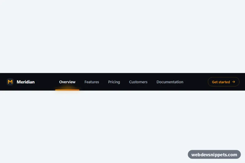
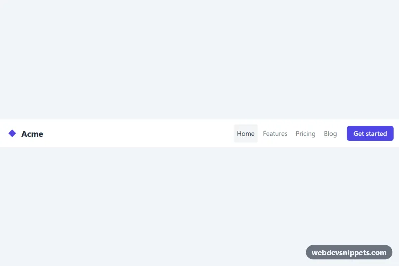
A dark navigation bar in pure CSS and vanilla JavaScript with a glowing amber underline that slides between the links. The indicator follows the mouse as a preview, glides back to the active page when the pointer leaves, and moves for good when a link is clicked. It fits SaaS sites, landing pages and documentation headers.
How it works
The root header.sn-nav holds .sn-bar, a CSS grid with three areas: the .sn-brand logo, the nav.sn-menu with its ul.sn-list of .sn-link anchors, and the .sn-cta button. Inside the menu sits a single span.sn-indicator: an absolutely positioned gradient bar with a soft light cone drawn by its ::before pseudo-element.
On DOMContentLoaded the script initializes every .sn-nav on the page. moveTo() reads the offsetLeft and offsetWidth of a link and writes them into the custom properties --sn-x and --sn-w on the root, which the indicator uses for transform and width. Both properties transition, so the bar stretches and slides at once. The script listens to mouseenter and focus on each link, mouseleave and focusout on the menu, and click to call setActive(), which moves aria-current="page" and fires an sn:change event with detail.link and detail.href.
While a non-active link is previewed, the root gets .sn-previewing and the bar dims. Transitions are only enabled after the first position is set (the .sn-ready class), so the bar does not fly in on load. Without JavaScript the active link shows a static inset underline instead.
Below 768px the menu moves to its own row and scrolls horizontally; the indicator scrolls with the links, and a clicked link is centered.
Customization
--sn-accentand--sn-accent-2on.sn-nav: the gradient and glow of the indicator and the outline color of.sn-cta.--sn-indicator-height: thickness of the sliding bar,3pxby default; try100%with a low-opacity accent for a full highlight block.--sn-speedand--sn-ease: duration and easing of the slide; a springy curve such ascubic-bezier(0.34, 1.56, 0.64, 1)adds a slight overshoot.data-sn-follow="false"on.sn-nav: the indicator stays on the active link and only moves on click or keyboard focus.--sn-bg,--sn-textand--sn-text-active: background, idle link color and the color of the hovered or active link.- Change the
aria-current="page"link in the markup to set the page that is active on load. - Remove the
.sn-indicator::beforerule if you want a flat bar without the light cone.
Accessibility
The links live in a nav landmark with aria-label="Main", and the current page carries aria-current="page", which the script keeps in sync. The indicator is decorative and marked aria-hidden="true". Keyboard focus moves the indicator just like hover, and every link, the logo and the call to action have a visible :focus-visible outline. With prefers-reduced-motion: reduce all transitions are switched off and scrolling is instant.
Usage notes
Each .sn-nav keeps its own state, so several navbars can share a page. The indicator is recalculated on resize and after web fonts load.