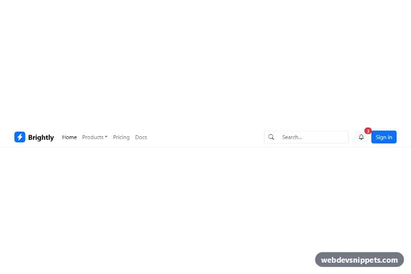
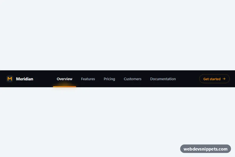
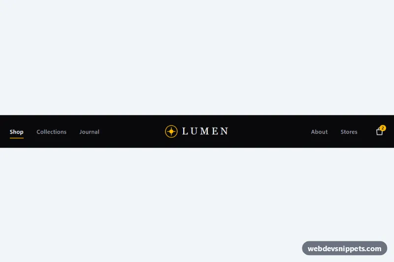
A Bootstrap 5 navbar with a brand logo, a Products dropdown, an inline search field, a notification bell with an unread badge and a sign-in button. It fits SaaS dashboards, marketing sites and web apps that need search and account actions in the header.
How it works
The root is a nav with Bootstrap's navbar navbar-expand-lg classes plus the scoping class .ns-navbar. Inside a .container sit the navbar-brand link with an icon tile .ns-logo, the navbar-toggler button and the collapsible area #ns-menu. The collapse contains a navbar-nav list with a dropdown item, the search form .ns-search built on an input-group, and a group with the bell button and the primary Sign in link.
There is no custom JavaScript. Bootstrap's bundle handles everything through data attributes: data-bs-toggle="collapse" with data-bs-target="#ns-menu" opens and closes the mobile menu, and data-bs-toggle="dropdown" opens the Products menu. Below the lg breakpoint the links, search and buttons stack inside the collapsed panel; from lg up they line up in one row and me-auto pushes the search and buttons to the right. The small style.css only sizes the .ns-logo tile, gives .ns-search a min-width of 220px and adds vertical padding to .dropdown-item.
Customization
navbar-expand-lgon thenav: change tonavbar-expand-mdornavbar-expand-xlto switch to the horizontal layout at a different width.background: var(--bs-primary)in.ns-navbar .ns-logo: set your own color for the logo tile, or replace thebi-lightning-charge-fillicon.bg-whiteon thenav: swap forbg-body-tertiaryor adddata-bs-theme="dark"withbg-darkfor a dark header.min-width: 220pxin.ns-navbar .ns-search: make the search field wider or narrower on desktop.- The badge
bg-dangerspan inside the bell button: change the number, color or remove it; update the button'saria-labelto match. btn-primaryon the Sign in link: usebtn-outline-primaryorbtn-darkfor a different call-to-action style.- Add or remove
dropdown-itementries anddropdown-dividerin thedropdown-menuto change the Products list.
Accessibility
The nav has aria-label="Main navigation", and the toggler carries aria-controls, aria-expanded and aria-label, which Bootstrap updates when the menu opens. The active link uses aria-current="page". The search form has role="search" and a visually-hidden label tied to #ns-search-input. The bell button announces "Notifications, 3 unread" while the visual badge is aria-hidden, and all decorative Bootstrap Icons are hidden from assistive technology. Bootstrap's dropdown supports arrow keys and Escape.
Usage notes
Requires Bootstrap 5 CSS and JS bundle (added automatically) and Bootstrap Icons, which is listed as an external library. If you use two navbars on one page, give the collapse a different id and update data-bs-target and aria-controls.