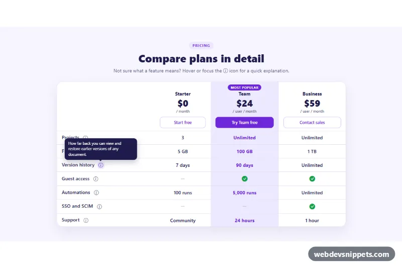
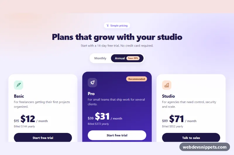
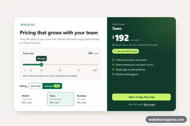
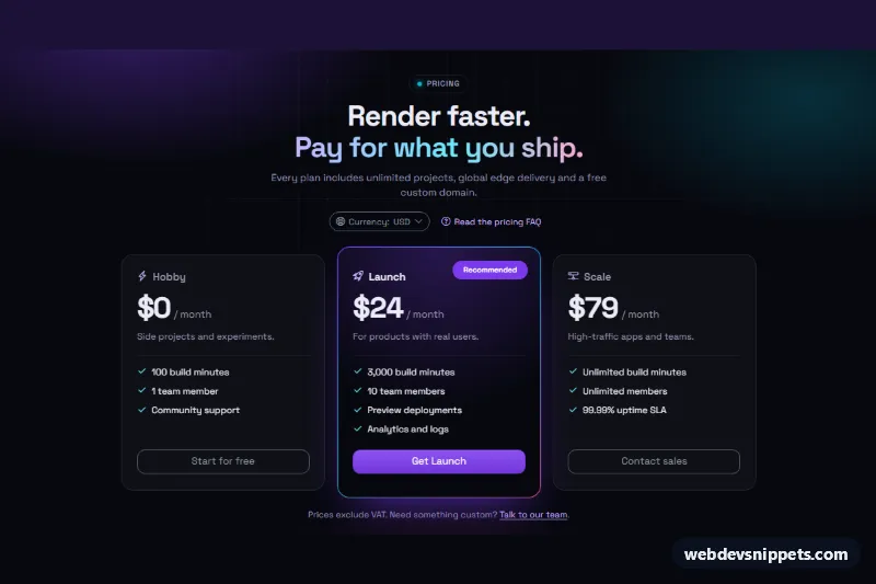
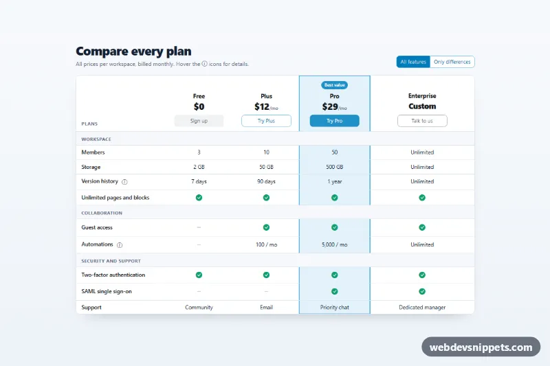
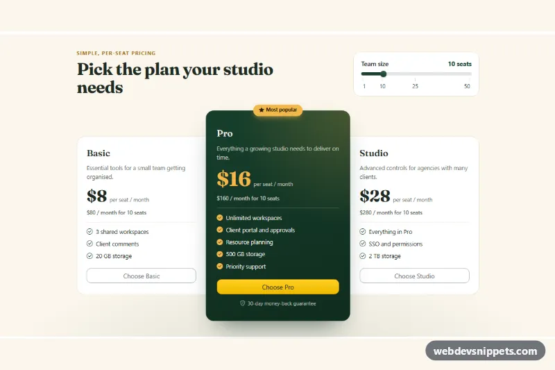
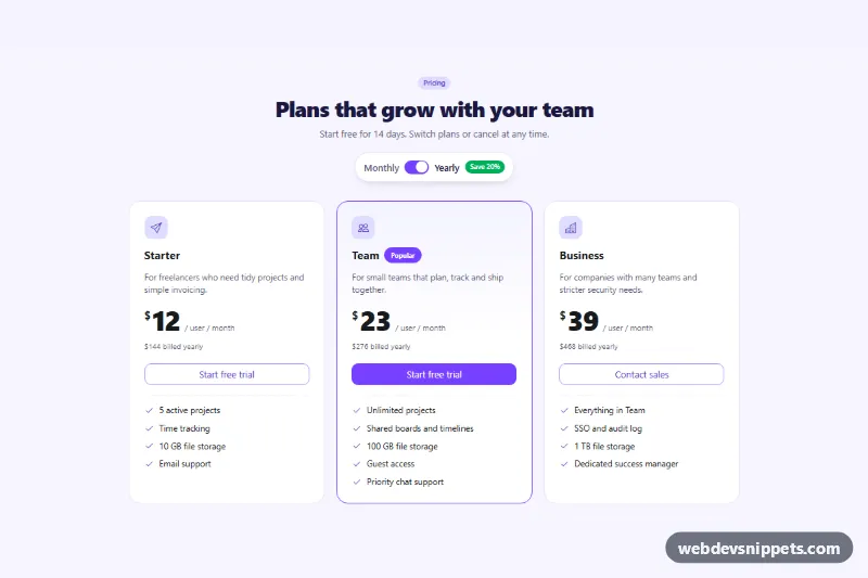
A Bootstrap 5 pricing comparison table with three plans, a highlighted "Most popular" column and an info button next to every feature that opens a short Bootstrap tooltip. Use it on pricing pages where plan limits such as storage, automations or SSO need a one-line explanation without cluttering the table.
How it works
The root is a section.pft-pricing with a heading and a .table-responsive.pft-wrap box that holds a real table.pft-table. The header row contains one th.pft-plan per plan with the name, the price in .pft-amount, the billing period in .pft-per and a call-to-action button. The middle plan and its body cells carry the .pft-pop class, which tints the whole column and adds the .pft-tag label. Each body row starts with a th scope="row" that holds the feature name and a button.pft-info with data-bs-toggle="tooltip" and the explanation in data-bs-title.
The script runs on DOMContentLoaded for every .pft-pricing. It creates a bootstrap.Tooltip for each trigger, listens for show.bs.tooltip so that only one tooltip is open at a time, and closes all tooltips when Escape is pressed. The button marked with data-pft-open shows its tooltip right after loading, so visitors notice the info icons; it closes on the first click or tap elsewhere. On narrow screens the table scrolls sideways and the feature column stays pinned with position: sticky.
Customization
--pft-accentand--pft-accent-softon.pft-pricinginstyle.css: change the violet of the buttons, the popular column tint and the hover state of the info icons.- Move the
.pft-popclass to another plan'sthand cells to highlight a different plan. data-bs-titleon each.pft-infobutton: edit the tooltip text; keep it to one or two sentences.- Remove
data-pft-openfrom the Version history button if you do not want a tooltip open on page load, or add it to another button. --bs-tooltip-bgand--bs-tooltip-max-widthin.pft-tooltip: change the tooltip color and width.- Change
placement: 'top'inscript.jsto'right'to open tooltips beside the icons. - Replace the
bi-check-circle-fillandbi-dash-lgicons, or the text values in the cells, to match your plans.
Use cases
- SaaS pricing pages: compare three plans with a highlighted Most popular column
- Complex plans: an info button next to each feature explains limits such as storage or SSO
- Product websites: check and dash icons show what each plan includes
- Mobile visitors: the table scrolls sideways while the feature column stays pinned
- Keyboard users: tooltips open on focus and close with Escape
Accessibility
The comparison is a semantic table with a hidden caption, column headers and row headers, so screen readers announce the plan and feature for every cell. Check and dash icons are hidden from assistive technology and paired with visually-hidden "Included" or "Not included" text. Info buttons are real button elements with an aria-label; Bootstrap opens their tooltips on hover and on keyboard focus and links them with aria-describedby. Escape closes an open tooltip. The scrollable wrapper is a labelled role="region" with tabindex="0", so keyboard users can scroll it, and all interactive elements have a visible focus outline. Bootstrap's fade animation is disabled when prefers-reduced-motion: reduce is set.
Usage notes
Requires Bootstrap 5 with its JavaScript bundle (added automatically) and Bootstrap Icons. Tooltips are appended to the body, which is why their style lives on the .pft-tooltip custom class set through data-bs-custom-class.