Skip to content

Pricing with Team Size Range

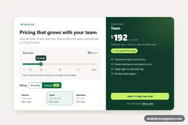
Bootstrap 6 per-seat pricing card with a Range slider for team size, volume tiers, a monthly/annual toggle and a live total price.

Also known as: per seat pricing calculator, saas pricing slider, volume pricing card, team size pricing, user based pricing table

Pricing with Team Size Range live demo

Open in new tab

Bootstrap 6 code (HTML, CSS, JS)

A per-seat pricing card for SaaS pages, built with Bootstrap 6. Visitors drag a Range slider to their team size, and the card picks the volume tier, applies the annual discount and updates the total, yearly bill and savings badge live.

How it works

The root .tsr-root holds a two-column .tsr-card. The left .tsr-config column contains the seat slider. It is a .form-range.theme-success wrapper around an input.form-range-input (1 to 100 seats) with a linked <datalist>, which Bootstrap turns into labelled tick marks. Below it sit a Monthly/Annual radio toggle made of .btn-check labels in a .btn-group, and the three .tsr-tier cards. The right .tsr-summary column shows the plan name, the .tsr-amount total, a breakdown line, the .tsr-savings badge, the feature list and the call to action.

script.js imports Range from the Bootstrap bundle. It disposes the instance the data API created and re-creates it with bubble: true and a formatter, so the value bubble reads "24 seats" instead of "24". On every input event of the slider and every change of the billing radios, update() finds the tier in the TIERS array. It then calculates the per-seat price (minus ANNUAL_DISCOUNT for yearly billing) and writes the totals into the summary. It also marks the current .tsr-tier with .is-current and aria-current. At the maximum value the root gets .is-enterprise, which highlights the "Talk to sales" line.

Customization

  • TIERS in script.js: change the tier names, the first seat of each tier (min) and the per-seat price. Update the .tsr-tier text to match.
  • ANNUAL_DISCOUNT in script.js: set the yearly discount (0.2 = 20%). Change the .tsr-save-chip label too.
  • min, max and value on #tsr-seat-range: set the seat range and the starting team size. Edit the <datalist> options to move or relabel the ticks.
  • --tsr-brand, --tsr-brand-dark and --tsr-accent on .tsr-root: recolor the slider, the summary panel and the lime highlights. The root also maps Bootstrap's --bs-success-* tokens to these colors.
  • --bs-range-track-height and --bs-range-thumb-width on .tsr-range: make the slider track and thumb thicker or thinner.
  • The formatter passed to Range.getOrCreateInstance(): change the bubble text, for example to "24 users".

Use cases

  • SaaS pricing pages: visitors drag a slider to their team size and see the per-seat price and total
  • Collaboration and project tools: volume tiers show how the price per seat drops as the team grows
  • Annual versus monthly offers: the billing toggle applies the yearly discount and shows a savings badge
  • Enterprise sales funnels: the maximum slider value highlights a talk to sales line for large teams

Accessibility

The slider has a real <label>, help text via aria-describedby, and an aria-valuetext such as "24 seats, Team plan, $192 per month", so screen readers announce more than a number. The total uses aria-live="polite". The billing toggle is a labelled radio group that works with arrow keys. The bubble and ticks are aria-hidden. Focus outlines are visible on the slider, toggle, links and button, and the tier transitions are off under prefers-reduced-motion.

Bootstrap 6 notes

Bootstrap 5's .form-range class on the input becomes a .form-range wrapper with an inner .form-range-input. Bootstrap 6 adds the filled track, the data-bs-bubble value bubble and datalist ticks. btn-outline-success is now btn-outline theme-success, and .btn-check moves onto the label that wraps the radio. text-bg-success badges become badge badge-subtle theme-success. Built on Bootstrap 6.0.0-alpha.1, so APIs may still change. Icons come from Bootstrap Icons.
Pricing with Team Size Range at a glance

Framework
Bootstrap 6
Code
HTML, CSS, JavaScript
JavaScript
Vanilla JavaScript, no jQuery
Dependencies
Bootstrap 6, Bootstrap Icons
Layout
Responsive, works on mobile
Category
Pricing Tables
License
Free for personal and commercial use

Questions about this template

Can I use the Pricing with Team Size Range code for free?

Yes. You can copy or download the code and use it in personal and commercial projects, including client work. No sign-up is needed. Reselling it as part of a component library or template collection is not allowed; see the license.

How do I add it to my website?

Load Bootstrap 6 and Bootstrap Icons from a CDN (the links are under Requirements). Paste the HTML where the component should appear, add the CSS to your stylesheet and load the JavaScript before the closing </body> tag. Download HTML gives you a complete page with everything already linked.

Does it need jQuery or a JavaScript framework?

No. The script is plain vanilla JavaScript, so it works without jQuery, React or Vue. You can still use the markup inside those frameworks.

Does it work on mobile?

Yes. The layout adapts to small screens. Use the Mobile and Tablet buttons above the live demo to check it at phone and tablet width.

Requirements

Add these to your page (already included in the download):

  • <link rel="stylesheet" href="https://cdn.jsdelivr.net/npm/bootstrap@6.0.0-alpha.1/dist/css/bootstrap.min.css">
  • <script type="module" src="https://cdn.jsdelivr.net/npm/bootstrap@6.0.0-alpha.1/dist/js/bootstrap.bundle.min.js"></script>
  • <link rel="stylesheet" href="https://cdn.jsdelivr.net/npm/bootstrap-icons@1.11.3/font/bootstrap-icons.min.css">

Built for Bootstrap 6.0.0-alpha.1. Bootstrap 6 ships as an ES module, so its script and this component's JavaScript load with type="module". Alpha releases can still change before the stable version.

Pricing with Team Size Range – Bootstrap 6 pricing tables component screenshot
Pricing with Team Size Range · Bootstrap 6 Pricing Tables

More Pricing Tables

Pricing Cards with Billing Toggle – Bootstrap 5 pricing tables preview

Pricing Cards with Billing Toggle

Bootstrap 5 pricing cards with a Monthly / Annual segmented switch that updates prices, savings and yearly totals, plus a highlighted featured plan.

Dark Pricing Section – Bootstrap 6 pricing tables preview

Dark Pricing Section

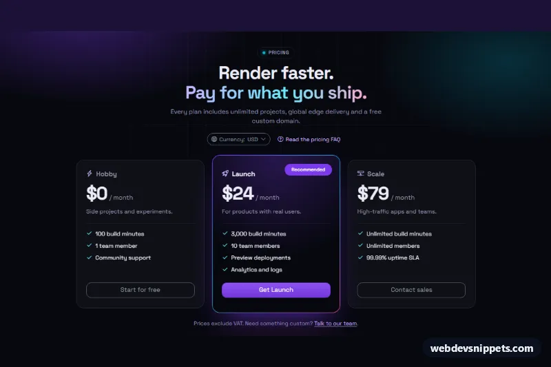
Dark Bootstrap 6 pricing section with three glass cards, a gradient-bordered recommended plan, a currency Menu and an FAQ link that opens a Drawer with an accordion.

Pricing Comparison Table – Bootstrap 6 pricing tables preview

Pricing Comparison Table

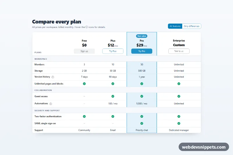
Bootstrap 6 feature comparison table across four plans with check icons, a highlighted Pro column, tooltips, a sticky feature column and an Only differences filter.

Pricing Table with Highlighted Plan – Bootstrap 6 pricing tables preview

Pricing Table with Highlighted Plan

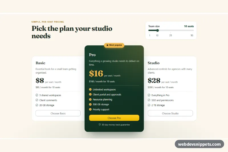
Bootstrap 6 pricing cards with a raised dark green Most popular plan, gold accents and a team-size Range slider that recalculates every plan's monthly total.

Pricing Table with Monthly Yearly Toggle – Bootstrap 6 pricing tables preview

Pricing Table with Monthly Yearly Toggle

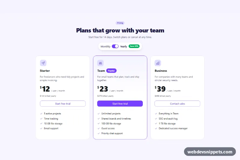
Bootstrap 6 three-tier pricing table with a monthly/yearly billing switch that updates every price and billing note, plus a save badge and a popular plan.

Pricing Plan Comparison Table – WordPress pricing tables preview

Pricing Plan Comparison Table

A pricing plan comparison table for the block editor that compares three plans across eight features in a striped table, with prices in the header and plan buttons below.