Skip to content

Product Page with Vertical Thumbnails and Size Chart

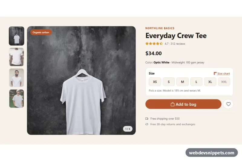
Bootstrap 5 product detail section with a vertical thumbnail gallery, size buttons with validation and a size chart modal with a cm/inch switch.

Also known as: product page with size chart, product gallery vertical thumbnails, clothing product detail page, size guide modal, apparel product page

Product Page with Vertical Thumbnails and Size Chart live demo

Open in new tab

Bootstrap 5 code (HTML, CSS, JS)

A Bootstrap 5 product detail section for clothing stores: a photo gallery with a vertical thumbnail column, size buttons, an add-to-bag button that requires a size, and a size chart modal that switches between centimeters and inches. Use it on apparel, shoe and accessory product pages.

How it works

The root is section.vts-page with a two-column Bootstrap grid. The left column holds .vts-gallery, a CSS grid. On phones the .vts-stage photo comes first and .vts-thumbs becomes a horizontal, scrollable row below it; from 768px the thumbnails form a narrow column on the left, sized by --vts-thumb-w. Every .vts-thumb button stores the large image in data-src and its description in data-alt.

The script listens for click on the thumbnails and swaps the src and alt of .vts-main, toggles is-active and aria-pressed, and updates the "1 / 4" .vts-counter. Arrow keys, Home and End move between thumbnails and show the matching photo. While the new photo loads, .vts-main gets is-loading for a short fade.

The size options are Bootstrap btn-check radios styled as .vts-size tiles; a disabled radio shows a sold-out size with a strike-through. On change the .vts-size-note text shows the chest width from data-chest. Submitting .vts-form without a size adds is-invalid to .vts-sizes, shows a hint and focuses the first available size; with a size it writes a confirmation into .vts-status.

The "Size chart" link opens #vts-size-modal through data-bs-toggle="modal". Each table cell stores its value in data-cm; the cm/in radios recalculate all cells. On show.bs.modal the row of the chosen size gets vts-current.

Customization

  • --vts-accent and --vts-accent-dark in .vts-page: recolor the badge, brand line, size chart link and the add-to-bag button.
  • --vts-bg and --vts-ink in .vts-page: change the page background and the selected size and thumbnail border.
  • --vts-thumb-w in .vts-page: make the thumbnail column wider or narrower.
  • --vts-stage-max-h in .vts-page and aspect-ratio: 9 / 10 in .vts-main: change the height and shape of the main photo.
  • data-chest on each size radio and data-cm on the chart cells: enter your own measurements.
  • Add disabled to any size radio to mark it as sold out.
  • The submit handler in script.js: replace the status message with a fetch() call to your cart API.

Use cases

  • Clothing stores: shoppers click thumbnails in a vertical column to switch the main product photo
  • Shoe and accessory shops: size buttons mark sold-out sizes and require a choice before adding to bag
  • Fit-sensitive products: a size chart modal switches between centimeters and inches and highlights the chosen size
  • Fashion product pages: a photo counter and keyboard navigation make browsing the gallery easy
  • Apparel brands: a wishlist button and add-to-bag form sit beside the gallery

Accessibility

Thumbnails are real buttons inside a labelled role="group" with aria-pressed and descriptive image alt text. Sizes are native radios in a fieldset with a legend, so arrow keys work and sold-out sizes have hidden "(sold out)" text. The size note uses aria-live, the confirmation uses role="status", and the wishlist button toggles aria-pressed and its label. The modal is labelled by its title, and the table has a caption and scope attributes. Transitions are off under prefers-reduced-motion: reduce.

Usage notes

Requires Bootstrap 5 with its JS bundle and Bootstrap Icons. The photos come from Unsplash; replace them with your own product images. For several products on one page, give each modal and radio group unique id and name values.
Product Page with Vertical Thumbnails and Size Chart at a glance

Framework
Bootstrap 5
Code
HTML, CSS, JavaScript
JavaScript
Vanilla JavaScript, no jQuery
Dependencies
Bootstrap 5, Bootstrap Icons
Layout
Responsive, works on mobile
Category
Product Details
License
Free for personal and commercial use

Questions about this template

Can I use the Product Page with Vertical Thumbnails and Size Chart code for free?

Yes. You can copy or download the code and use it in personal and commercial projects, including client work. No sign-up is needed. Reselling it as part of a component library or template collection is not allowed; see the license.

How do I add it to my website?

Load Bootstrap 5 and Bootstrap Icons from a CDN (the links are under Requirements). Paste the HTML where the component should appear, add the CSS to your stylesheet and load the JavaScript before the closing </body> tag. Download HTML gives you a complete page with everything already linked.

Does it need jQuery or a JavaScript framework?

No. The script is plain vanilla JavaScript, so it works without jQuery, React or Vue. You can still use the markup inside those frameworks.

Does it work on mobile?

Yes. The layout adapts to small screens. Use the Mobile and Tablet buttons above the live demo to check it at phone and tablet width.

Requirements

Add these to your page (already included in the download):

  • <link rel="stylesheet" href="https://cdn.jsdelivr.net/npm/bootstrap@5.3.3/dist/css/bootstrap.min.css">
  • <script src="https://cdn.jsdelivr.net/npm/bootstrap@5.3.3/dist/js/bootstrap.bundle.min.js"></script>
  • <link rel="stylesheet" href="https://cdn.jsdelivr.net/npm/bootstrap-icons@1.11.3/font/bootstrap-icons.min.css">
Product Page with Vertical Thumbnails and Size Chart – Bootstrap 5 product details component screenshot
Product Page with Vertical Thumbnails and Size Chart · Bootstrap 5 Product Details

More Product Details

Bootstrap Product Page – Bootstrap 5 product details preview

Bootstrap Product Page

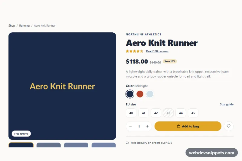
Bootstrap 5 product details page with image gallery, color and size pickers, quantity stepper, and tabs for description, specifications and customer reviews.

Product Detail with Gallery – Tailwind CSS product details preview

Product Detail with Gallery

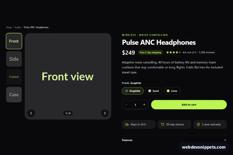
Dark Tailwind CSS product page section with a thumbnail image gallery, finish options, quantity stepper and add to cart button with loading state.

Frequently Bought Together Section for Shopify – Shopify product details preview

Frequently Bought Together Section for Shopify

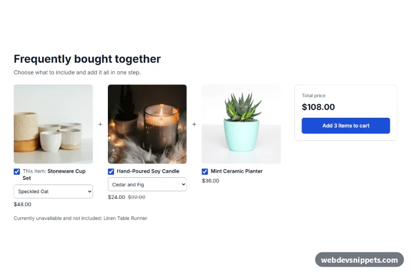
Shopify section that shows the current product with up to 3 picked products, checkboxes, variant selects, a live total and one button that adds everything checked to the cart.

Sticky Add to Cart Bar for Shopify – Shopify product details preview

Sticky Add to Cart Bar for Shopify

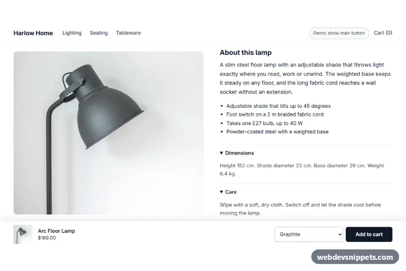
Shopify section: a bar fixed to the bottom of product pages that appears once the main add-to-cart button scrolls away, with image, price, variant select and a real product form.

Product Detail with Image Zoom Lens – Tailwind CSS product details preview

Product Detail with Image Zoom Lens

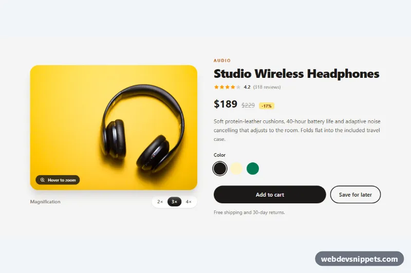
Tailwind CSS product detail section with a round magnifier lens that zooms the photo on hover or arrow keys, plus adjustable 2x to 4x levels.