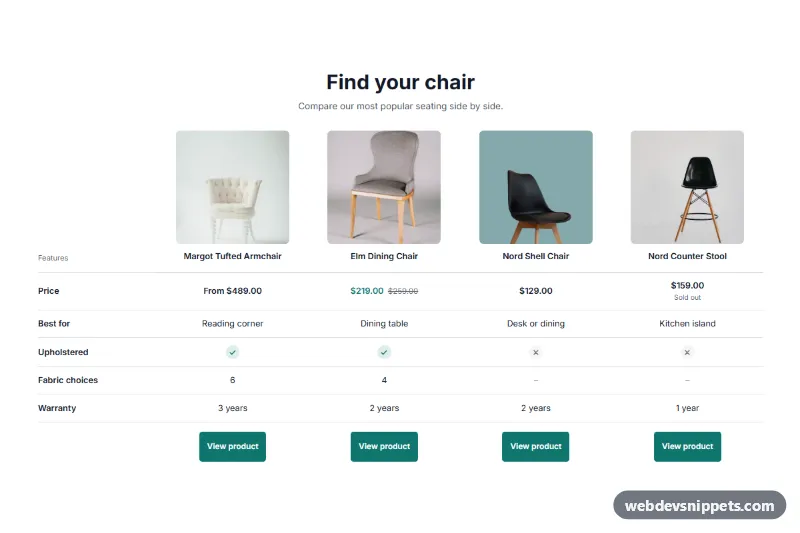
A product comparison table for Shopify: a Liquid section that puts 2 to 4 products side by side, with live images, prices and availability, plus feature rows you write yourself in the theme editor. No app is needed.
How it works
The section outputs a real HTML table. Each column header holds a product's image and linked title, and the first row always shows its price. Sale prices appear with the compare-at price struck through, products with variable prices start with "From", and sold-out products get a small label. All of that comes from the products themselves.
The other rows are blocks. You add a Row block, give it a label and enter one value per product. Typing yes or no shows a check or cross icon, any other text is shown as written, and an empty value shows a dash. Below the rows, each column ends in a button linking to the product page.
On narrow screens the table keeps its column widths and scrolls sideways inside .wds-pc__scroll, so the page itself never overflows. The first column stays pinned with position: sticky and gains a soft shadow while scrolled, and the scroll hint appears only when the table really does not fit.
Customization
In the theme editor, the section is called WDS Product comparison:
- Products: choose 2 to 4. Each row's values follow this order.
- Row blocks: Label and Product 1 value to Product 4 value.
- Heading, Subheading: the text above the table.
- First column heading, Price row, Button, Price prefix for variable prices, Sold out, Scroll hint: visible labels.
- Table description, Yes, No and the other labels under Screen reader labels.
- Background, Text, Accent: colors. With a light accent, the button text and sale price switch to a darker color automatically.
- Side padding, Top padding, Bottom padding: spacing.
Use cases
- Online stores with similar products: compare two to four items side by side with live images and prices
- Stores with sales: show sale prices with the compare-at price struck through and sold-out labels
- Spec-heavy catalogs: write feature rows in the theme editor, using yes or no to show check icons
- Mobile shoppers: keep the first column sticky while the table scrolls on small phones
Accessibility
It uses scope on row and column headers and a hidden caption. The scroll area is a focusable, labelled region, so keyboard users can scroll it with the arrow keys. Icons are hidden from screen readers and replaced by the text labels above, and each button's name includes its product. Focus outlines are visible, and motion is removed for prefers-reduced-motion.
Usage notes
It requires an Online Store 2.0 theme. Row values are typed by hand: they are not read from metafields or product data, so you must keep them accurate and update them when a product changes. If you reorder the products, the values do not move with them.
With products selected and no rows, the live store shows just prices and buttons. Sample rows appear only when no products are selected or in the theme editor.
The preview uses sample products and feature values for an invented store, and its links show a demo message instead of opening a page. Photos in the preview are from Unsplash; section.liquid contains none and uses your product images.