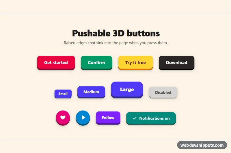
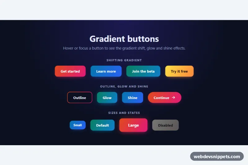
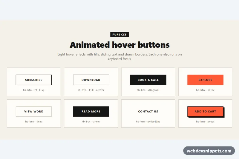
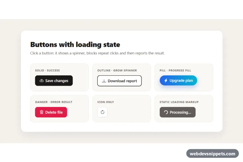
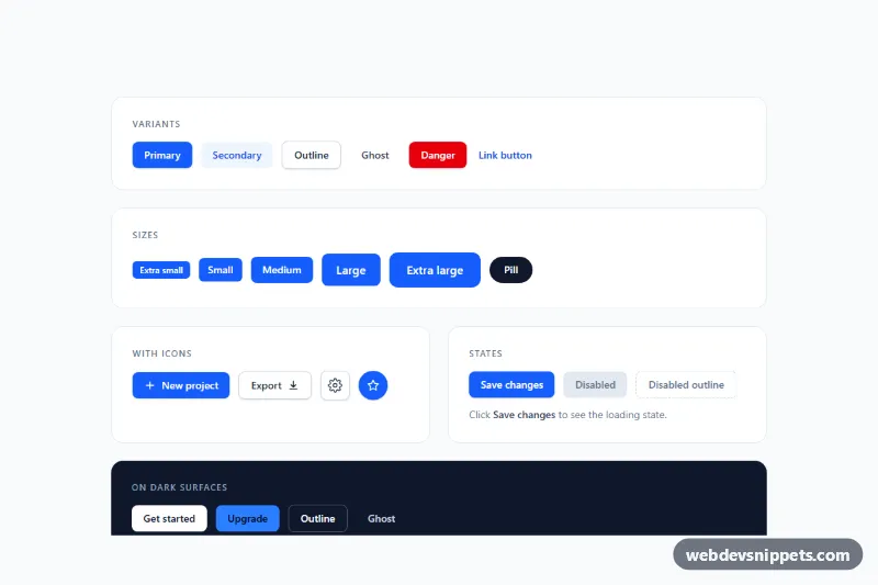
A set of chunky 3D pushable buttons built with Tailwind CSS: each button has a raised front face sitting on a darker edge, lifts slightly on hover and sinks into the page when it is clicked. The set includes color variants, three sizes, round icon buttons, a disabled state and toggle buttons that stay pressed, ready for call-to-action areas, games and playful landing pages.
How it works
Every button is a real button.pb-push containing three stacked spans. .pb-shadow is a blurred, semi-transparent layer that sits below everything, .pb-edge is the darker "side" of the key (for example bg-rose-900), and .pb-front is the colored face with the label (for example bg-rose-600). The two back layers are absolutely positioned to fill the button, and the front face is moved up with transform: translateY(var(--pb-rest)), which reveals the edge underneath and creates the 3D look.
style.css handles the motion. On hover (only on devices that support it) the face rises to --pb-hover and the shadow drops; on :active the face moves down to --pb-press with a very short transition, so the click feels instant, and on release it springs back with a cubic-bezier(.3, .7, .4, 1) easing. A gradient on .pb-edge darkens its ends to suggest a curved surface.
The optional script initializes every .pb-buttons section. Buttons with data-pb-toggle flip their aria-pressed value on click, swap the text inside [data-pb-label] with data-on-label or data-off-label, and announce the new state. While aria-pressed="true" the face stays sunk and a .pb-check icon appears. Without JavaScript all the press animations still work.
Customization
--pb-rest,--pb-hoverand--pb-presson.pb-pushinstyle.css: control the button height at rest, on hover and while pressed..pb-push--smand.pb-push--lg: size modifiers that set shallower or deeper edges; combine them with smaller or larger padding on.pb-front.--pb-speedon.pb-push: changes how slowly the face springs back after a click.- Swap the pair
bg-rose-900on.pb-edgeandbg-rose-600on.pb-frontfor any Tailwind shade pair to create a new color; keep the edge two or three steps darker. - Replace
rounded-xlwithrounded-fullon the button and all three spans for pill or circular buttons, as in the icon examples. data-on-labelanddata-off-labelon a[data-pb-toggle]button: set the text shown in each state.
Use cases
- Landing pages: a raised call-to-action that sinks into the page when clicked
- Games and playful sites: chunky colored keys in three sizes feel like real arcade buttons
- Kids and education apps: big, friendly buttons with round icon variants invite tapping
- Settings screens: toggle buttons stay pressed to show an on state, with a disabled style for unavailable options
- Design systems: a reference set of color variants for primary and secondary actions
Accessibility
All controls are native button elements, so Enter and Space trigger them and they appear in the tab order. Decorative layers and icons use aria-hidden="true"; the icon-only buttons have an aria-label. Toggle buttons expose their state with aria-pressed, and a visually hidden [data-pb-status] region with aria-live="polite" announces the new label. Keyboard focus shows a thick dark outline offset from the button. Under prefers-reduced-motion: reduce the transitions are removed and the buttons change position instantly. Darker shades were chosen for white text to keep contrast readable.
Usage notes
Requires the Tailwind browser build (added automatically). Several .pb-buttons sections can share a page because the script scopes all queries to each section.