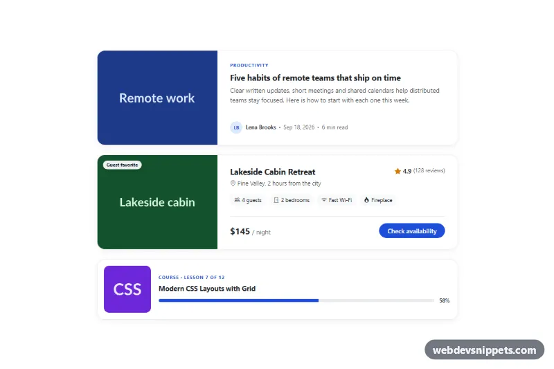
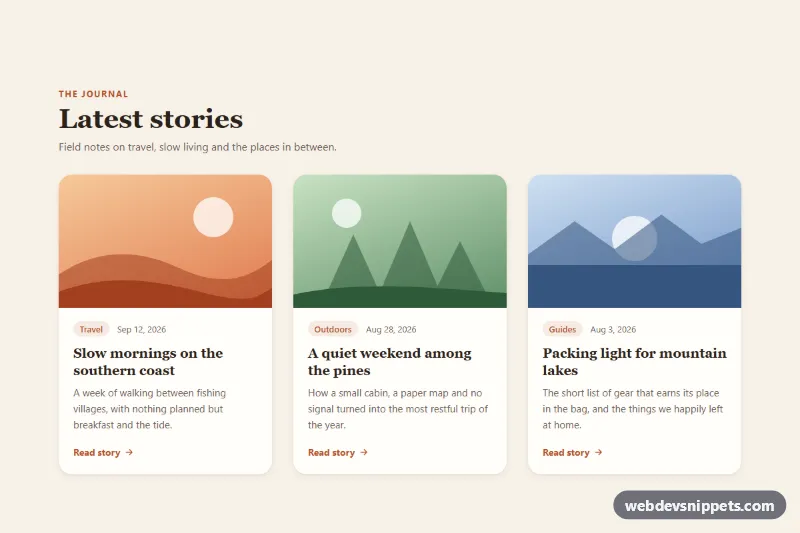
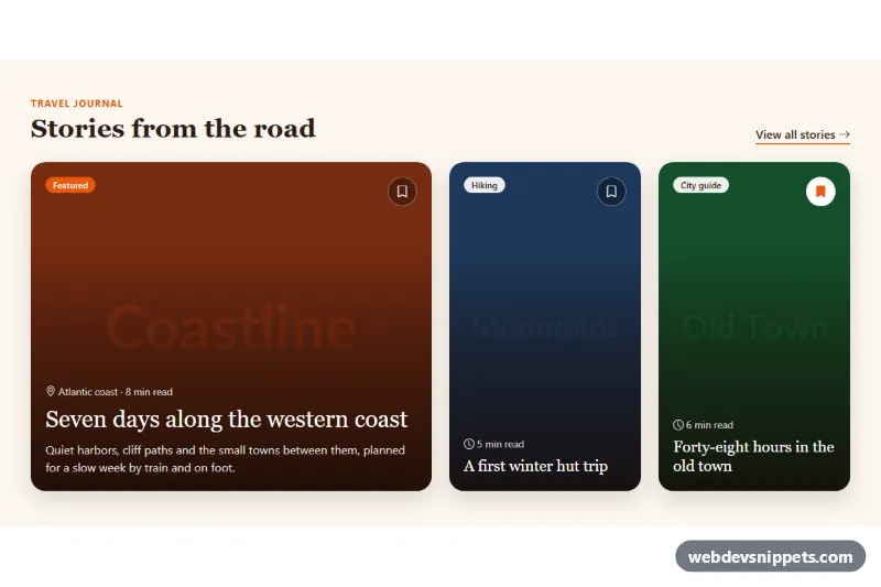
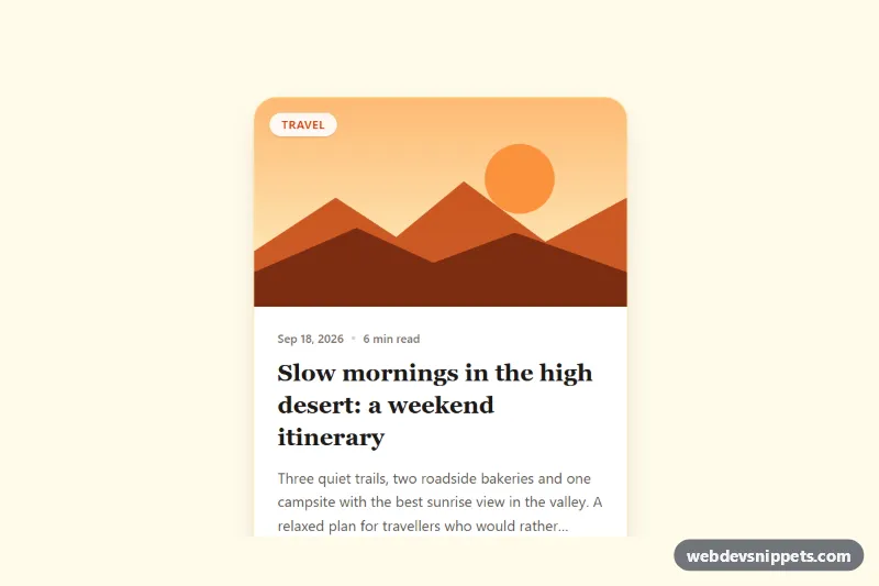
A set of three Bootstrap 5 horizontal cards with the image on the left and content on the right: a blog article card, a listing card with rating, features and price, and a compact course card with a progress bar. Use them in blog indexes, search results, booking sites and learning dashboards.
How it works
The cards sit in .hc-list, a one-column grid limited to 920px. Each article.card.hc-card uses a Bootstrap row g-0: the image column (col-md-5 col-lg-4) contains .hc-media, and the content column contains .hc-body, a flex column that pushes .hc-meta or .hc-footer to the bottom. On phones the columns stack and the image keeps a fixed ratio from --hc-img-ratio. From the md breakpoint the image is positioned absolutely and covers the whole column with object-fit: cover, so it always matches the height of the text.
The article card and the compact card use Bootstrap's stretched-link on the title, so the whole card is clickable. The .hc-card--listing variant has a real button instead, a .hc-badge over the photo, a .hc-rating line and .hc-features pills. The .hc-card--compact variant keeps a small square thumbnail next to the text even on phones. Hovering a card lifts it, deepens the shadow and zooms the image slightly. A small script reads aria-valuenow from each progress bar in .hc-progress, sets the width of .hc-progress__bar and fills .hc-progress__value, so the value is defined in one place.
Customization
--hc-accentand--hc-accent-hoverin.hc-list: change the kicker, link hover, avatar, button, focus outline and progress color.--hc-img-ratioin.hc-list: set the image ratio of stacked cards on phones, e.g.4 / 3or1 / 1.--hc-radiusin.hc-list: make the corners rounder or set0.5remfor a sharper look.--hc-thumbin.hc-list(phones) and in the.hc-card--compactrule inside themin-width: 576pxmedia query (larger screens): resize the square thumbnail of the compact card.col-md-5 col-lg-4on the image column andcol-md-7 col-lg-8on the text column: usecol-md-4andcol-md-8for a narrower image on tablets.aria-valuenow="58"on the progress bar: set the course progress; the bar and percentage update on load.background: #e2e8f0in.hc-media: change the placeholder color shown while images load.
Accessibility
Each card is an article with a heading. Thumbnails that only repeat the title use an empty alt, while the listing photo has descriptive alt text. When a stretched link receives keyboard focus, :has(.stretched-link:focus-visible) draws an outline around the whole card. The rating includes visually hidden "out of 5" text, the date uses a time element, and the progress bar has role="progressbar" with aria-label and value attributes. Icons and initials are aria-hidden. Hover lift and image zoom are disabled with prefers-reduced-motion: reduce.
Usage notes
Requires Bootstrap 5 and Bootstrap Icons. The script is only needed for the progress bar; without it the bar stays empty.