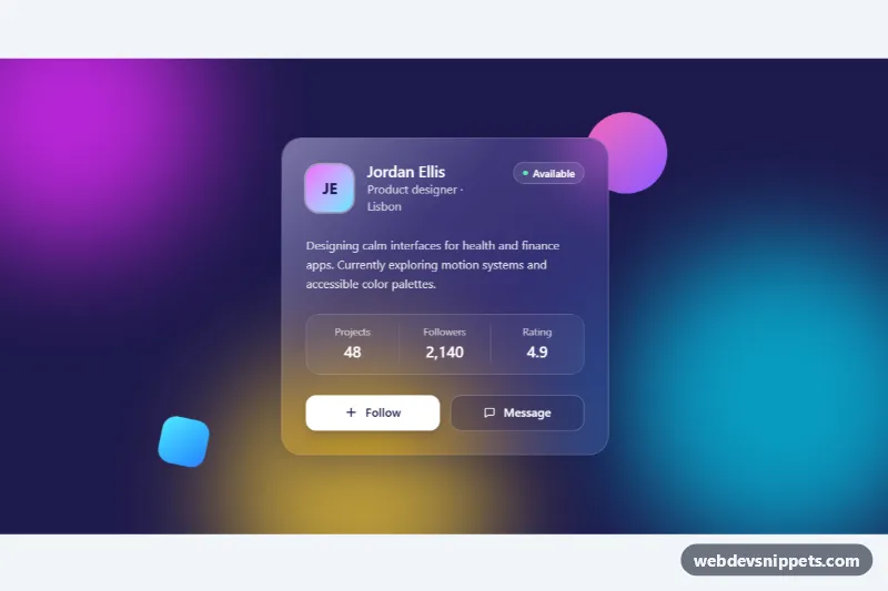
A glassmorphism profile card built with Tailwind CSS: a frosted, semi-transparent panel floating over a colorful background of blurred gradient blobs. It works well for profile previews, team pages, landing page highlights or any spot where you want a modern, layered look.
How it works
The root is section.tgc-scene, a dark bg-indigo-950 stage with isolate and overflow-hidden. Behind the content sits an aria-hidden layer with three .tgc-blob circles (fuchsia, cyan and amber) softened with blur-3xl, plus two small sharp gradient shapes that make the blur effect behind the glass easy to see.
The card itself is article.tgc-card. The frosted effect comes from Tailwind utilities: bg-white/10 for the translucent fill, backdrop-blur-2xl and backdrop-saturate-150 to blur and boost the colors behind it, and border-white/25 for the bright glass edge. In style.css, a .tgc-card::before gradient adds a diagonal light reflection, and an @supports not rule switches to a more opaque indigo fill when the browser has no backdrop-filter support, so the text stays readable. The blobs drift slowly with the tgc-float keyframes.
Inside the card are an initials avatar, name, location, an "Available" pill, a short bio, a three-column stats list (dl) and two actions. The script runs on DOMContentLoaded for each .tgc-card: clicking [data-tgc-follow] toggles aria-pressed, swaps the label between "Follow" and "Following", switches the plus and check icons with the hidden class, and adds one to the follower number stored in data-tgc-count.
Customization
bg-white/10andbackdrop-blur-2xlon.tgc-card: raise the opacity (bg-white/20) or lower the blur (backdrop-blur-md) for a clearer or frostier glass.- The color classes on
.tgc-blob--a,.tgc-blob--band.tgc-blob--c(bg-fuchsia-500,bg-cyan-400,bg-amber-300): change them to match your brand palette. bg-indigo-950on.tgc-scene: set the base color the blobs glow on; a lighter base gives a pastel look.animation-durationon.tgc-blobinstyle.css: make the drift faster or slower, or remove the animation for a static background.data-tgc-counton the Followers value: set the starting number used by the Follow button.rounded-3xlon the card: userounded-2xlfor tighter corners.
Accessibility
The card is an article labelled by #tgc-name, and the decorative background and avatar are aria-hidden. The Follow control is a button with aria-pressed and a fixed aria-label, so screen readers hear "Follow Jordan Ellis, toggle button, pressed" instead of a changing name; a role="status" region confirms each change. White text sits on a dark, blurred backdrop for strong contrast, and buttons show a white focus-visible outline. Blob motion stops under prefers-reduced-motion, and button transitions use motion-reduce:transition-none.
Usage notes
backdrop-filter needs a colorful or detailed background behind the card to be visible; over a flat color it looks like a plain translucent box. Multiple cards can share a page because the script scopes its queries to each .tgc-card; give each name heading a unique id.