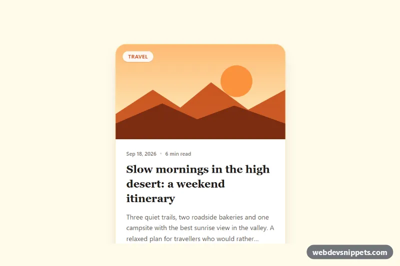
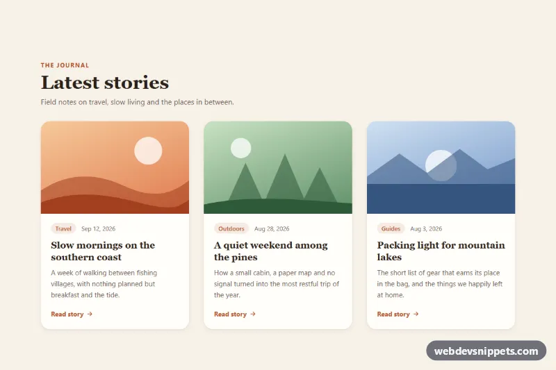
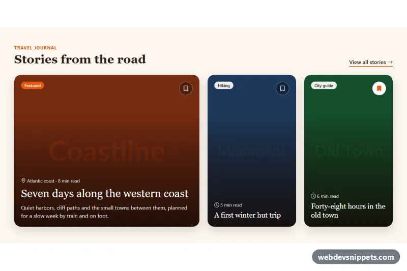
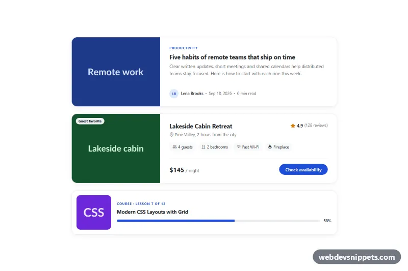
A warm, editorial blog post card built entirely with Tailwind CSS utility classes: a cover illustration with a category badge, publish date and reading time, a serif headline, a clamped excerpt and an author row. Use it on blog index pages, "related articles" sections, newsletter archives or a magazine-style homepage grid.
How it works
The root is .tbp-card, an article with group, relative and overflow-hidden. The top .tbp-cover block keeps a fixed 16:9 frame with aspect-[16/9] and holds an inline SVG landscape, so the card needs no external image. A category badge sits on top of it with absolute left-4 top-4.
The body is a flex column. The meta line uses a real time element with a datetime attribute, followed by the reading time. The headline link .tbp-link is the only interactive element: its after:absolute after:inset-0 pseudo-element stretches over the whole card, so clicking anywhere on the card opens the post while screen readers still hear a single, meaningful link. The excerpt is limited to three lines with line-clamp-3, so cards stay the same height in a grid even when excerpts differ in length.
Hover effects come from the group class: the cover SVG scales with group-hover:scale-105, the title turns orange and the arrow in the author row slides right. The shadow deepens on hover through arbitrary shadow-[...] values. There is no JavaScript.
Customization
max-w-smon.tbp-card: raise tomax-w-md, or remove it and place several cards in agrid sm:grid-cols-2 lg:grid-cols-3 gap-6wrapper for a blog index.aspect-[16/9]on.tbp-cover: useaspect-[4/3]oraspect-squarefor taller cover images.- Replace the
svginside.tbp-coverwith<img src="https://placehold.co/800x450" alt="" class="h-full w-full object-cover">to use a real photo; keep thegroup-hover:scale-105classes for the zoom. line-clamp-3on the excerpt: change toline-clamp-2for compact cards or remove it to show the full text.font-serif text-2xlon theh3: switch tofont-sans text-xlfor a more product-like look.from-orange-400 to-rose-500on the avatar: change the gradient, or swap the initials for animgwithrounded-full.text-orange-700,bg-orange-100andfocus-within:ring-orange-500/30: replaceorangewith another Tailwind color to retheme the card.
Accessibility
The card is an article with an h3 headline; adjust the heading level to fit your page outline. Only the title is a link, so keyboard users reach each card with one Tab stop and the accessible name is the post title rather than a generic "Read more". When the link has focus, focus-within:ring-4 draws a clear ring around the whole card. The cover SVG, avatar initials, dot separator and arrow are aria-hidden. Dates use time datetime for machine-readable values. All motion uses motion-reduce: variants, so zoom and arrow movement are disabled under prefers-reduced-motion.
Usage notes
If you need additional links inside the card (for example an author profile), give them relative z-10 so they sit above the stretched title link.