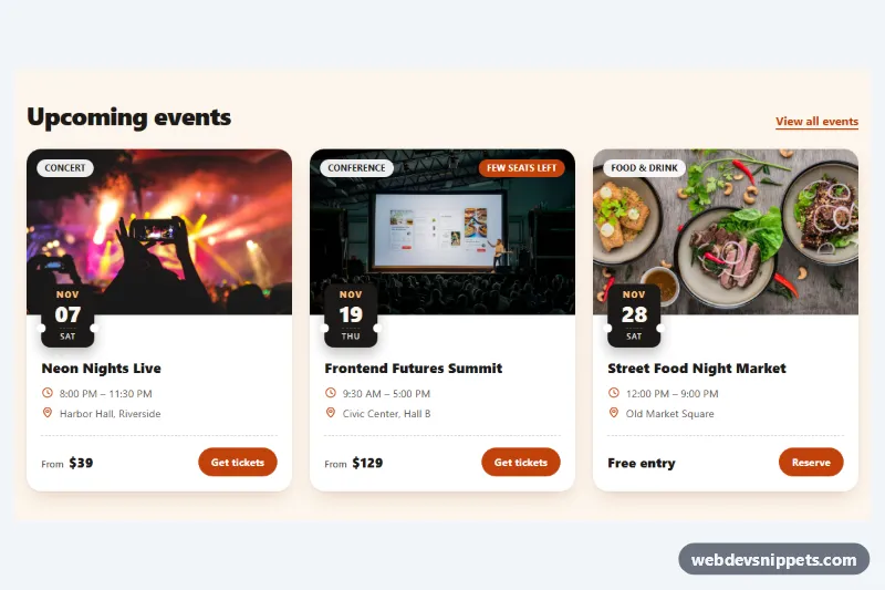
Event Card with Photo and Date Badge
Pure CSS event cards with a cover photo, ticket-stub date badge, category chip, time and venue details, price and a ticket button.
Flexible content containers.
8 component(s)
Pure CSS event cards with a cover photo, ticket-stub date badge, category chip, time and venue details, price and a ticket button.
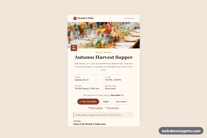
Bootstrap 5 event invitation card with a header photo, date chip, event details grid, RSVP buttons, calendar and directions links.
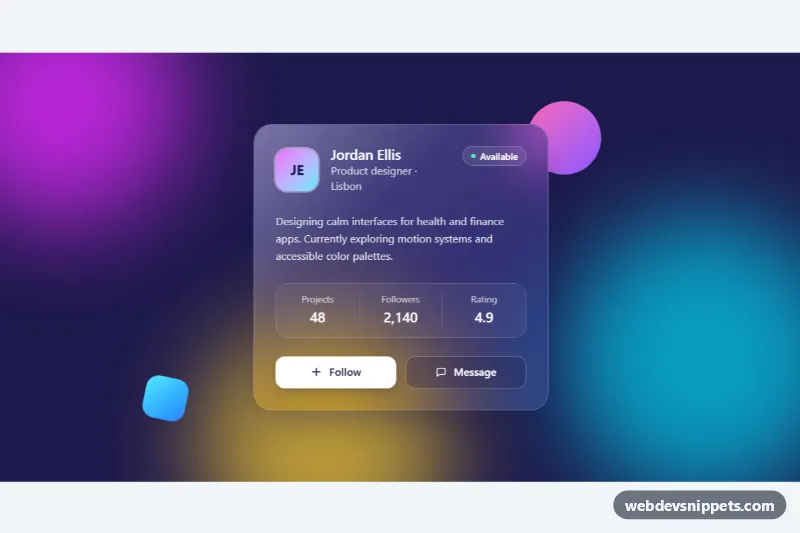
Frosted glass profile card in Tailwind CSS with backdrop blur, a light reflection and a follow button over colorful animated gradient blobs.
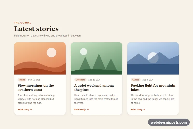
Pure CSS blog card grid where each card lifts with a deeper shadow and zooms its image on hover or keyboard focus.
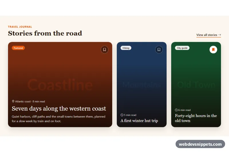
Bootstrap 5 image cards with text overlaid on photos, a readability gradient, category badges, save buttons and a featured layout.
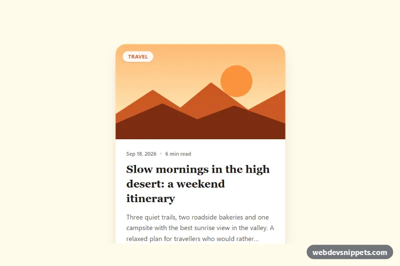
Tailwind CSS blog post card with cover illustration, category badge, date, reading time, clamped excerpt, author row and a fully clickable area.
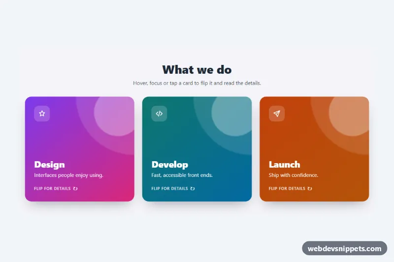
Three pure CSS 3D flip cards that turn on hover, keyboard focus or tap to reveal details and a link on the back.
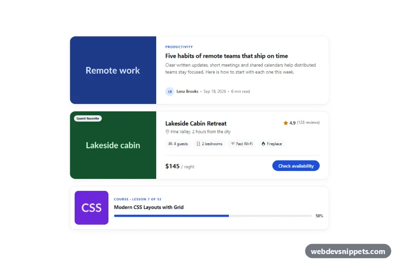
Three Bootstrap 5 horizontal cards with the image on the left: an article card, a listing card with rating and price, and a compact course card.
A card is a flexible container that groups related content and actions about a single subject. A typical card has an image or icon, a title, some text and one or more actions, wrapped in a box with a border or shadow. Cards are among the most widely used UI patterns: product tiles, blog previews, pricing options, user profiles, dashboard widgets, feature blocks and settings panels are all variations of the card.
Use cards when you display a collection of similar items that users browse and compare, or when you want to separate distinct pieces of content on a busy page. For dense data that needs comparison across many attributes, a table is usually a better choice.
aspect-ratio and object-fit for card images so heights stay even.repeat(auto-fill, minmax(...)) adapts nicely without breakpoints.The card examples cover Bootstrap 6, Bootstrap 5, Tailwind CSS and pure CSS. Bootstrap versions are based on the card component and the grid, and Bootstrap 6 examples use the theme-* colour roles for borders, backgrounds and accents. Tailwind CSS versions build the card from utilities, and the pure CSS cards use custom properties so you can change radius, shadow and spacing in one place. Use the framework filter to find bootstrap card examples or Tailwind cards, try them in the live preview, then copy the code from the tabs or download it.