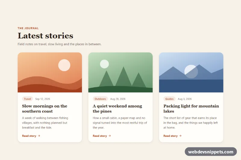
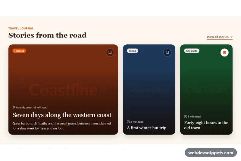
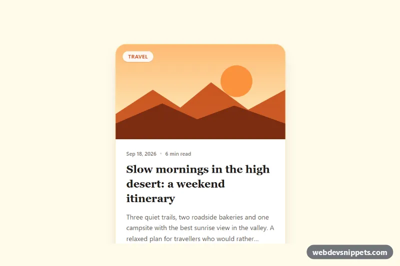
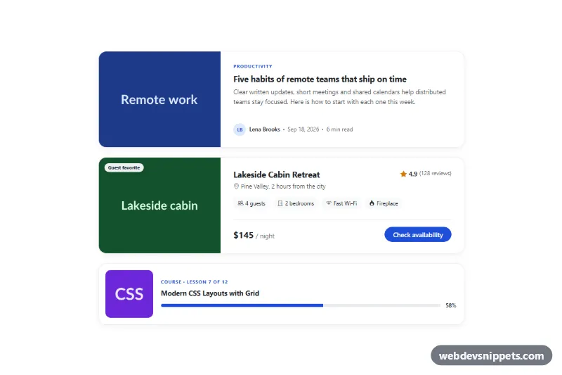
A responsive grid of blog cards built with pure CSS that lift off the page with a deeper shadow while the illustration inside zooms in. It suits article listings, travel journals, portfolio teasers and resource hubs, and needs no JavaScript at all.
How it works
The root section.chl-section contains a .chl-header and a ul.chl-grid of article.chl-card elements. Each card has a .chl-media block with an inline SVG landscape (.chl-art) and a .chl-body with a .chl-meta row (a .chl-tag pill and a time element), a .chl-title heading, a .chl-excerpt and a .chl-more label.
The heading link .chl-link is a stretched link: its ::after pseudo-element is absolutely positioned over the whole card, so a click anywhere on the card follows the link while the markup keeps a single, meaningful anchor. On :hover and :focus-within, .chl-card moves up by --chl-lift and switches from --chl-shadow to --chl-shadow-hover. At the same time .chl-art scales by --chl-zoom inside .chl-media, which has overflow: hidden, so the image grows without breaking the frame. The arrow inside .chl-more slides a few pixels to the right as an extra cue.
The grid is one column on phones, two columns from 640px and three columns from 960px. Each list item is a flex container, so cards in a row share the same height and the "Read story" labels line up.
Customization
--chl-lifton.chl-section: how far the card rises on hover, e.g.-4pxfor a subtle effect.--chl-zoom: the scale of the illustration on hover; set it to1to turn the zoom off.--chl-speed: duration of the lift; the image zoom uses 1.6 times this value for a softer feel.--chl-shadowand--chl-shadow-hover: the resting and lifted shadows of each card.--chl-accent: color of the eyebrow, tag pill, "Read story" label and focus ring.--chl-radius: corner radius of the cards..chl-media--dune,.chl-media--forestand.chl-media--lake: gradient and shape color of each illustration. Replace thesvg.chl-artwith animg(keep the class) to use real photos.grid-template-columnsin the.chl-gridmedia queries: change the number of columns per breakpoint.
Accessibility
Each card has exactly one link, the article heading, so screen readers announce a clear link name instead of a whole card of text. The illustration and the "Read story" label are aria-hidden. When the link receives keyboard focus, :focus-within lifts the card just like hover, and :has(.chl-link:focus-visible) draws a visible outline around the whole card. Dates use time elements with a machine-readable datetime. With prefers-reduced-motion: reduce, the lift, zoom and arrow movement are removed while the stronger shadow still marks the active card.
Usage notes
The :has() focus ring works in all current browsers; older browsers still show the lifted state on focus. Keep interactive elements other than the main link out of the card, or give them position: relative; z-index: 2 so they sit above the stretched link.