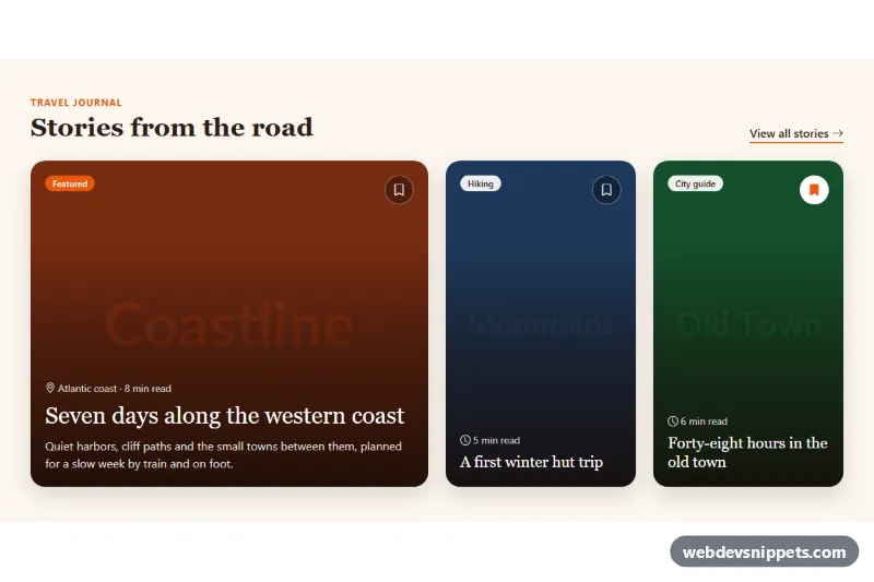
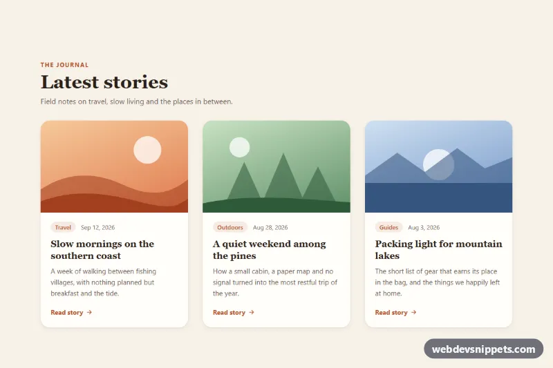
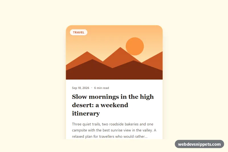
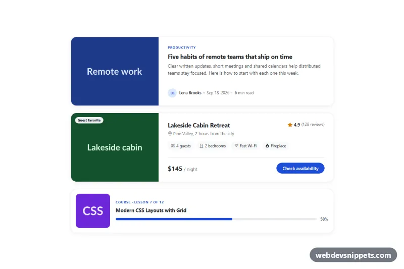
A set of Bootstrap 5 cards that place the title, meta line and category badge directly on top of a photo, with a dark gradient that keeps the text readable on any image. It suits blog and magazine home pages, travel journals, portfolio highlights and "featured stories" blocks.
How it works
The root is section.cio-section, which defines the palette and card height with CSS custom properties. Inside a Bootstrap row, one wide .cio-card--featured card takes half the row on large screens and two portrait cards share the other half; on tablets the small cards sit side by side and on phones everything stacks.
Each card is a Bootstrap card with a full-size card-img and a card-img-overlay. The image fills the card with object-fit: cover, and .cio-overlay turns the overlay into a flex column: the badge and save button at the top, .cio-body with the meta line and title at the bottom. The overlay background is a linear-gradient that goes from almost black at the bottom to nearly transparent at the top, so the photo stays visible while the text keeps strong contrast. The title link uses Bootstrap's stretched-link, making the whole card clickable. On hover or keyboard focus the card lifts and the image zooms slightly.
The script runs on DOMContentLoaded for every .cio-section. A click on .cio-save toggles aria-pressed, swaps the icon between bi-bookmark and bi-bookmark-fill, updates the button label and announces the change in the hidden .cio-status region. Without JavaScript the cards and links work; only the save buttons do nothing.
Customization
--cio-shadein.cio-section: sets the darkest gradient color; raise its alpha for brighter photos or lower it for darker ones.--cio-heightin.cio-section: changes the card height (24rem by default, 28rem from thelgbreakpoint).--cio-accentin.cio-section: recolors the kicker, the featured badge, the saved bookmark and the focus outline.--cio-radiusin.cio-section: use0.5remfor sharper corners or2remfor a softer look.col-lg-6andcol-lg-3on the columns: switch tocol-lg-4everywhere for three equal cards.d-none d-sm-blockon.cio-text: remove it to show the excerpt on phones too.- Replace the
placehold.coURLs with your own photos and keep thealttext descriptive.
Accessibility
Every image has meaningful alt text and each card is an article with an h3 title link. Because the whole card is a stretched-link, the outline is drawn on the card with :has() when the link has :focus-visible. The save buttons are real button elements with aria-pressed and an aria-label naming the story, and they sit above the stretched link through z-index. A visually hidden role="status" region announces saves. The gradient keeps white text above WCAG AA contrast, and the lift and zoom transitions are disabled under prefers-reduced-motion.
Usage notes
Requires Bootstrap 5 (loaded automatically) and Bootstrap Icons. Browsers without :has() still show a focus ring on the save buttons; add your own fallback outline if you need one on the card.