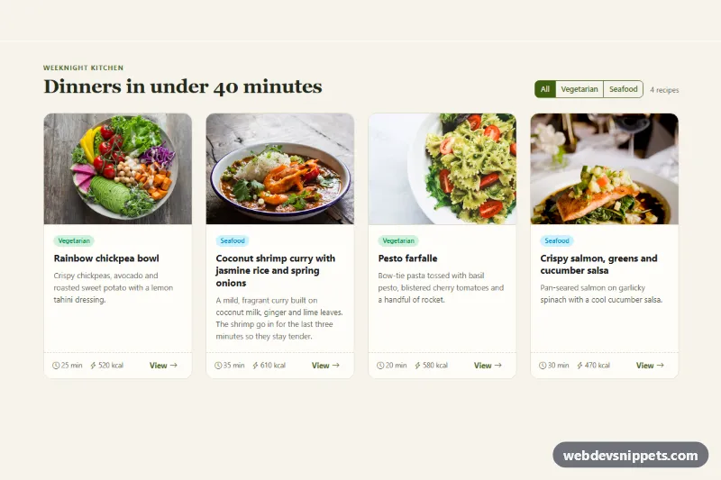
A responsive Bootstrap 6 card grid in which every card in a row has the same height and the footers line up, however long the titles and descriptions are. The demo is a recipe section with photos, tags, cooking time, calories and a radio-button filter. The pattern suits blog listings, product teasers and course catalogs as well.
How it works
The grid uses Bootstrap 6's prefixed row columns: row row-cols-1 sm:row-cols-2 lg:row-cols-4 g-7. That gives one column on phones, two from 576px and four from 1024px. Each .col holds a .card.h-100, so every card stretches to the height of the tallest card in its row. In Bootstrap 6 the .card-body is a flex column with flex: 1 1 auto. It takes up the extra space, so each .card-footer sits at the bottom of its card and the footers line up across the row. Equal heights need no JavaScript.
The photos use .card-img-top plus .cge-img, which sets aspect-ratio and object-fit: cover so every image has the same height. Each footer holds a small .cge-meta list and a btn-text "View" link.
The filter is a .btn-group of Bootstrap 6 toggle buttons. Each <label class="btn-check btn-outline theme-success"> wraps its own radio input. script.js listens for change on these radios, sets hidden on every .cge-col whose data-cge-type does not match, and updates .cge-count-num. The rest of the grid reflows, and the remaining cards still share one height per row.
Customization
row-cols-1 sm:row-cols-2 lg:row-cols-4on.cge-grid: change it tolg:row-cols-3for three cards per row on desktop.g-7on.cge-grid: sets the gutter (1.5rem); tryg-5for a tighter grid.--cge-img-ratioon.cge-root: changes the photo shape, for example16 / 9for wider images.--cge-accenton.cge-root: recolors the filter buttons, icons and "View" links.--cge-bg,--cge-lineand--cge-radiuson.cge-root: adjust the section background, card borders and corner rounding.data-cge-typeon each.cge-colplus the radiovalue: add your own filter categories, such asveganordessert.
The photos come from Unsplash; replace them with your own images.
Use cases
- Recipe sites: cards with photo, tags, cooking time and calories line up in neat rows
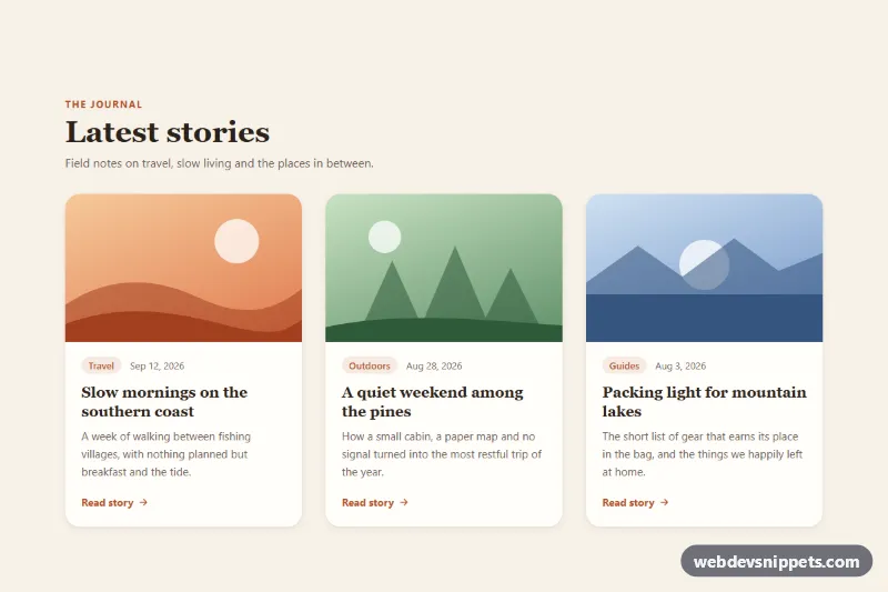
- Blog listings: footers stay aligned however long the titles and descriptions are
- Course catalogs: a radio button filter narrows the visible cards
- Product teasers: the responsive grid shows one, two or more cards per row by screen size
Accessibility
Each card is an <article> with a heading. The toggle buttons are native radio inputs in a labelled role="group", so arrow keys move between them. .cge-count is an aria-live region that announces the new number of results. Each "View" link has an aria-label that names the recipe. Focus outlines are visible, and the hover lift is turned off under prefers-reduced-motion.
Bootstrap 6 notes
Bootstrap 5's row-cols-md-2 and col-lg-3 become md:row-cols-2 and lg:col-3, and the breakpoints moved (lg is now 1024px). Toggle buttons no longer use input.btn-check with a separate label: the input goes inside a label.btn-check. Badges use badge badge-subtle theme-* instead of text-bg-*. Built on Bootstrap 6.0.0-alpha.1, so details may still change.